A quick note on terminology and history.
Object-source lighting, or OSL, refers to when one of the light sources depicted by your painting is an actual object on the figure or its base, such as a torch, lamp, or glowing sword. Lighting effects is a more general term I use to cover any use of paint to suggest a light source which is present in the scene, but may be “off camera” rather than being depicted on the miniature.The miniature painting community was introduced to OSL by Slayer-Sword-winning painter Victoria Lamb, whose creations The Rescue of Sister Joan and Firey Angel are two of the best examples of this effect.
To the extent that miniature painting is a genre of art, there are no hard-and-fast rules. However, when painting a miniature to simulate the behavior of a light source, you are trying to create an illusion of something which is not really there—the light that you imagine being cast on your miniature, from an object it is holding or from its environment. In order to create a convincing illusion, you must follow the same physical laws that govern how light behaves, or you risk spoiling the illusion because something will look “off” to the viewer. These rules about how light behaves are part of how you understand the world, but are often instinctive and subconscious. By taking these rules and making them explicit, it becomes easier to see when a lighting-effect illusion is not working, understand why it is not working, and fix it.
Rules of light physics
- The Cardinal Rule of OSL: lit areas always appear brighter than surrounding unlit areas.
- Lit areas appear no brighter than the light source they are lit by.
- The apparent color of an object is affected by both the color of the object itself and the color of the light falling on it.
- Light moves in straight lines.
- The strength of the light diminishes with distance from the object.
Rules 1-3 are the ones that people get wrong most often. I normally see people getting rules 4 and 5 right, or if they violate them they seem to have sensible reasons.
Rule 1, the Cardinal Rule of OSL: lit areas always appear brighter than surrounding unlit areas. This is the most important rule, but is also the rule I see violated most frequently when portraying colored light sources, which is why I have chosen to call it the cardinal rule of OSL. Very frequently I see people represent a yellow light source by painting the entire miniature as if the light source were not casting any light at all, and then glazing the areas around the light source with a thin translucent layer of yellow paint. This violates the cardinal rule of OSL, since the glazed areas are no lighter than the areas around them, and in fact are usually darker.1 And while the effect is not spoiled too much when people use yellow for this, it is completely destroyed when people choose a darker color for the light source, like green, red, or purple. If you are going to use the glazing approach (which can be a good one), it is important to highlight the areas where the light will fall before you glaze them.
Rule 2: Lit areas appear no brighter than the light source they are lit by. This rule most commonly gives people trouble when painting light sources which are red or purple, since saturated purple and red colors appear darker in value compared with other hues. If you are trying to simulate something like a red or purple neon sign or lightsaber, you are in a bit of a bind, since neon signs are themselves very saturated and also put out a lot of light. One way of resolving this is taking a cue from how photos of neon often appear, where the tube itself is a very light orange, pink, or white, but all of the reflected light has the characteristic neon red-orange color.

Of course this only works if there are surrounding areas to reflect the light. If the lightsaber is held away from the mini where there’s nothing to reflect the light, it will just look white.
This doesn’t mean that the entire light source must be brighter than the light it casts, just the brightest part. If your light source is a fire, parts of the fire can be a dark orange, red, or even black for the smoke, but the brightest part should be white.
Even though this is art, which allows you a certain license to break rules, in my experience breaking either rule 1 or rule 2 is a very bad idea. Rules 3-5 are a bit more flexible: it is possible to violate them without destroying the illusion, but this is best done in limited ways and for good reason, such as emphasizing a focal point of your figure.
Rule 3: The apparent color of an object is affected by both the color of the object itself and the color of the light falling on it. This is the rule I struggle with the most, and the way I have stated it is somewhat vague and doesn’t really tell you which color to use. There are a couple of ways to figure out what color to use. The best way is to use reference—either find an image of a similar color of light falling on a similar color of object, or do an experiment with colored light sources and materials in your home. This is recommended wherever possible. You can try other things, such as mixing the paints you are using for the material and the light together in varying ratios, but this gets tricky. For example, there’s a difference between the yellow of a torch, which has blue in it, and the yellow of a traffic light, which does not.2
Rule 4: Light moves in straight lines. People normally get this one right. This doesn’t mean you have to follow the model exactly—you can combine the light source illusion with a trompe l’oeil illusion to show how the light interacts with detail which is not physically sculpted on the model, but which you are simulating with paint.
Rule 5: The strength of the light diminishes with distance from the object. People normally get this one right too. Note that there is a difference between how this effect interacts with matte materials, like cloth, and reflective ones, like metal. With cloth, the increase in lightness due to the cast light diminishes with distance. With reflective materials, the apparent lightness diminishes less (and not at all for highly polished metals like chrome), but the reflections themselves are smaller.
Step-by-step process of painting an OSL effect
The rules of light physics are about the final result, not the process. It is important to follow them to get a good result, regardless of what process you use. Different artists use different processes, and that is fine. Process is important, but there are a lot of different ways to get good results.
However, there is one process I like a lot for creating lighting effects. It’s simple, produces good results, and makes it easy to stay consistent with how light behaves. The basic idea is to start by ignoring the color of the light source, but simply highlighting. Paint the light source white, the purest, brightest white you can find (which in most paint lines will be made from titanium oxide). Paint the surrounding areas whatever colors you have chosen for those areas, and then highlight those areas aggressively by adding white, and paying attention to where the light is coming from. Your goal is to sell the effect of illumination by a pure white source of light. Finally, once you have successfully created the illusion of a white light source, add in color by glazing with a bright, transparent paint, covering all of the areas you highlighted.
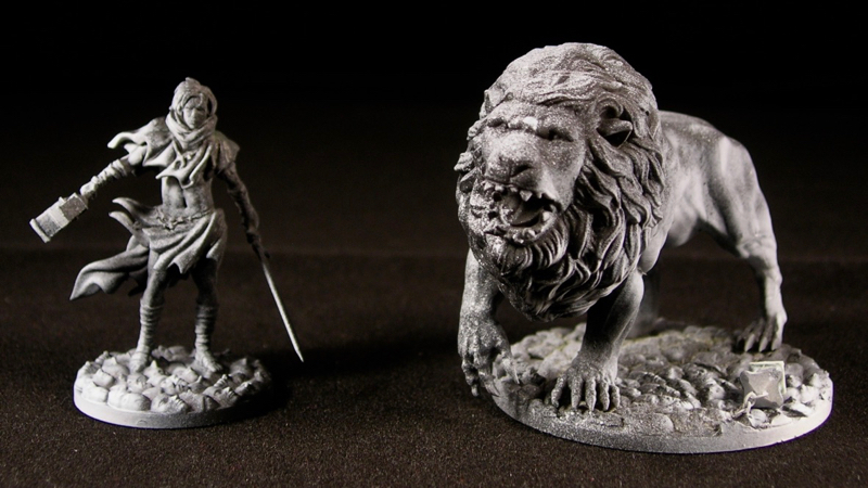
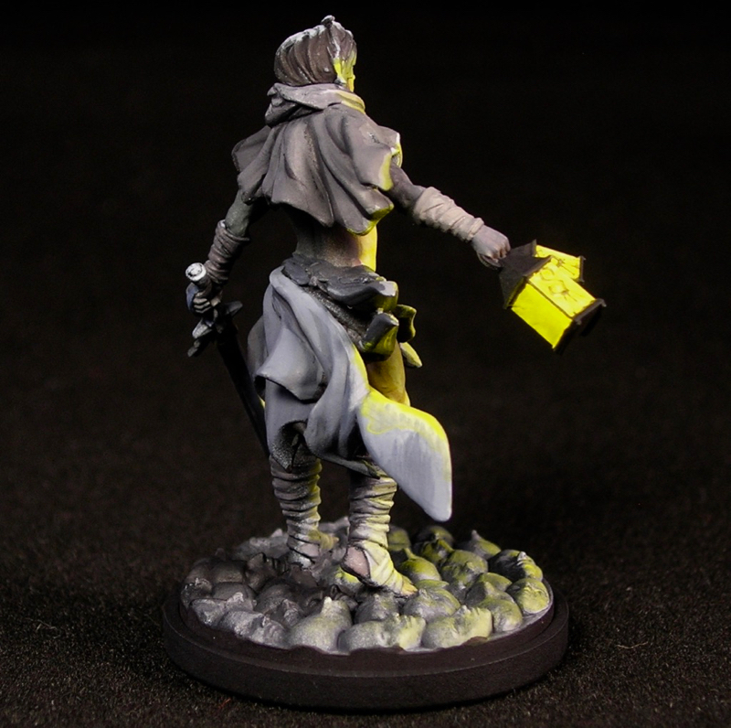
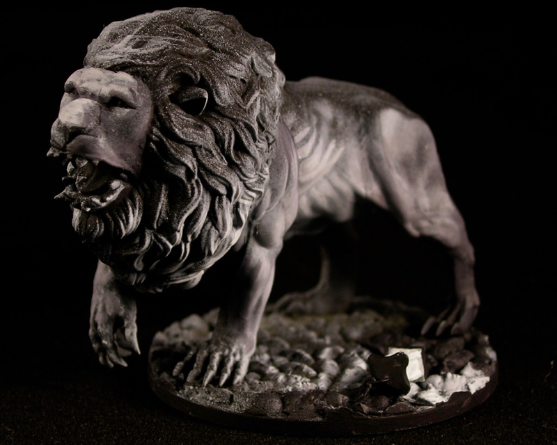
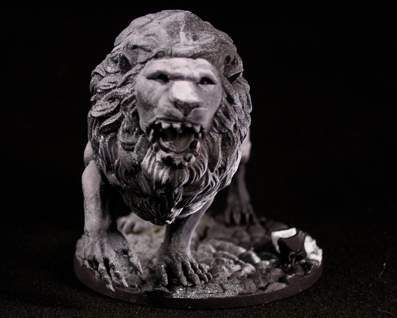
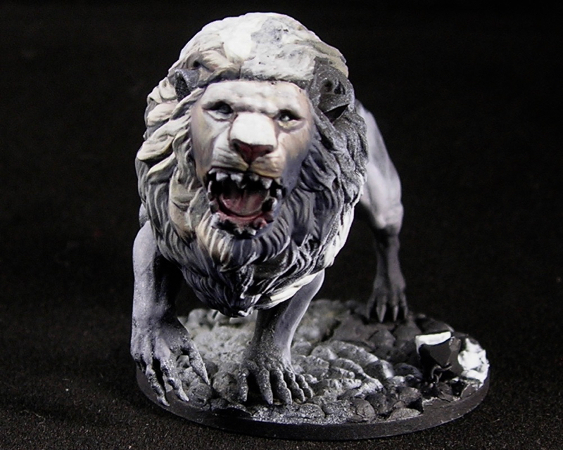
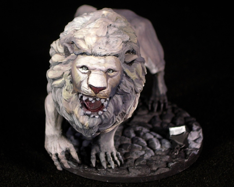
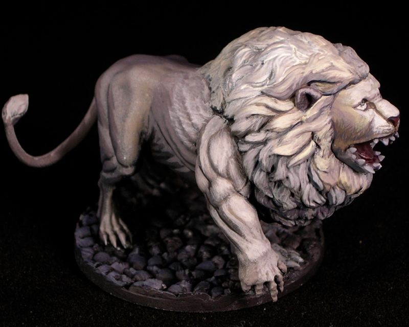
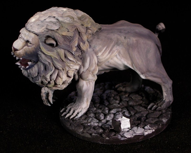
I will demonstrate with two models from kingdom death: the male intimacy survivor and the white lion. For the survivor, because of how the lantern is placed on the miniature, I can get away with making the lantern the only light source, so that’s what I’ll do. For the lion, this is not possible, so there will be two light sources: the lantern on the base, and a weak white light source (like moonlight) from the opposite side of the lion as the lantern.
Our subjects, ready for paint
These are gaming figures, not display figures, so both will have fast paintjobs designed to be effective on a gaming table with a minimum amount of time, not display or competition-level painting by any stretch. OSL can be very effective without spending hours on precise technical painting or creating smooth blends. The key is to understand how the light would affect your model and to paint it appropriately, whether you are doing a quick sketch or a time-consuming showcase piece.
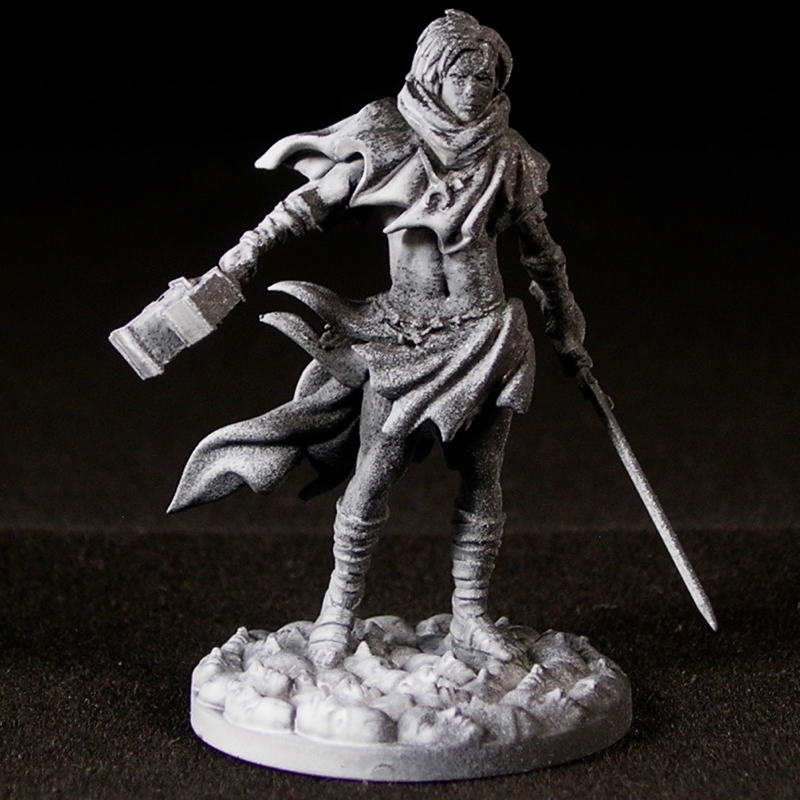
For my fast gaming pieces, I like to do two-tone priming, starting with black, and then applying a white spray from the direction (or, in the case of the lion, directions) that the light is coming from. Because I can’t spray directly from the lanterns, I matched the direction as closely as I could while spraying from the recommended priming distance.
Step 1: Pre-shading with primer
Since the survivor only has light from one direction, he is a bit simpler, so I will start with him.
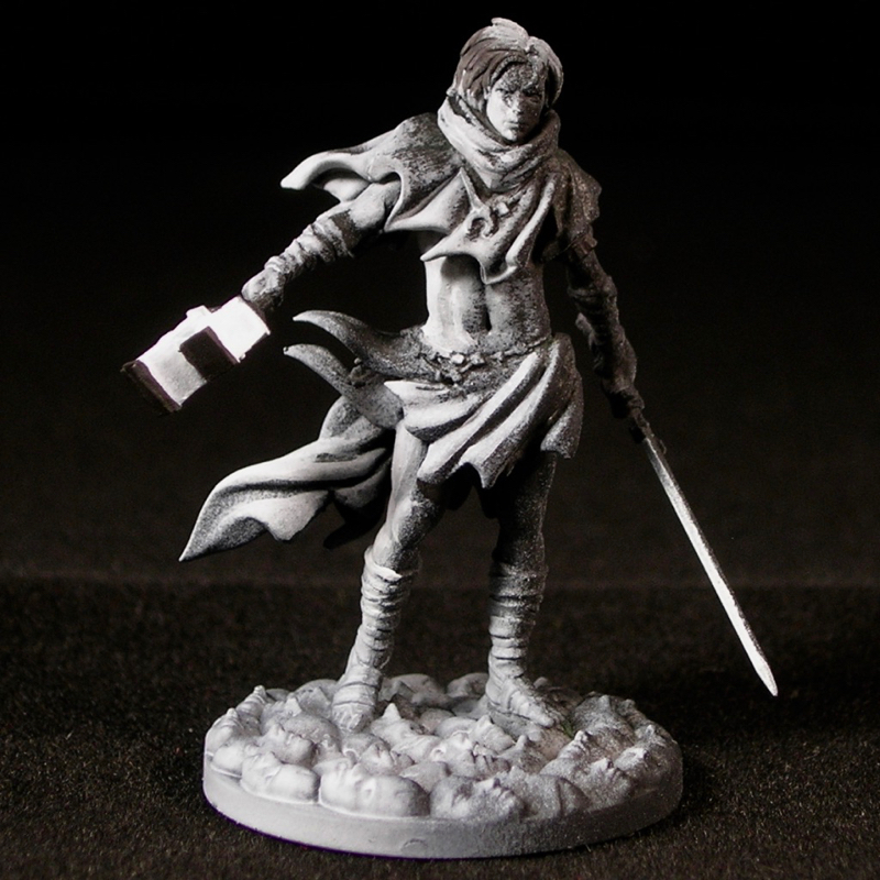
Step 2: Pre-shading with a brush
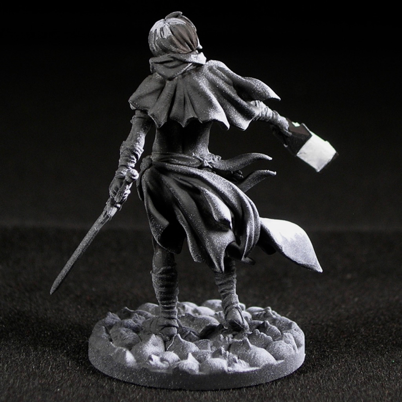
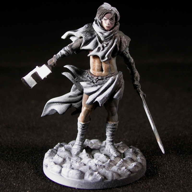
I did a very quick refinement to the primer pre-shade using white and black. Most important at this step is to paint the light source itself with an opaque coat of pure white, which will help it appear as bright as possible, to be consistent with rule #2. I also painted the body of the lantern black, to maximize the contrast around the light source. The other important part of this step is correcting places where the directional spray does not match where the light or shadows should be, since spray paint does not act quite like light. I corrected the cloth closest to the lantern, and the survivor’s torso, face, and hair.
The pre-shading in total was only about 5 minutes of work. It doesn’t need to be terribly precise.
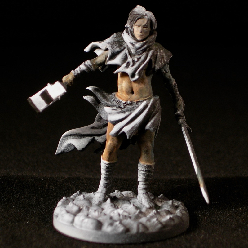
Step 3: Basic flesh volumes
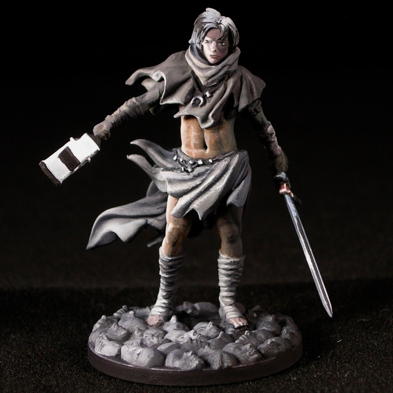
After the fast pre-shading step, it’s time to add color, starting with the skin. At this stage I painted only the most basic volumes. I essentially treated the legs, arms, and torso as cylinders, and the head as a sphere in terms of the highlight/shadow placement. All of the additional detail you see is created by the sculpt and the underpainting.
I used a thin, translucent layer of paint, so you can still see the effects of the underpainting through this paint layer. I painted each limb separately, first covering the entire area with a flesh tone, then adding blue to darken the shadows and keep contrast high. Since this is at night, there is little ambient light, so it’s important that the shadows are very dark. I chose to use blue for the shadows because we experience night as bluer compared with day,3 and because it creates complementary color contrast with the yellow of the light source. For similar reasons, I also used nightshade purple, which is a purplish off-black color by Reaper, as my “black.”
Step 4: Refining the flesh and face
After establishing the most basic volumes in the flesh, I picked out the smaller volumes, such as the details of the face and the six-pack abs, increasing contrast at the same time. This is only about one brush stroke per muscle, still obviously very sketchy. I could have refined much further, but again, this is a gaming model.
Step 5: Clothing, sword, jewelry, hair, and base
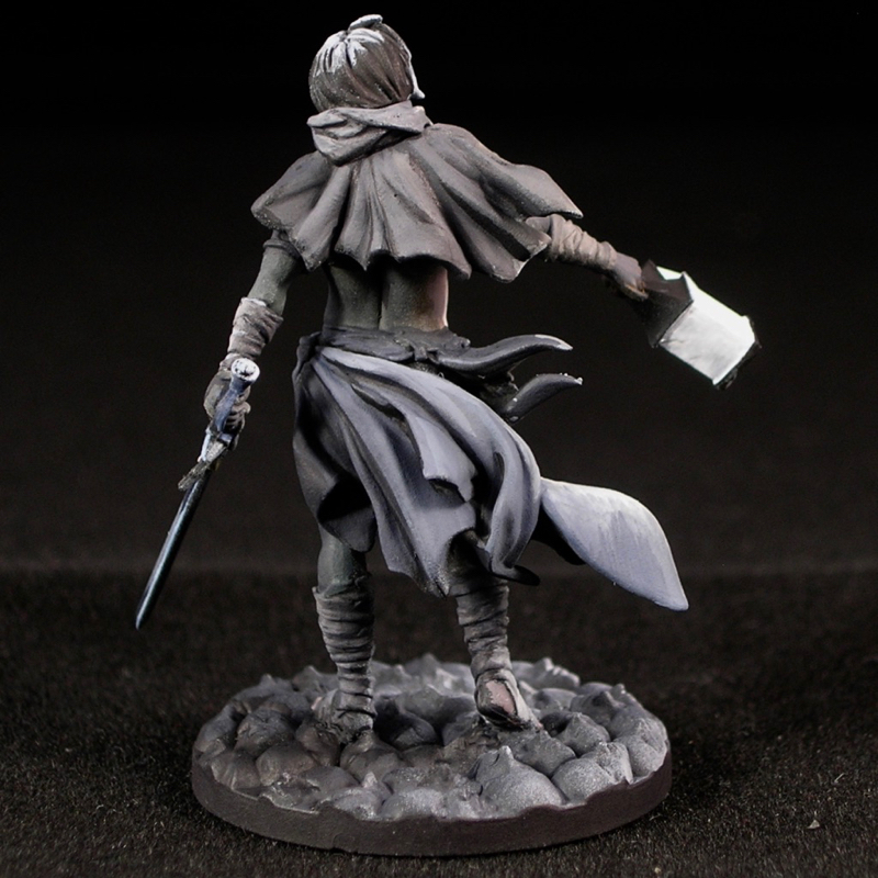
The next step is to paint the other details to the same level as the flesh. I won’t describe this step in detail, as it is similar to steps 3-4, or any other highlighting and shading that you do. Just keep thinking about where the light is coming from, and do all of your highlighting and shading with that in mind.
After this step, I have hopefully sold the idea that his lantern is a white light source, and all of the other areas are illuminated by it.
Step 6: Change the color of the light
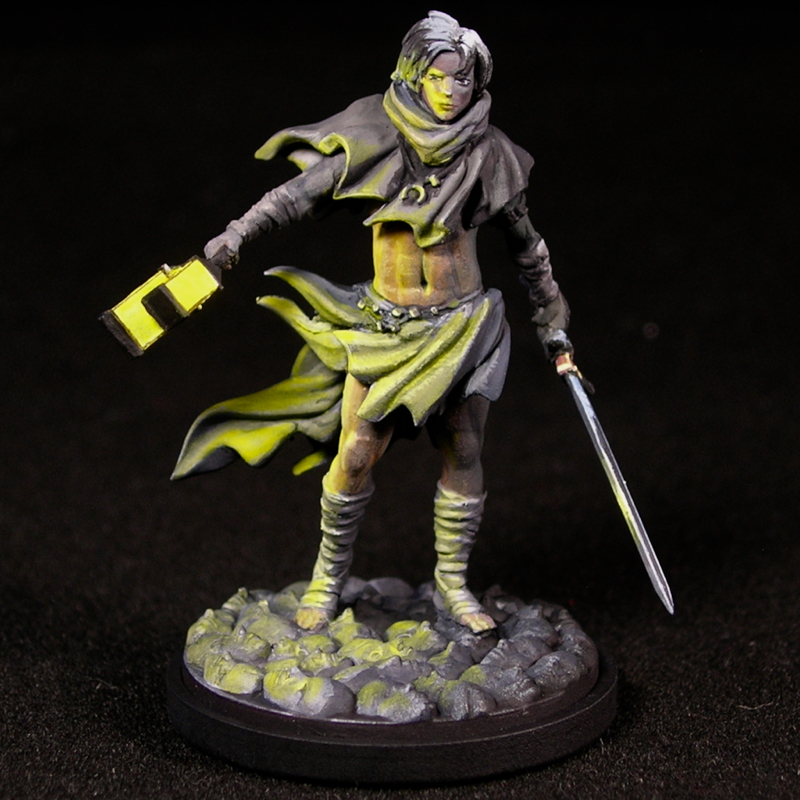
Once I’m sure I have believably sold the light source as a white light source, it’s time to add color. Using thin glazes of a very saturated and not too dark color, I glaze over all of the midtones and highlights I painted.
The apparent difference between this step and the previous step is huge, but actually this step is not very time consuming. Most of the work happened in steps 3-5, but this preparation is critical for the payoff in step 6. All I did was apply thin, dilute glazes with yellow over all of the areas I had highlighted in steps 3-5. (For those who like to keep track of such things, I used Reaper MSP candlelight yellow, but any saturated, slightly translucent yellow paint should work fine, and yellows tend to be translucent.)
Be careful to use very thin glazes, ideally with a fairly saturated but not super dark color. This is especially important if you are using a color other than yellow for your light source, since other hues naturally appear darker.
If I were painting to a display standard instead of a gaming standard, the sequence of steps would be the same, I would simply spend a lot more time refining in steps 3-5, and do some touch-up work at the end.
Painting the lion was quite similar to the survivor, except that light comes in from two directions instead of one, and only one of the light sources is yellow. The steps are similar, and you can see how things change (and don’t) with two light sources instead of one.
Step 1: Pre-shading with primer
 I sprayed the lion from two directions, to depict the light from both sources. In this case, it was a bit easier to spray the lion before I attached it to the base. I also sprayed the base around where the lantern would be, before I glued the lantern to the base.
Step 2: Pre-shading with a brush
Most important: opaque white paint on the lantern’s faces, black on the top and bottom. I used black to paint the shadows cast by the top and bottom of the lantern.
I added white to the parts of the lion which would get the most light: the ribs and muscles around the lantern, and the top of his face.
Step 3: Face and mane
Since the lion is much larger than the survivor, and essentially all one color, I worked area by area, always keeping in mind where my light sources are. The pre-shading was really helpful for keeping in mind the locations of the light sources.
To sell that there are two distinct light sources, it helps if you can define the boundary between them with shadow. You can’t cheat in order to do this—you also have to paint the light and shadow where they make sense given the shape of the figure and where the light is coming from. For the lion, I planned ahead by deliberately placing the light sources to make this possible. I positioned the lantern on the base where it would best illuminate one side of the lion from below, and then placed the second light source on the exact opposite side of the lion’s head from the lantern.
Since the lantern was not part of the sculpt, I had complete freedom in placing both light sources for maximum impact. But even when the sculpt constrains your choice of light sources, you still have control over the non-object light sources which come from off camera. If you want to use lighting effects on a mini, think about how to light the scene as if you were a cinematographer.
Movies can be great inspiration for this, since movie-makers devote a lot of attention to positioning the lighting for optimal effect. I’ve been known to pause movies and take screenshots when I see lighting I want to as reference material.
Establish your light sources early on, and keep them in mind throughout the painting process. One advantage of pre-shading is that it forces you to do this. When you choose not to pre-shade, it is especially important to always be mindful of where the light is coming from as you paint.
Step 4: Body and base
As with the survivor, I painted all of the areas of the lion as if both the off-camera light source and the lantern were white,
In the view where the lantern light is not visible, notice that the shadows are quite dark, even black in places. The lion still reads clearly as white, because it is painted white where it is well illuminated by the off-camera light source. But because it is night and there is not much ambient light, just weak moonlight and a lantern, the midtones are quite gray, and the shadows go all the way to black.
The same is true on the side illuminated by the lantern, except that there are two light sources, with a definite area of shadow in between. Because most places would catch at least a bit of the light from either the lantern or the moonlight, the shadow is not the deep black shadow of the lantern-less side, except in a few of the deepest folds. Rather, it is mostly a dark gray midtone.
I used a black wash over all of the stone faces on the base, except the ones right around the lantern, to make sure there would be black in the cracks and crevices in between them. I then highlighted the stone faces with a succession of gray, focusing on the area right around the lantern. On the far side of the lion from the lantern, where the moonlight would hit the base, I added some weaker highlights in the direction of the other light source.
Step 4: Change the color of the light
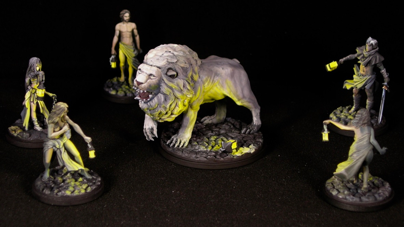
Again, the final step is glazing in the color of the lantern light.
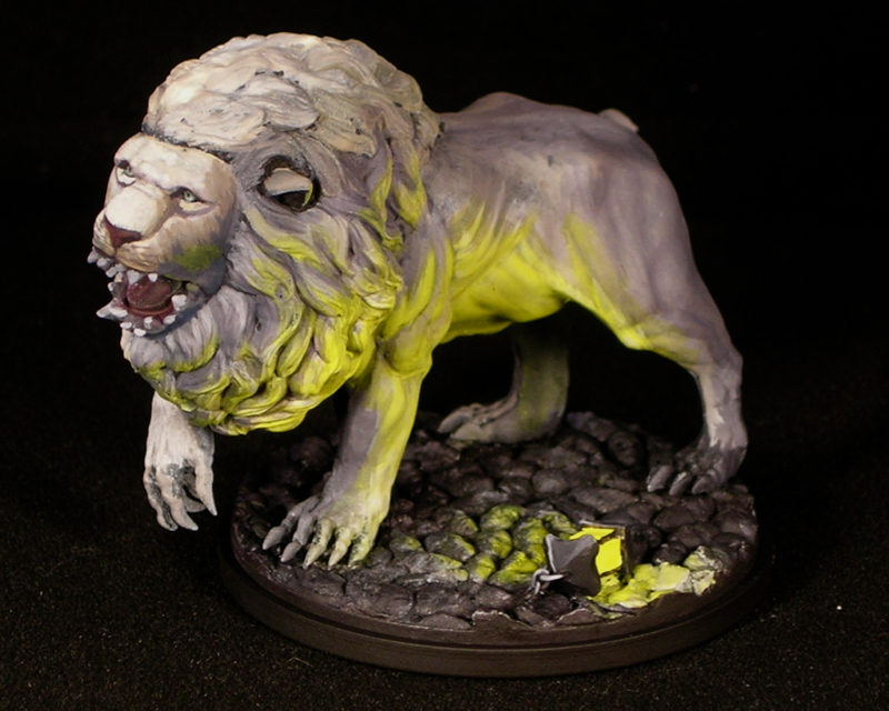
Because there are two light sources affecting the lion’s left side, I needed to be a bit more careful in the glazing step than I did with the survivor. As a result, this step took a little bit longer, but still represents a very small amount of time compared with the previous steps. The defined area of shadow between the two light sources was quite helpful for this, since it made it easy to keep track of which areas of light were coming from the lantern vs. the moonlight. Keeping this in mind, I glazed the parts illuminated by the lantern light, leaving the parts illuminated only by the moonlight white, and the parts without strong illumination from either gray.
Since the different muscle groups and tufts of fur create lots of small volumes, this part was quite fun.
Of course, the lion’s right side changes hardly at all in this step.
Voila, finished lion and survivors!
As I said above, this step-by-step shows one of many possible processes for achieving a believable light source effect; this is by no means the only way to do it. For instance, you could easily skip the pre-shading steps if that is not your thing, as long as you plan your light sources from the very beginning and shade and highlight with them in mind, achieving the same level of contrast.
I do recommend using a process where you first depict a convincing pure white light source, only adding color once you’ve made the light source believable without it. When you only add color after you add light, it’s much easier to be consistent with the physical properties of light you are trying to replicate, the rules of physics described above.
Ultimately you can get a good result regardless of the process you choose to follow, as long as the end result is consistent with the physics of light.
I will conclude this tutorial with some tips for getting good results with lighting effects. These are not rules, so feel perfectly free to ignore them, but I have found they help me get better results.
Subtlety is not your friend. When a lighting effect is not working, the solution is usually to either make the light brighter, the shadows darker, or both.
Try to avoid placing light sources where you will fight with the mini’s natural shadows. No matter how bright you paint your lighting effect, it will be ruined if the mini casts shadows that hide it. Sometimes you can get around this problem by repositioning part of the mini or filling in a recess where you want to paint a lighting effect. For instance, if you want to paint a skull with glowing eye sockets, fill the eye sockets first, as in this great example by Jen Haley.
Highlight light sources backwards. If you paint an object in a very light color because it is glowing, parts of it will still be in shadow, and that can spoil the effect. Increasing the lightness of the areas which are in shadow can fool the eye into thinking that no part of it is in shadow, similar to how camouflage works. This makes the eye more willing to accept the illusion that the object is glowing.
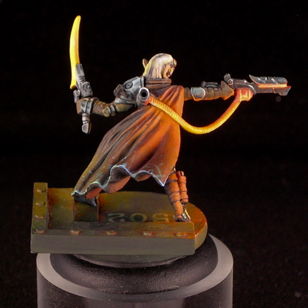
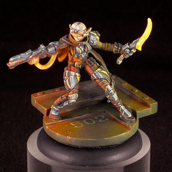
The glowing hose and energy pack of Kaelyssa’s gun are highlighted in reverse—the top is a saturated orange color and the bottom is a warm yellow-white.
This is more for appreciating the miniature in person, when light is usually from overhead, rather than in photos, where you have more control over the lighting environment.
Light interacts with different materials differently. Just like highlights from the main light source, reflected light from a secondary or object source should be more spread out for more matte materials, and more concentrated for reflective materials like glossy leather or metals. material, and should be affected by the textures of rough surfaces like coarse fabric or unfinished wood.
When the orange glow reflects off of the matte cloth and leather parts of Kaelyssa’s armor, it is softer and more diffuse, but when it reflects off of her shiny metal armor, we see actual reflections of the glowing objects rather than a diffuse aura of light. Even a less mirror-like metal, like brushed steel, would reflect the light in a more concentrated way compared with cloth or leather.
Avoid interacting complementary colors, or multiple secondary colors. Often in art, you are told that complementary colors are good, because they create strong contrasts and help balance colors. This is all true, but having light of one color falling on a surface of its complementary color is a bad way to create complementary color contrasts. This is because of the physics of light: a surface of one color will is poor at reflecting the light of its complementary color. Similarly, a surface of one secondary color, like green, will be poor at reflecting light of a different secondary color (orange or purple). Instead, it is better to use neutral tertiary colors, or combine colors of light and colors of surfaces that mix well as paints, to create bright colors, such as yellow light falling on a blue surface to make it appear green. You can still create complementary color contrasts, but do it in other ways, such using the complementary color of your light source in the shadows, or having complementary colors of materials illuminated by light of a primary color (such as a red and green fabric illuminated by a yellow or blue light).
Yellow light is the easiest to pull off. Yellow has a lot of things all working for it. It is perceived as the lightest of all of the colors of the rainbow, which makes it easier to follow rules 1) and 2). It is a primary color, so it combines well with the previous tip. And yellow pigments are often translucent, which means they work well in glazes. This will make your life easier if you are using glazing as part of your process, such as the one I described above. Cyan is also pretty easy, for similar reasons. A bluish purple is probably the hardest.
It can be immensely helpful to do a “lighting study” for more complex pieces. Plan what you want to do, then try to arrange light sources to match what you have in mind, and take a photograph for reference. This can be effective even if you can’t match the colors you have in mind—either translate mentally or fix it in photoshop.
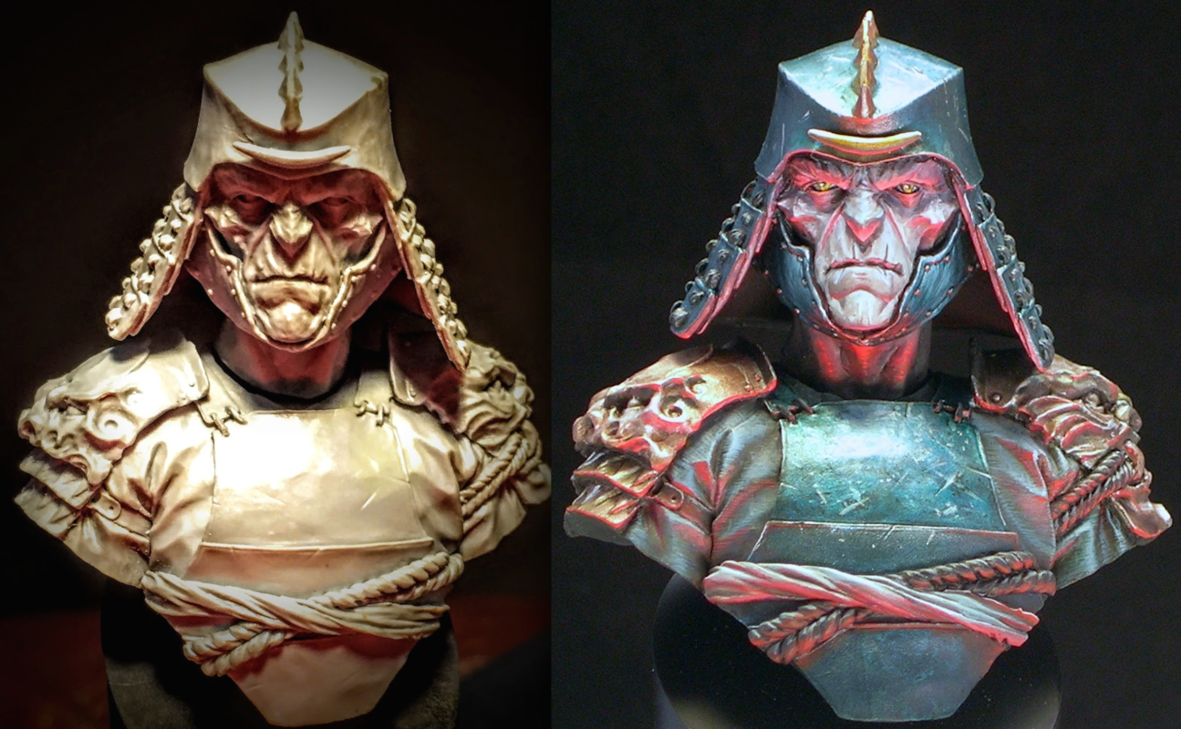
I referred to my initial lighting study frequently while painting Abalam.
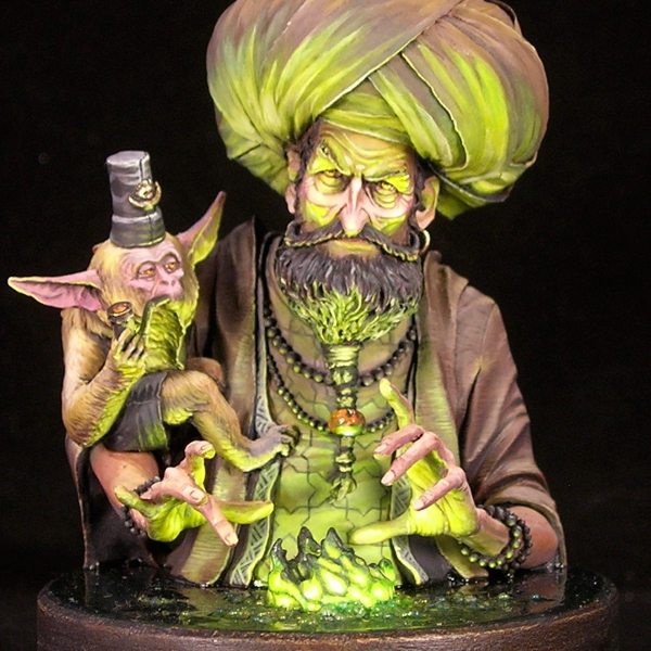






An excellent tutorial – thank you’
Glad you like it! Tutorials take a lot of time and energy to put together, so it’s good to know they are appreciated.
Still being appreciated , thank you!!
Also now still 🙂
And now, too. 🙂 Thank you!
and still
Still now too 🙂
Still being appreciated.
Stiiiiiill being appreciated
Very nice work
Very helpful. Thank you!
This is SOMETHING that I want!
thanks
Can I take This tutorial to my blog? ; )
Hi Jaehun. I’m glad you enjoyed my tutorial. You’re welcome to link the article from your blog, or try it out yourself and blog about your results, but please don’t copy the entire article on your blog. Thanks!
Good stuff!
Gonna try it out tonight on my KD:M models.
Thank you for the very nice tutorial! It didn’t get lost in detail while still explained everything perfectly 🙂
You’re very welcome. Glad you found it useful!
Phew! Great job! Gonna have to OSL a horse from the Vast miniatures line. The lighting comes from beneath the model, so i get to come up with a base that radiates red light as well. Whee. 😛
This is EXACTLY the tutorial I’ve been needing! Thanks!!!
So glad!
Really appreciate the time put into this. Very illuminating! 😉
You’re very welcome. And groan. 😛
Very illuminating! Thank you!
What color blue did you use for flesh shadows?
Thanks for this great article
I do not remember. It was just a little blue mixed in with other colors anyways, so it doesn’t matter a huge amount. Feel free to experiment.
Excellent tuto, I am planning to paint in ‘statue’ style the starting survivors of KDM, this will help a lot.
This is exactly the effect I’m looking for for dungeon delving minis.
Thanks for your time and effort to creat this great tutorial.
Now to practice it….
Cheers
Phil
Wow! What a fantastic tutorial. So good to see people writing lengthy guides like this in this age of video, too.
I’m with Adam: I appreciate a written tutorial more than a video one, because I can slow down where I need to. Fantastic work! There aren’t a lot of physicist/painters around – congrats!
Hello,
Great tutorioal !… and as many others i prefer a well written tutorial like this one rather than a long boring video.
I have not your talents so i still have difficulties to get a very good osl effect, but thanks to this tutorial i avoided big mistakes and the result is at least acceptable. Thank you.
Thanks for this, I’ve just recently got back into mini painting after a fairly large break and wanted to try to improve upon my painting skills as the models I have atm aren’t exactly the most eye catching haha.
Also just wondering what that ‘Kaelyssa’ model is from, can’t say I recognize it, but I’d love to paint one.
Glad you like it! Kaelyssa is from Warmachine, although I made a much more sci-fi version of her than is usual for that setting.
I’ve always thought I wasn’t a good enough painter to achieve OSL but I’ve been pushing myself to get better and your tutorial is just what I needed! Can I link it to my School Club Twitter Page?
Glad you found my tutorial useful! You’re welcome to link to it from wherever you would like.
Great tutorial. Very clear & practical. Thanks!
Hi,
I’ve just came accross this tutorial and this is super dope.
It’s rare to encounter such painting skills mixed with such pedagogic skills on a blog post.
Working with light is my current focus and I will for sure use this this very week-end.
Thank you so much!
Greatly appreciate this tutorial. I share it whenever someone asks about OSL. Got it pinned to my homescreen too.
Thank you so much.
I will have to paint a bunch of lightsaber-glows with no OSL experience and this tutorial is going to help me a lot.
Unfortunately, none of the lightsabers are yellow :/
This is really useful, thank you!
I just had one question that I’ve been struggling with, and I wondered if you’d mind letting me know what you think. In the tips towards the end, you said that it is helpful to combine primary colours of object and light, and mentioned yellow light falling on a blue surface to make it appear green. My understanding is that a blue object will absorb all colours of light apart from blue. Given that yellow light is a mixture of red and green light, my brain is telling me that a blue object would absorb all of that light, therefore reflecting nothing back, and therefore appearing black.
Have I got this muddled? If I’m along the right lines, then would I be right in thinking that a cyan object under yellow light would look green?
I can see what you mean about the colour mixing, and it’s a really interesting thing to think about (and certainly something I’m going to try!), I’m just now sure how I’ve understood how it is actually supposed to work!
P.s. definitely sharing this article with a friend – can’t stress how helpful it is!
Hi Ryan, thanks for your question! It’s an interesting one. Indeed you are correct that a cyan object would look quite green under a yellow light, and an object that doesn’t reflect any green wavelengths (such as certain very dark blues, or very cold blues) might appear black or almost black in a yellow light. So it does depend on what kind of blue we’re talking about, and what kind of yellow.
What follows is a nerdy physics digression which probably won’t help anyone paint better, but contains the true answer to your question, and may be interesting to some:
A really helpful tutorial many thanks
Amazing tut. Thanks for keeping it up for newbies to the art to learn from.
Brilliant tutorial thank you