Never be afraid to paint outside the lines

Tag: Privateer Press

Miniatures manufacturer, maker of Warmachine and Hordes

Crystal Brush Entries, part 2

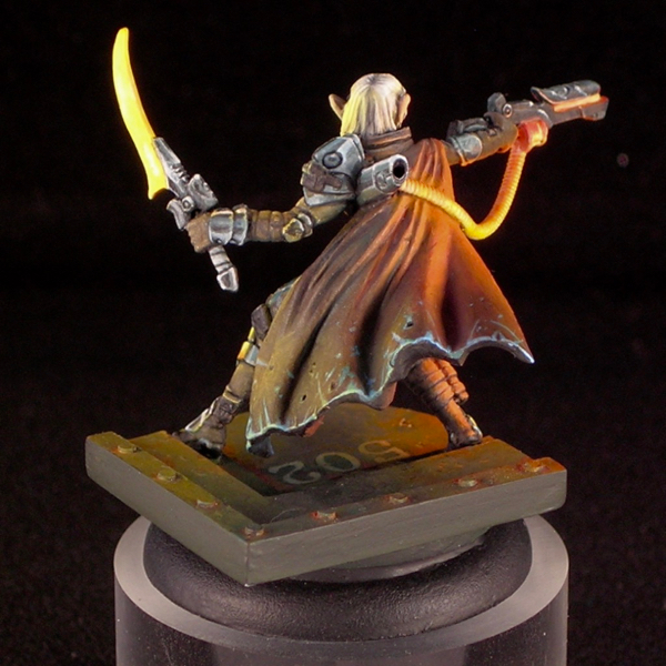
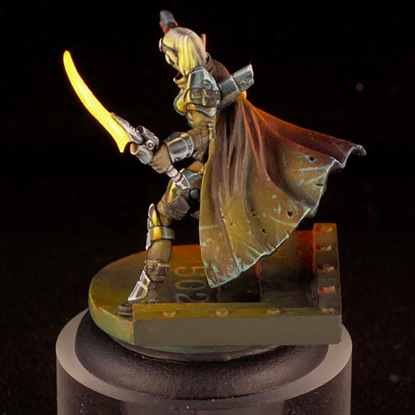
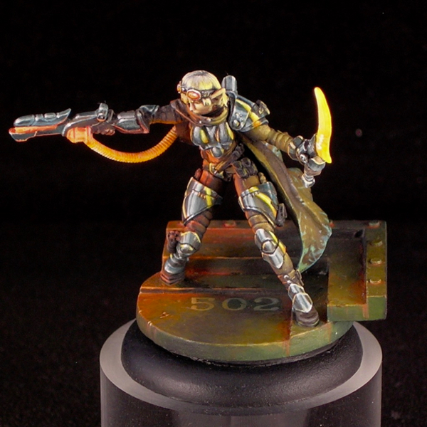
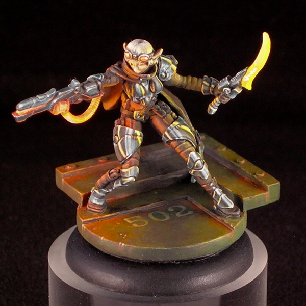
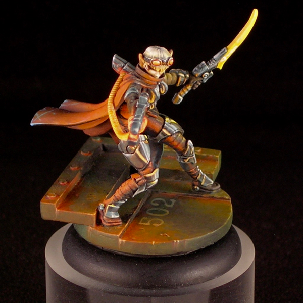
Today I’m continuing my three-part series on my Crystal Brush entries with my single figure entry. If you missed part 1, please check it out here. This figure is titled “Space Pirate Kaelyssa.”

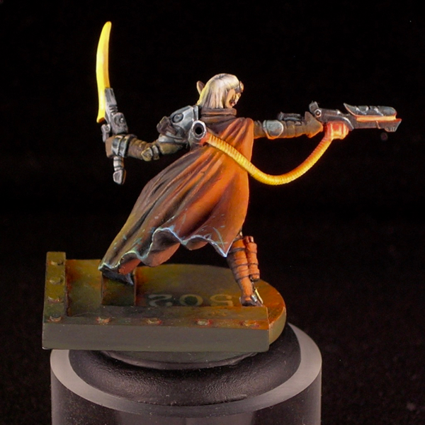
The figure is Kaelyssa, from Privateer Press’ steampunk game Warmachine. I got a big kick out of doing her up in true sci-fi fashion, not at all steampunk. Since she belongs to the Retribution faction, which already have a rather sci-fi look, this was quite easy. All I did was a very simple conversion to add a hose connecting her gun and backpack. The only other thing it took was paint. I was amused how many people asked me if it was an Infinity figure.

Part of the inspiration came from James Wappel’s excellent Professor Karrick. I absolutely love dramatic lighting and glow effects, and James’ take on Professor Karrick’s two light sources is excellent. The base he did complements it really well, providing a nice backdrop to catch the light. For my version, I kept the base but used a different figure from the same sculptor (Patrick Keith), converting it slightly to have a similar hose.

I tend to do simpler color-schemes on most of my figures, with two or three main colors dominating. In my experience, the easiest color-schemes to pull off are those that have at most two bright colors in them, and the rest of the colors are more muted. Here I was able to come up with a more complicated color scheme, with many very saturated colors in it, and I still think it works.

I was really surprised when Kaelyssa didn’t make first cut. I spoke with one of the judges, and he said that she was right on the bubble but the judges felt that the blending on the orange was not smooth enough and that kept her out. I’ve never been the smoothest blender, preferring to take my time creating textures and dramatic ambiance rather than glazing and glazing until I have really really ridiculously smooth blends. I think that hurt me here.

While I think there are some weaker elements, like her left arm and sword, I’m really happy with how the ambience and light effect came out. I think that overall Kaelyssa is good work, but given her poor result in Crystal Brush I plan to rework some of the weaker elements and enter her in another competition in the future (probably the Privateer Press competition at Gen Con).

Kaelyssa is sculpted with some fairly simple, round armor plates. Simple surfaces can be wonderful for an ambitious miniature painter, because they provide a good opportunity to make them much more complicated and interesting using paint. I took the opportunity to do a comic-book-style chrome effect, reflecting the glowing sword and ray-gun. I think the comic-book style art complements the sci-fi vibe really well.

There are a lot of debates between non-metallic metals vs. the use of metallics in miniature painting, with hard-line adherents on either side arguing their way is “better”. Personally I use both, but I think this miniature is a good example of some of the advantages of non-metallic metals. I could never have portrayed the interaction of shiny metals and a light source using metallic paints, the way I was able to do it here using nmm.
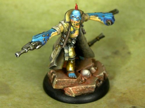
Gurka Firewater

A lot of people get in to miniature painting through RPGs. When you play the same character weekly in a regular game, it’s a good motivation for painting a figure to represent the character, and doing a good job on it.

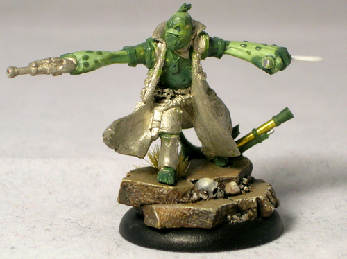
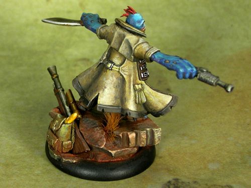
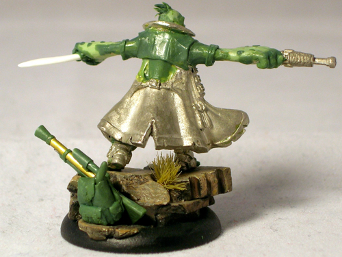
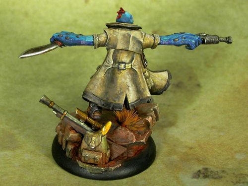
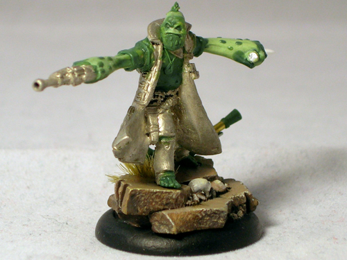
This is Gurka Firewater, my character in a weekly Unleashed game. I was disappointed with the available pygmy troll options in the Privateer Press miniatures line, so ended up converting my own, using Captain Allister Caine as the starting point. Since I started with a human figure, this involved extension conversion work.

The head, arms, and feet are full scratch. I sculpted one of the hands around one of Caine’s pistols, but the kukri and the rifle on the base are also fully scratchbuilt. I used a rotary tool to remove the head and grind down the breastplate so I could sculpt a troll belly over it.

Yes, that’s a baguette sticking out of his backpack. In the lore, trolls eat a lot and tend to carry food with them everywhere they go. I guess they’re sort of the hobbits of the Iron Kingdoms? A baguette seemed like a fun and fitting way of giving him some extra character. Perhaps I should also have added a flask, given his name. 😉

I ended up doing a very gritty paint-job with lots of texture. Somehow that seemed appropriate for a bushwhacker character. No smooth blending for this guy.

I entered Gurka in the “open” category at ReaperCon. Usually when I enter competitions, I use stock or near-stock models that are judged only on the quality of the painting. In the “open” category, they give roughly equal weight to both sculpting and painting, making it a much more challenging category. This is especially true for me, as I’m a much better painter than I am a sculptor. Luckily I was able to compensate somewhat for my sculpting deficiencies through my paintwork, and managed to eke out a gold medal.

It’s always good to push yourself, as that’s the best way to improve. With this miniature, I pushed myself to do a much larger amount of sculpting than I had before on any model, and that was definitely a challenge. But it also gave me the confidence to tackle more challenging sculpting projects in the future, since now I know I can do a project that involves significant sculpting, and still end up with a decent result.

Time-traveling Haley

Sorry it’s been so long since I’ve updated the blog! Between ReaperCon, non-miniature things, and the holiday season, I just haven’t had the chance. But today I find myself stuck at the airport, with a delayed flight, and it seemed like a perfect opportunity to update the ol’ blog. Rest assured, I have much more new material planned for January.

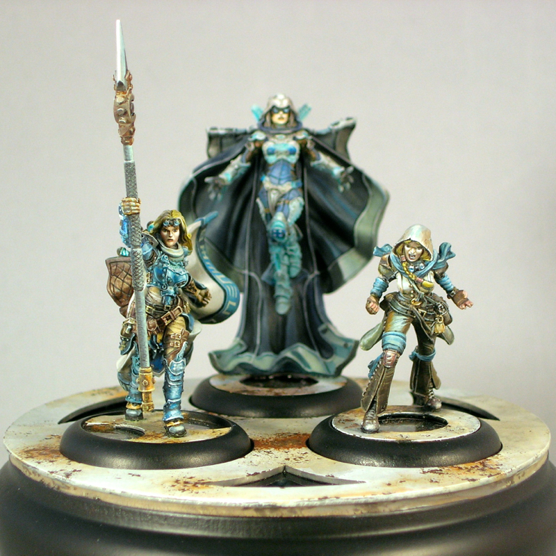
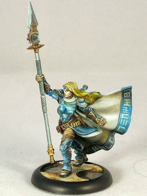
Those of you who have seen my work probably know I’ve long been a fan of Privateer Press’ games and miniatures, especially Cygnar, which was my first faction. So when I saw the epic time-traveling version of Victoria Haley, I was instantly sold. It’s a great new spin on a classic, iconic Cygnaran leader.

For my take on this classic, I decided to go for a much sketchier and more painterly style than my usual. After painting miniatures for two decades, this was a pretty radical change of style for me, but sometimes that’s the best way to grow.

I think using this sketchier style helped me push a lot of things, and in some ways this group of miniatures was a breakthrough for me. I think I took some big steps forward in my ability to sell the appearance of metal with non-metallic paints (nmm) through contrast and highlight placement alone, without smooth blends. I think it was also a big step forwards in my use of color, subtle gradations of warm and cold tones that add complexity, interest, and realism, especially in the whites.

In the end, however, it was not entirely successful. The end result is just too rough, and I should have taken more time to clean things up and smooth them out. (Compare how future Haley looks in the group shot, where she’s slightly out of focus, to how she looks here.) This was fairly quick work by my standards, less than 10 hours per character I estimate. I entered them in the Privateer Press competition at Gen Con, and ended up with a disappointing silver.

Past Haley ended up being my favorite of the three to paint. I love her facial expression, screaming in rage and defiance. Getting the tiny bits of nmm, like the goggles and hair cuffs, to look metallic was a challenge, but I think I managed to pull it off.

In the end, this group was a great learning experience, and it was great to push myself in a new direction, even if it didn’t entirely succeed. I think I can take what I learned about from painting this group, but blend it more with my usual, cleaner, smoother style, and end up a much better painter as a result.

“Black Arts”

This was one of those miniatures that sat around half-painted for a very long time, over a year in fact, before I finally finished it.

black_arts_2

Initially I didn’t have the lighting effect, just red fabrics with black armor. The result was a deadly dull miniature with the cloak stealing all of the focus and the armor a muddy mess. It took me a year to figure out how to fix it, but when I came up with the idea of a strong green light from some dark ritual Fiona was performing, I knew it would be perfect.

black_arts_3

I really like the result – it brings the focus back to Fiona’s weapon and face, where it should be, and also has a strong story-telling element when combined with the pentagram Fiona is standing in.

black_arts_4

The old Fiona the Black miniature has a lot of things going for it, but I never much liked its spindly legs. When someone on the Privateer Press forums suggested doing a conversion with the legs from the satyxis sea witch, I knew I had to try it. Since the Satyxis have a matching pirate theme and the same sculptor (Werner Klocke) as Fiona, the converted parts work well together, and the result is a great, powerful pose.

black_arts_1

I entered this mini into the Privateer Press painting competition at Gen Con, where she finished with a disappointing silver. I honestly think she deserved better than that, but I guess you can’t win them all.

Khador Extreme Battlegroup

I painted this group several years ago, but it took me a long time to take any decent photos (and even longer to remember that I did and get around to posting them, it seems).

khador_bg

This group won the best battlegroup award in Privateer Press’s 2014 Gen Con Grandmaster Painting Competition, and appeared in No Quarter 57. Unfortunately the picture taken by Privateer Press at the convention wasn’t that great. You can see it in my battle damage tutorial, which goes over the technique I used to damage the ‘jacks.

khador_destroyer_1

Then again, since it took me over two years to finally take decent photos of my own, I probably shouldn’t be complaining about what Privateer Press could do in the middle of a busy convention. Subtle white shading is hard to photograph, and the metallic work is even harder to photograph.

khador_destroyer_2

I’m really happy with how the metals turned out, especially the axe blades. Since the axes on the extreme ‘jacks are really big and flat, I knew I needed to do something to make them more interesting to look at. Painting them involved a lot of time-consuming back and forth between painting scratches and glazing over everything with inks, but the end result was worth the effort.

khador_destroyer_3

I had half of a hunter lying around from my Caine battlegroup, since I replaced it with a grenadier chassis, and a plastic Cygnar battlegroup box that Privateer Press gave away at Adepticon one year. I thought they would work well as battlefield rubble. Having a well-stocked bits box is a godsend for more ambitious projects.

khador_destroyer_4

Even though the models in this battlegroup are all painted using metallics, I used nmm to paint the destroyed Cygnar models on their bases. I did this for a few different reasons. First, I thought it would be fitting for the destroyed Cygnar jacks to be less shiny than the Khador ones, which were already quite gritty and corroded. Second, I thought it was a nice callback to the Nemo I’d entered in a prior year. And finally, I wanted to show off that I can paint both metallics and nmm (since many painters seem to stick with one or the other).

khador_destroyer_5

This worked well with the extremely scratched effect I did for the turquoise parts, to make the Cygnar ‘jacks look extremely beat up and damaged, but in a completely different way from the Khador ‘jacks.

khador_juggernaut_1

To get the bright glowing effect for the ‘jack visors, I first filled them almost entirely with green stuff, since normally there’s a big recess there. It’s very difficult to paint a believable glow effect in a deep recess, since you’re fighting against the shadow that the recess creates. Filling it first makes painting a glow much easier.

khador_juggernaut_2

The rust drips are going “down” in different directions. I imagined that the rust would drip down and collect most with the ‘jack in its resting pose, and I tried to imagine what that would be when painting the drips.

khador_juggernaut_3

The Khadoran runes on the ‘jacks’ shoulders read “Br’er Fox” and “Br’er Bear,” named after the main antagonists in the traditional Br’er Rabbit stories. The Cygnaran runes on the hunter’s shoulder pad say “Fire.” Warmachine faction fonts can be found here.

khador_juggernaut_4

I painted the Juggernaut first, and I think it came out slightly better. Normally the models I paint later, once I’ve figured out my color scheme, turn out better, so this is unusual. But I think playing around with the whites a bit added an extra bit of texture and randomness that worked really well with the effect I was going for. It’s much easier to create randomness by accident than intentionally.

khador_juggernaut_5

I painted Sorscha last, and she is much cleaner than the ‘jacks. I imagined the armor of a powerful and important warcaster would be carefully tended, unlike the warjacks.

khador_sorscha_1

I left off the ice-formation base she comes with, since it wouldn’t match the other bases, and instead sculpted something to match, using the head that belongs to the hunter on the juggernaut’s base.

khador_sorscha_3I said in my previous post that I’m planning to teach a class on painting “tricky colors”—white, black, and red—at KublaCon and again at Gen Con. I think I can consider my street cred for teaching that class pretty well established.

Tutorial: True Metallic Metals

tmm-bane-thrall-teaser

In the miniature painting community, there are two broad types of approaches to representing metallic surfaces, “non-metallic metal” (nmm) and “true metallic metal” (tmm). In non-metallic metal, the painter represents a metallic surface without using metallic paints by painting the reflections by hand, in the manner of 2-dimensional art. True metallic metal, in contrast, involves the use of metallic paint, which contains little bits of mica or other reflective material to gain a metallic look. I have no interest in debating which is “better”; the two techniques have very different aesthetics and lend themselves to different styles, but both can look amazing when done well. Personally, I have used both in my work [tmm, nmm], although generally I think I get better results when using metallic paints.

In this article I will share my standard technique for painting metals with metallic paints, by painting all of the metals on a bane thrall from start to finish. (Why do all of my tutorials seem to be on Cryx minis?)

Continue reading

Step-by-step: clockwork base

clockwork_base_closeup

When I painted Commander-Adept Nemo, I was inspired by Natalya “Alexi-Z” Melnik’s amazing version of Nemo from the previous Gen Con. I really liked the non-metallic metal armor and the elaborate base she used, so I decided to do something similar for my version. It’s a fair bit different from hers, but I really liked her idea of putting Nemo on a raised platform with technological elements. For my version, I wanted to create a clockwork mechanism you could see into, like a skeleton watch.

Continue reading

Tutorial: Object-Source Lighting

This tutorial is quite old. Please check out my new one instead!

Really! The new one is much better!


One of the most eye-catching effects in miniature painting is source lighting, where a glowing object casts light on the rest of the miniature. Especially in the fantasy and science-fiction genres, it’s a great way to show that a sword is imbued with magical energy, or a plasma cannon is charged and ready to fire. Let’s face it: glowing weapons are just cool. This technique is often called “object-source lighting” (OSL) by figure painters, as the source of the light is represented on the miniature (an “object-source”).

Pulling off believable glow effects is tricky, however, and there are many examples of poorly done lighting effects on the internet. In this article, I will show a step-by-step sequence of how I paint source lighting effects, using a Cryxian Slayer by Privateer Press as the demo mini. I’ll also provide plenty of tips and additional examples to help you give your models that eye-catching glow.

Continue reading

Tutorial: Painting Battle Damage

damage

We all love tabletop wargames, and our miniatures often see many battles. As hobbyists, we want our miniatures to look it! Well-done battle damage effects can make miniatures look more realistic on the battlefield, and also more fun to look at. In this tutorial, I will demonstrate a couple different techniques for giving your models that battle-hardened appearance. The miniature I’ve chosen to demonstrate them on is a Deathripper, a Cryxian bonejack from Privateer Press.


Realistic Chipped Paint

The first technique I’m going to demonstrate is called the blister-foam technique. Its purpose is to give the appearance of chipped paint. A warrior or war machine in the field is going to be scraping against the terrain and other combatants, not to mention getting pelted with gunfire and hacked with melee weapons, and its paint will not remain intact long. That is the effect this technique will achieve.

You will need a small piece of foam, like the “blister-foam” that comes packaged with most miniatures.

Continue reading

Welcome to Althai Paints!

I’m a miniature painter best known by my online moniker “Althai”. I thought about saying a bit about myself, but I decided I’d rather let my work speak for itself.

Ruby – Studio McVey; Photo Courtesy Crystal Brush

Ruby – Studio McVey

"Riot Grrrl" Lisbeth – Studio McVey

“Riot Grrrl” Lisbeth – Studio McVey

Troll Axer – Privateer Press

Troll Axer – Privateer Press

Commander-Adept Nemo; Photos Courtesy Privateer Press

Commander-Adept Nemo – Privateer Press

© 2024 Light Miniatures

Theme by Anders NorenUp ↑