Never be afraid to paint outside the lines

Tag: Hera Models

The White Orc

This is the third and final installment of my series on my entries into Crystal Brush. Make sure to check out part 1 and part 2.

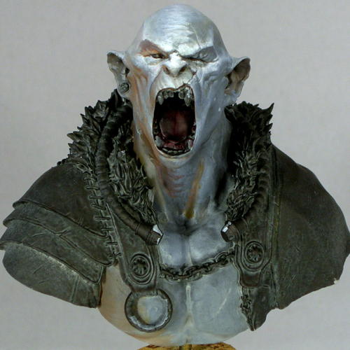
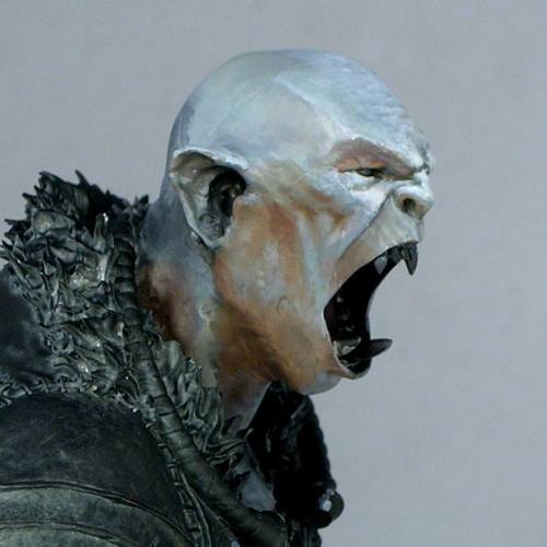
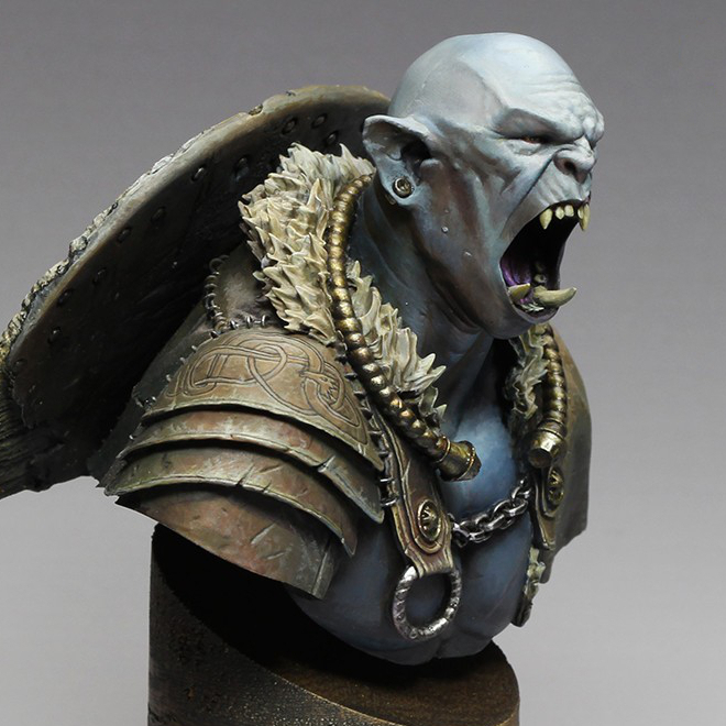
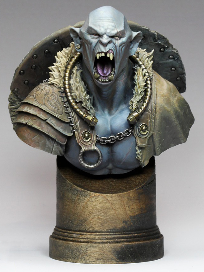
“The White Orc” was my main entry into the Crystal Brush competition this year, the one I spent by far the most time on.

Sometimes a miniature just goes right from the start, and this was one of those miniatures. I started the bust not long after taking a class with Alfonso Giraldes, and had a chance to watch him execute his style of sketching, and gradually turning the sketch into a finished painting. It was quite inspiring to watch, and I knew I wanted to have a go at it; this bust was the result.

I decided to paint the orc’s skin a light, neutral color that would be strongly influenced by his environment, and do a warm/cold ambiance. I really like complicated lighting situations, and study the way light is used in film in order to later recreate interesting situations with paint. Light neutral tones are perfect when you are playing with complicated lighting situations, since they will be most influenced by the light. I placed a strong white light almost directly overhead, with a warm ambiance from one side, and a cold ambiance on the other. The warm/cold contrast is extremely strong in the initial sketch. I eventually decided the contrast was too strong, and added more warmth to the cool side with some purple. The contrast is still quite apparent if you’re looking for it, but is now subtle enough that you might not notice it.

The shield was a lot of fun to paint, with all the battered wood texture. The freehand was one of the parts I struggled with a bit. I started out painting a bloody handprint, and it was just awful. I wasn’t the least bit happy with it, so started Googling alternative ideas for inspiration. Once I hit upon the idea of doing Celtic knot-work for the shield it all fell into place.

I like to get a lot of critiques on my miniatures, as other people often spot things I miss or have ideas I didn’t think of. One of the comments that kept coming up again and again in critiques was, the shield is too clean! So I kept dinging it up more and more. In the end, it ended up really with a really interesting weathered appearance.

It’s interesting to compare the initial face sketch with the finished product. I actually left a lot of the sketchiness in, especially in the cheeks. I tend to focus a lot more effort on areas that are meant to be focal points—the forehead, eyes, and mouth in this case—and leave things sketchier in areas which are less important. That may have been a mistake in retrospect, since I think it was one of the things the judges dinged me for, and may be part of why he finished just out of the medals. (My understanding is he finished 4th in his category.) I do plan to fix a few things that were bugging me in the photos (mostly where the neck meets the chest) and then enter him in another competition, so hopefully he’ll win some awards before too long. But in the end, I paint for me, not for the judges.

On a more positive note, he’s currently my top ranked model on CoolMiniOrNot, and even made the top 10 of the year as the score fluctuated between 9.5 and 9.6. That made me pretty happy.

The bust is by Hera Models, which has a fantastic little line of sci-fi and fantasy busts. They also make Abalam, which I painted last year. The miniature is now sold out; apparently it sold out in the last couple of weeks, after I presented my own version at Crystal Brush. I like to think I sold at least a few copies, wink.

Even though this bust is sold out, Hera’s “academic orc” bust is still available, and is a modified version of the same bust, without the armor. I can definitely recommend it, as the face is extremely well sculpted and a joy to paint.

Voting links, for those so inclined:
Abalám, revisited

When I posted Abalám on Putty & Paint, one of the comments I received was from Roman Lappat (of Massive Voodoo fame) who wrote,

Great piece. Love the light situation, even I think there are minor parts missing here and there, but this does not make the bust bad. If you want me to point out my thoughts about the light shot me an Emal 🙂

Let me just say I love this reaction. “I like this mini, but see some ways it could be better. I must tell the painter!” Constructive criticism is fantastic, and I’m thankful for all of it I can get, especially when it comes from as knowledgeable a source as Roman. As I wrote in Thoughts on painting competitions, constructive criticism is extremely valuable in improving your work.

When I emailed Roman, he sent me a very helpful diagram showing the areas he felt the light was missing or not strong enough.

Roman's critique

Armed with this sketch, my brush, and some red paint, I went back to my figure, and intensified.

abalam-before-after

Of course, the lighting is also rather different between the two photos. I’m terrible at miniature photography, sorry! I think the new pictures are somewhat closer to life, but this guy is really tricky to photograph.

abalam-revisit-5

I followed all but one of Roman’s suggestions, which was the back of the helmet. It’s just so recessed that I didn’t feel it would receive very much light, so the very strong light that Roman suggested would look out of place. Also, you have to be very careful painting lighting effects in heavily recessed areas of a miniature, because you are fighting against the shadows of the miniature itself. In the end, I did retouch the back of the helmet, but with a dull, dark red, instead of the strong effect that Roman suggested.

I did add light on the rivets, but it’s subtle, and hard to make out in these photos.

abalam-revisit-3

In addition to following Roman’s advice, I also intensified in some areas he didn’t highlight. I made the light on the neck much more dramatic, since it looked flat and poorly painted in the original. I added light on the lower-most armor plate, as that was one of the areas that lit up in my original study but where I had not added a glow effect. And I intensified the light on all of the ropes and the sash, and not only the parts Roman indicated.

Many people, when confronted with criticism, are resistant towards it, and try to find reasons to ignore it. I think this is a very good example of how one can benefit from not only being open to criticism, but trying to look further, and explore how you can use the insight in the criticism to improve upon things that the critique did not specifically identify.

abalam-revisit-4

Now that I’ve posted the back view, Roman’s probably going to point out all of the areas I’m missing here! I’m joking of course, but in truth, I think I can guess which areas he would point out.

I intentionally took a lot of shortcuts on the back, because a bust like this will normally be seen mostly from the front. Also, I have a policy never to retouch figures after they win awards!

abalam-revisit-2

I entered the bust into the KublaCon painting contest last weekend, and was fortunate enough to win Best in Show and one of the People’s Choice awards. This is my second KublaCon win in a row, as Tribe Chief Morrow won Best in Show last year. KublaCon is a Crystal Brush qualifier, which means that my award comes with round-trip airfare to Chicago for Crystal Brush. This will be my second time going, since I lived in Chicago for the first year of the competition, but moved away and missed the other years.

Word from the judges is that the decision between my entry and the second-place winner was very close. This just goes to show the importance of getting feedback on your work. Without Roman’s advice, I probably wouldn’t have won.

after

Thanks again, Roman!

Abalám

I finished painting this sweet little bust from Hera Models. I might still tweak a few things, so if you have any comments or critiques, please let me know in the comments!

abalam-3

The more I paint busts the more I find I enjoy them. They are large enough to give you lots of room to work and play with things like textures and freehand, but they still paint up very quickly, and you can focus on the fun bits like the face.


abalam-2

Abalám ended up quite close to my initial vision. There were only two minor changes that happened as I painted. Originally I planned to have an Oni Kanji on his breast plate. I tried painting it three times, once in red, once in black, and once in gold, and each time I decided I wasn’t really happy with it; eventually I ended up just painting over it and bringing back the beaten metal texture I had. The other change was the shirt, which was originally painted as brown leather, then became yellow, then green, before finally ending up as black cloth.

abalam-1

Unfortunately the large metallic areas make this guy difficult to photograph. This set of photos came from my third attempt. I’m still not entirely happy with them, but they’re a big improvement over the first two sets.

abalam-4

The lighting study I did before priming him didn’t end up being quite as helpful as I hoped, but I did make some use of it. I wanted the red glow to be much stronger than the one in the study (which was just reflected light from a red coffee mug, not an actual red light source). Still, it’s a useful trick and I recommend it for anyone who has difficulty painting lighting effects.

I’m really looking forward to my next bust!

© 2024 Light Miniatures

Theme by Anders NorenUp ↑