* * *
When Adriana approached the house and saw the door ajar, a spear of ice stabbed her heart. Silently chanting, “please, no, please, no,” she peered through the doorway. The disarray inside confirmed her worst fears. Turning on her heel, she rushed towards the church. Maybe there was still time to save her love. The blackened stake in front of the church burned that last hope to cinders, replacing the ice in her heart with fire.
Listlessly, not knowing her purpose, she sifted through the charred wood and ashes. When she found the bones she needed, she realized why she had been searching. There was a book she had read in her youthful researches: one filled with spells she had sworn she would never use. One spell in particular, blacker than the darkest night, required a human heart for its workings. Life could be restored, but only at deadly cost.
She knew just whose heart she would use…
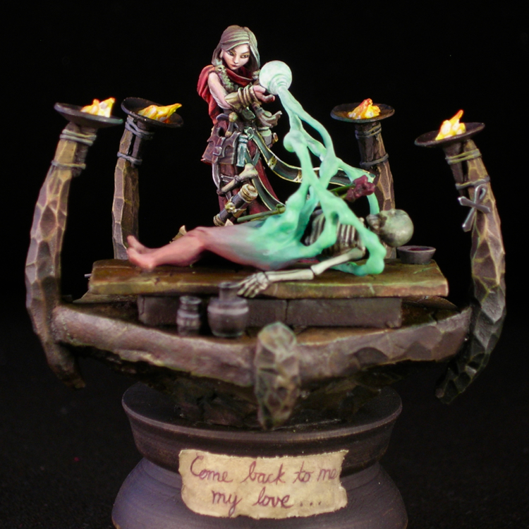
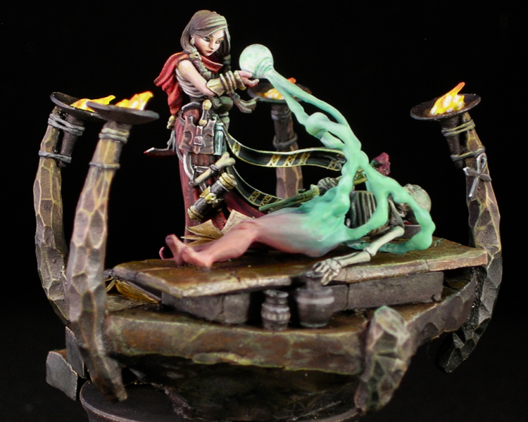
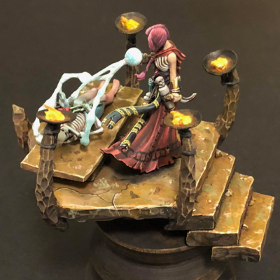
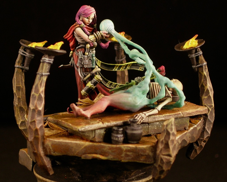
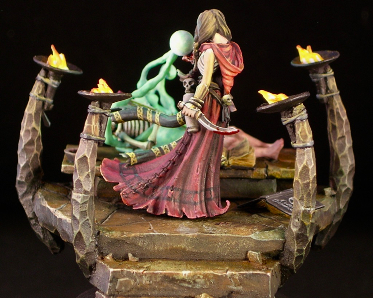
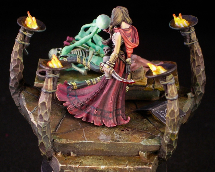
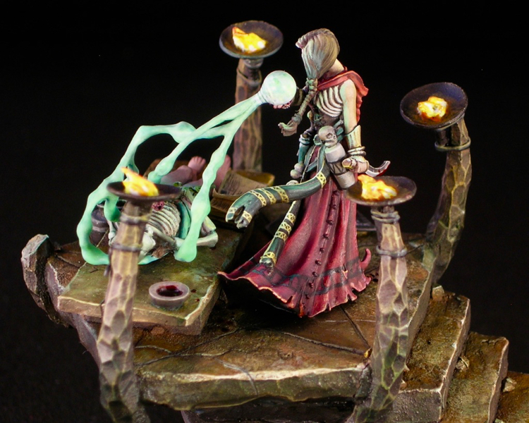
This was a really fun project. When I was thinking about ReaperCon projects this year, and settled on painting this lovely necromancer (03784: D’Vandra Lukesia by Bobby Jackson), I decided to do something a bit ambitious. D’Vandra comes equipped with a shovel, and something about a shovel-wielding necromancer just cries out to be raising the dead. I began mentally composing a graveyard scene, but in the end I decided that I just didn’t want to deal with all that dirt. So I swapped the shovel for a ritual blade, and replaced the graveyard with an unholy altar, upon which our heroine would resurrect her lost love.
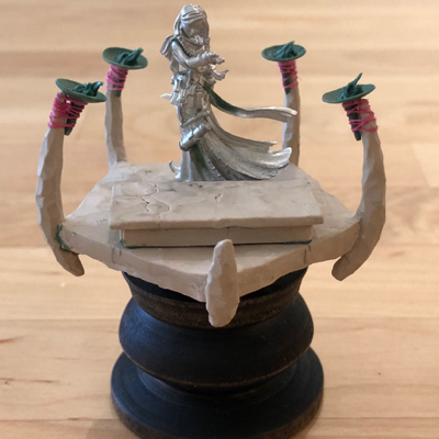
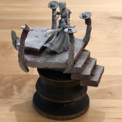
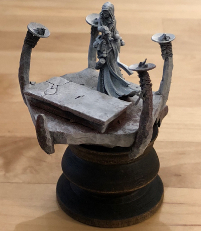
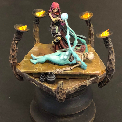
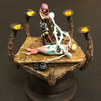
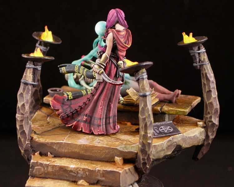
With the exception of the two figures and the urns, the scene is entirely scratch-built. The altar is composed of PC-Lumber two-part epoxy putty over a frame of cork tile. I like to use cork tile to test out shapes quickly and easily, and also save on putty. PC-Lumber is a great putty to use for terrain construction. It hardens very quickly, it cures rock hard, and it holds texture reasonably well. Its hardness makes it ideal for structural use, where a more flexible material like green stuff would bend slightly. It also means it holds crisp corners, which is useful for doing architectural details. For stone work, I like to alternate between adding material and subtractive sculpting, where I carve or break away material. I find that this process results in more natural shapes and textures. Because this particular putty cures hard enough to carve in about 45 minutes, I can do several cycles of this alternation in a day’s work.
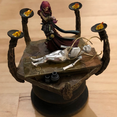
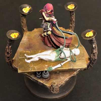
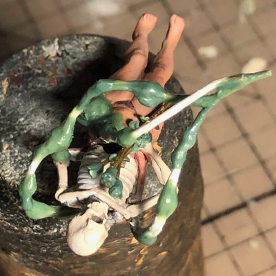
The torches themselves are green stuff, as you can see in the photo above. Originally, I tied them to the stone pillars with thread, which is what you see in the photo. However, the thread was noticeably fuzzy when primed, so in the end I had to replace it with green stuff ties.
I used zenithal priming for both necromancer and base, as I do for most of my figures. With the base, I did an intermediate step with a red oxide primer, after the black and before the white. I deliberately made the red oxide primer fuzzy and lumpy, by holding the nozzle of the paint can only part-way down. This makes the paint spray in larger droplets, creating a texture over the surface. This texture would be a disaster when priming a figure, but actually works quite well for rock and corroded metal. It was a bit of a problem for the flames however, and I ended up needing to use gloss varnish to smooth out the texture on the flames before painting them. Were I to do this over again, I would cover the flames with little blobs of blue tac when priming, in order to avoid that problem.
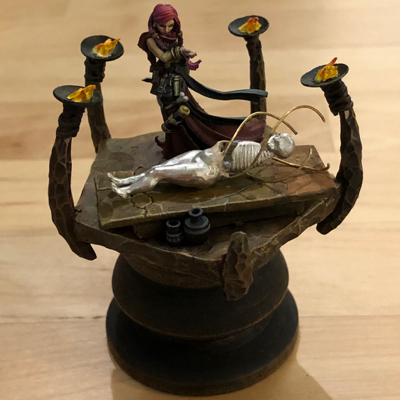
I started painting with just the basic structure in place, and added more details as I went, such as the resurrected body, urns, and books. Partly that was because things were easier to paint separately, but mostly it was because I didn’t have the parts I needed for the corpse when I started working on the project, and I didn’t get the idea for the books until half-way through painting.
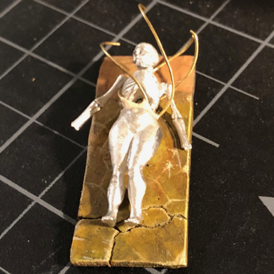
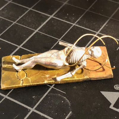
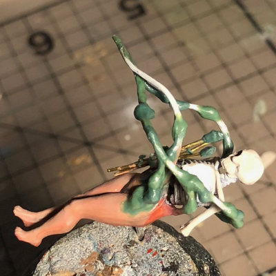
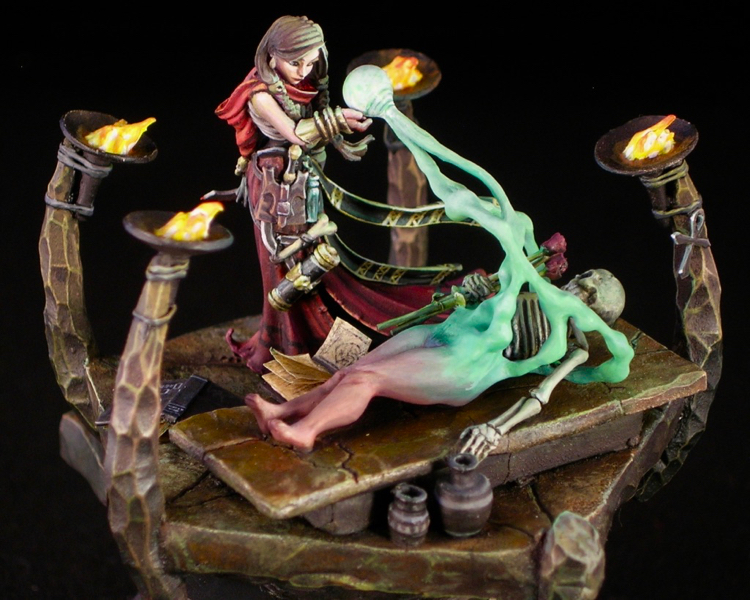
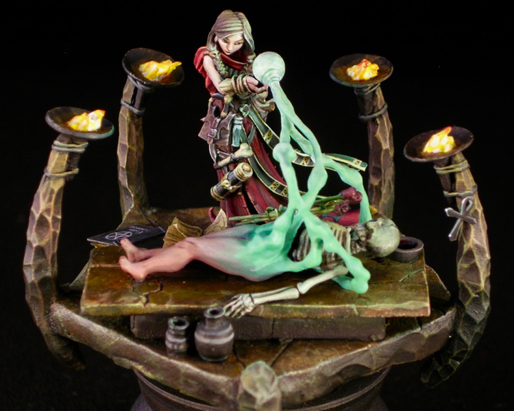
The corpse is converted from 03639: Bella, Succubus by Patrick Keith, and Secret Weapon’s skeleton kit. The spell effect I used to merge the two, showing flesh forming over bone out of ectoplasm, is made from putty over a brass wire armature.
After anchoring the wire to the corpse, I ended up playing with it quite a bit in order to find a design I was happy with. Originally it was spiraling out from left to right, but I decided I wanted more interaction between the corpse and the necromancer. Then it went through a phase where it it was coming in from her general direction in thin wisps.
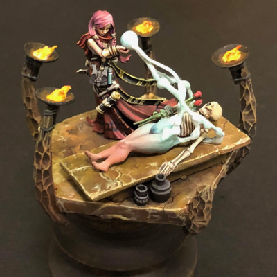
One problem I had to solve was how to ensure the viewer interpreted the spell being cast as resurrection, and not disintegrate. I combined several ideas in order to make this as unambiguous as possible. The first idea was to have the body forming from left-to-right in the main view, since English readers are used to things starting on the left. The second idea was using a cloudy spell effect, which I thought would look more like matter being formed from vapor, rather than being blasted into dust. I was also happier with the spell effect once I added a bit more structure to it, making it look like clouds rather than wires. The third idea (suggested by Chris Suhre) was to make the flesh parts quite red and lively looking. And the fourth was to put roses in the corpse’s hand, which fits well with the theme and should dispel any notion of violence.
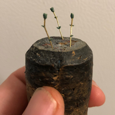
Making the roses was actually surprisingly easy. I just bent some brass wire (since stems are never perfectly straight) and sculpted the leaves and petals with color shapers.
In addition to sculpting the spell effect, I also had to sculpt the corpses hands and collar-bones, since those are not part of the Secret Weapon kit.
It was a bit of a disappointment to go from a miniature were all surfaces were decently far along to one with bare metal and green stuff, so it was a huge relief when I had everything covered in paint again.
The colors changed many times as I was feeling my way towards a composition I was happy with. Sometimes you just have to try stuff out and see how it looks to see what you’re happy with, as visualizing miniatures in your mind’s eye can only go so far. Even though I was fairly happy at this point, significant changes were still in store, including completely redoing the top surfaces of the rock, changing the color of the spell effect, and adding the books.
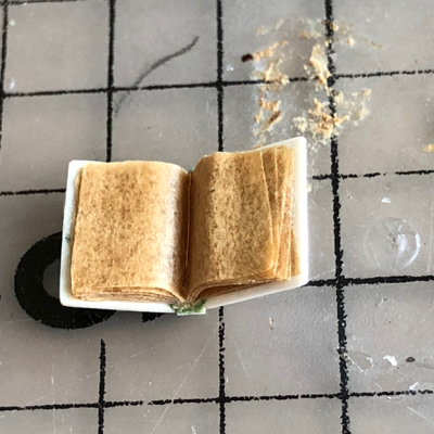
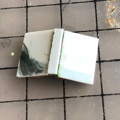
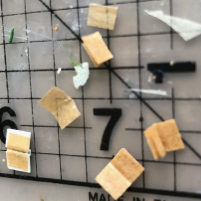
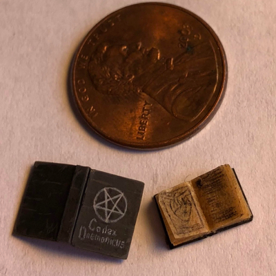
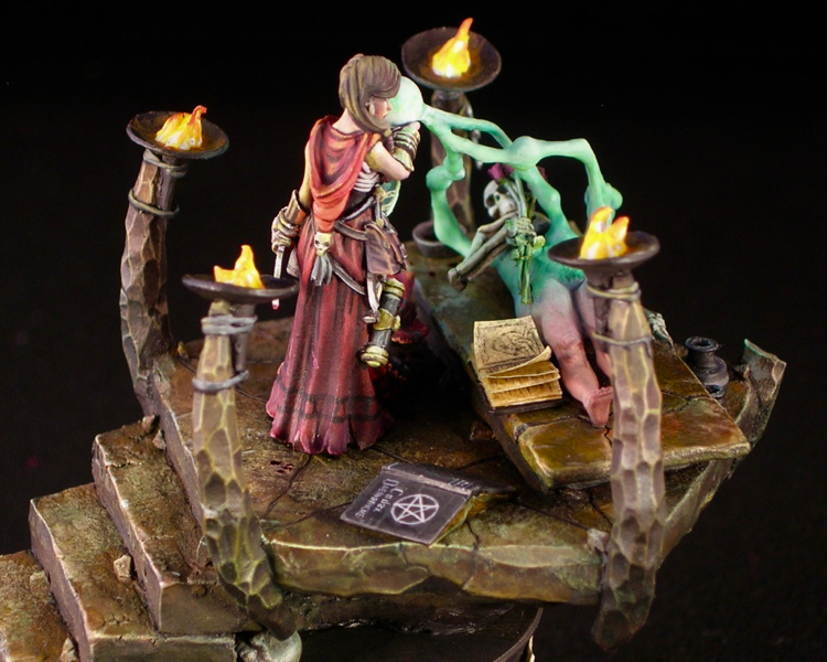
Both books are scratchbuilt, using thin plastic card and a hint of putty for the covers, and parchment paper for the pages. Parchment paper, in addition to being smoother than normal paper, is more durable, and slightly translucent. I was lucky enough to have some brown parchment lying around which was a perfect color for old, worn pages.
Lots of careful tweezer work during construction! Getting all of the pages the same size and lined up was a bit of a pain, but worth it.
Of course painting these was extremely fiddly as well. This is damn close to the maximum resolution I can wield a brush at.
With the addition of the books and some final work to bring everything together, I was ready to call her finished. But I’m also a big believer in critiques, so I circulated photos to a number of my mini painter friends in order to get their takes, before calling things finished.
The resounding comment from everyone I showed photos to was that they wanted some OSL. Even though there were four torches and a spell effect that could be casting light, I had depicted the scene as if the ambient light was bright enough to overpower the object sources. Ben Kantor’s critique, in particular, was extremely helpful. He used photoshop to suggest a darker, grittier ambience, with much more of the light coming from the sources in the scene. I debated back and forth whether I should follow this advice, but in the end I decided to go for it.
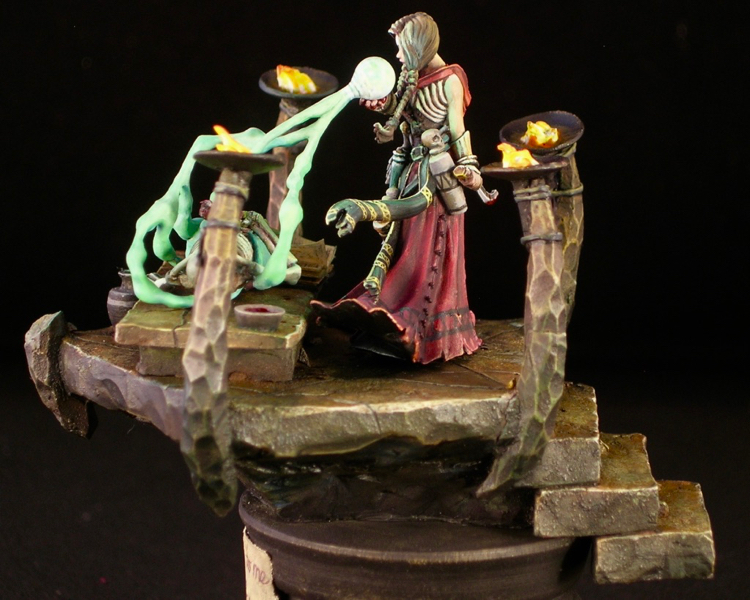
In order to make the OSL work, I needed to make the stone work much darker, with a bit of a greenish hue from the spell effect. This actually was not hard to accomplish: I grabbed a large brush, mixed some Reaper green liner with black pigment, and put a thin glaze over almost all of the stone. I avoided covering the upper parts of the columns with the torches, as I imagined they would receive some orange light from the torch glow to cancel out the green. I also used nightshade purple instead of green liner in the glaze in the places where the green light from the spell effect wouldn’t reach.
I also added a label to the base. This has two purposes: it clearly indicates what side is the front, and it informs the viewer of the title of the piece, which adds to the story. On the occasions when I include a title plaque, I try to tie it in with the piece somehow. In this case, I painted it as if it were a handwritten note from the necromancer to her beloved.
I tried to squeeze in a lot of storytelling elements, which rewards the attentive viewer.
I kept the OSL itself relatively subtle, in order to keep the focus on other elements. I made it most noticeable on the hair. It makes sense to do that because hair is shiny and tends to reflect light, and it’s an effective thing to do because it makes the head more of a focus.
I received many nice compliments for this piece at ReaperCon, and was lucky enough to end up with runner-up for Reaper Best of Show, and gold Sophie for best Reaper Diorama. I was hoping to improve upon the bronze Sophies I received in the last two years, so I was super excited to end up with not only a gold Sophie, but actually snagged one of the best-of-show awards, finishing after the legendary Doug Cohen. You can see all the entries and awards here.
Number of blood sacrifices involved in constructing Come back to me, my love…: One. Of course I sliced my thumb open at one point, since that’s pretty much inevitable for any serious miniature project. I think it was while I was building the base. And of course I made sure to spill some on the model. For luck, and/or to appease the dread god Osiris. Shockingly, no blood sacrifices were needed to construct either Codex Daemonicus or Codex Necronomicon (the two books).

Recent Comments