Never be afraid to paint outside the lines

Category: Workbench (Page 1 of 2)

Works in progress

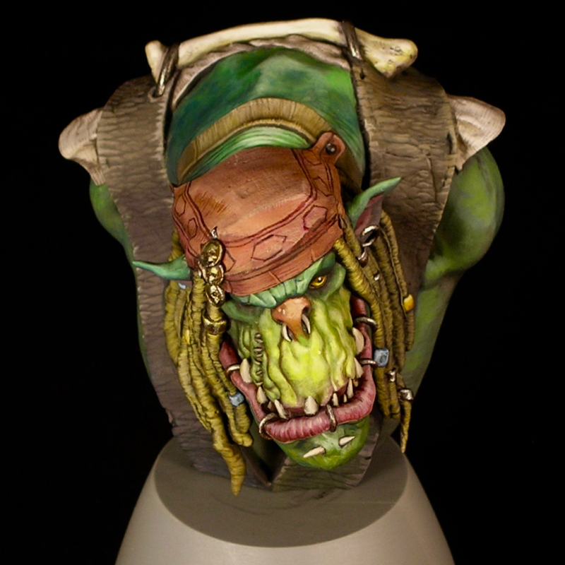
From the Workbench: J’ork Sparrow, part 2

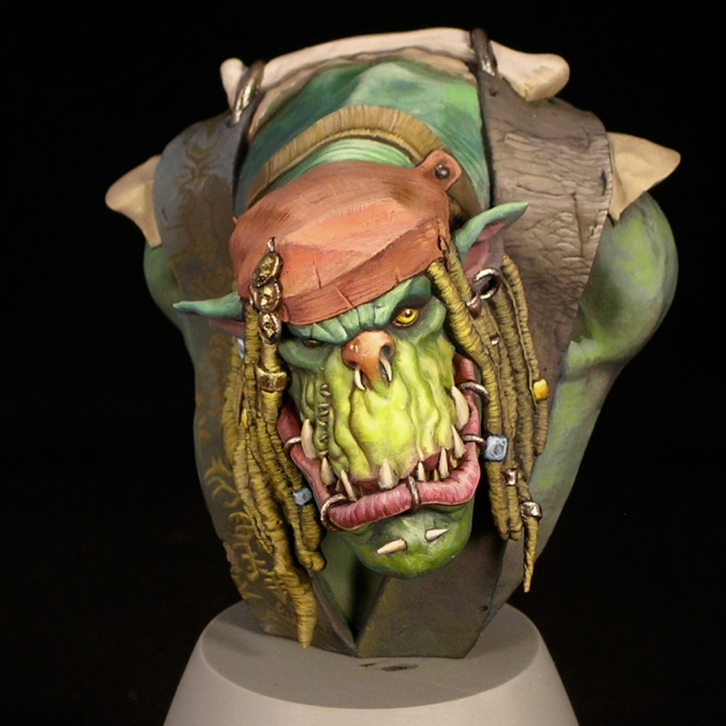
I started J’ork Sparrow in November, and so far I’m quite happy with his progress.

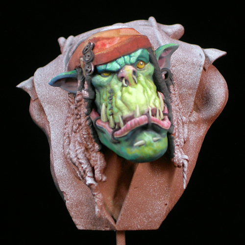
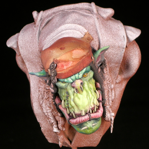
In the November post, all I’d painted was his face and started blocking in the color of the bandanna. The next step was blocking in the remaining colors, so that at least no primer was visible. That way you can see the overall composition which helps keep things consistent as you refine the individual areas.

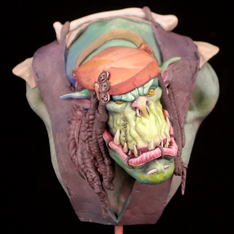
As with many of my recent works, J’ork is heavy on the textures. Because busts are a relatively much larger scale than other minis, you can depict surfaces with a much greater amount of detail, so it’s really important to depict the textures of the various materials as well as their shapes and colors. You can see the neck wrinkles, the weave if the fabric in the cap. I’ve even tried to replicate the texture of sun-bleached dreadlocks (which is not easy, I can tell you!)

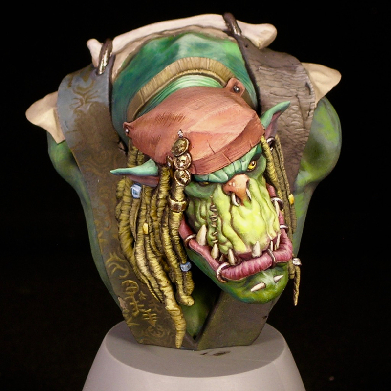
I wasn’t quite sure how I wanted to do the vest, so I tried out two ideas, one on either side. One option was a slightly tattered fabric with gold embroidery on blue, similar to Jack Sparrow’s vest in the movie. The other was a more orkish vest, weathered and textured black leather. In the end I decided to go with the leather texture, and keep my freehand limited to J’ork’s cap.

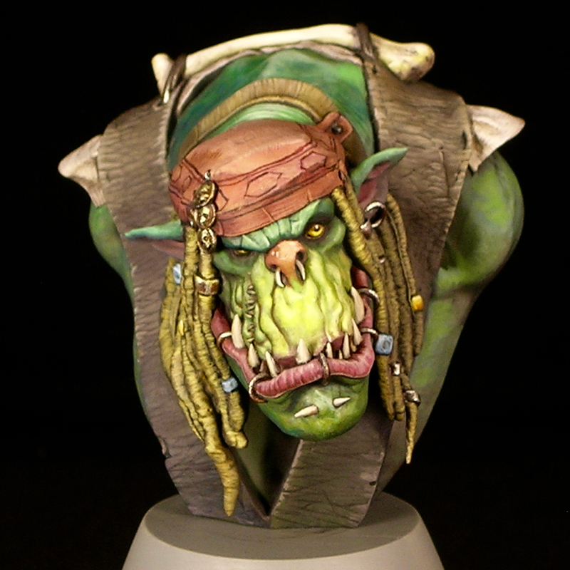
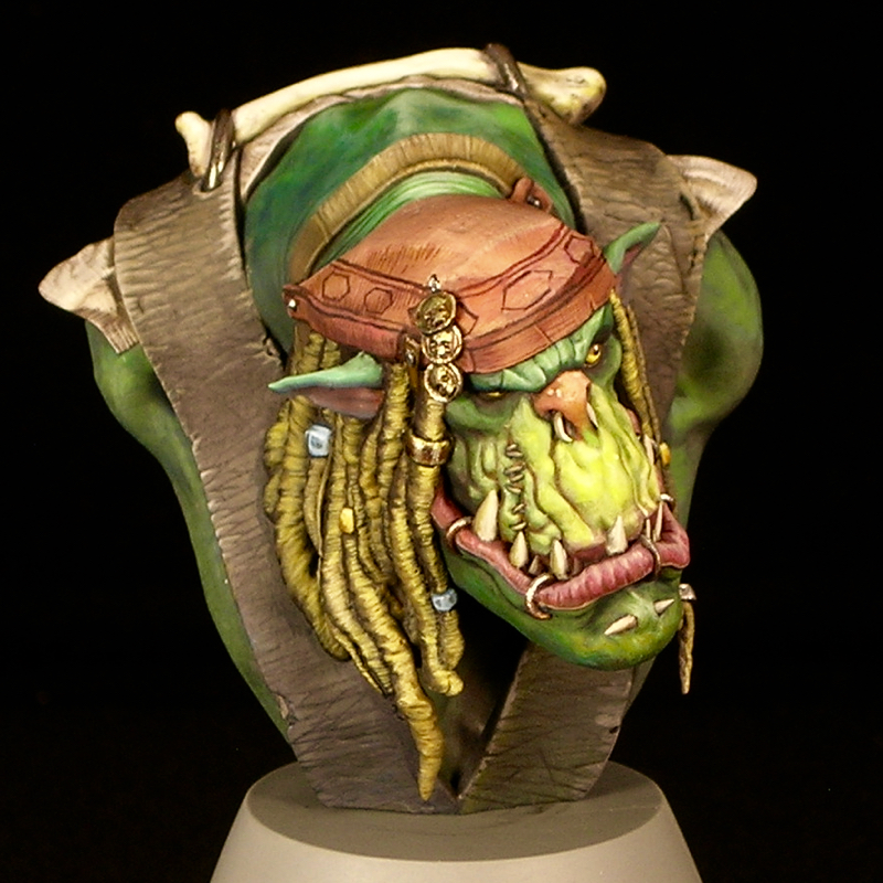
Even more textures! In addition to settling on black leather for the vest and starting the freehand printed pattern on the cap, I’ve also done some subtle texturing on the bone and the white fabric, which helps differentiate them. It’s pretty subtle, but subtle details like that can add a lot of realism.

At this point all of the surfaces are done to an acceptable level of detail, and the bust is approaching where I could call it finished. However, I have one large step remaining, which is that I really want to equip him with a musket, in a holster attached to his vest. So there’s some sculpting to be done, as well, obviously, as more painting.

Other than that, the main remaining work is simply refining the details I have already established, making them crisper and easier to read, and fixing any mistakes until I’m 100% happy.

From the Workbench: J’ork Sparrow

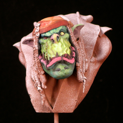
I started this fellow last night, and so far he’s coming along swimmingly. Here’s the face after one evening’s work (couple hours).

After getting the basic color composition down, I started refining. After a few more hours refining the face this morning, I’d say it’s about 80% done.

I don’t always finish entire areas like this before moving on. In fact I often like to put a bit of paint everywhere before finishing any areas, to test the overall composition. But in this case, all of the main colors are in the face, since the vest will be black and the other elements will be white, gray, or his skin color, so there’s no harm in it. Next I plan to block in all the other areas, then start in on the cap.

If you don’t know it, the bust is Papa Jambo, by Big Child Creatives. Quick tip: they have a good deal on a pair of busts from their pirate bust set—Papa Jambo, Sharki, and Capt. Albrecht—if you buy direct from them (though the shipping can be a bit pricy depending on where you live).

The Psychic’s Dream

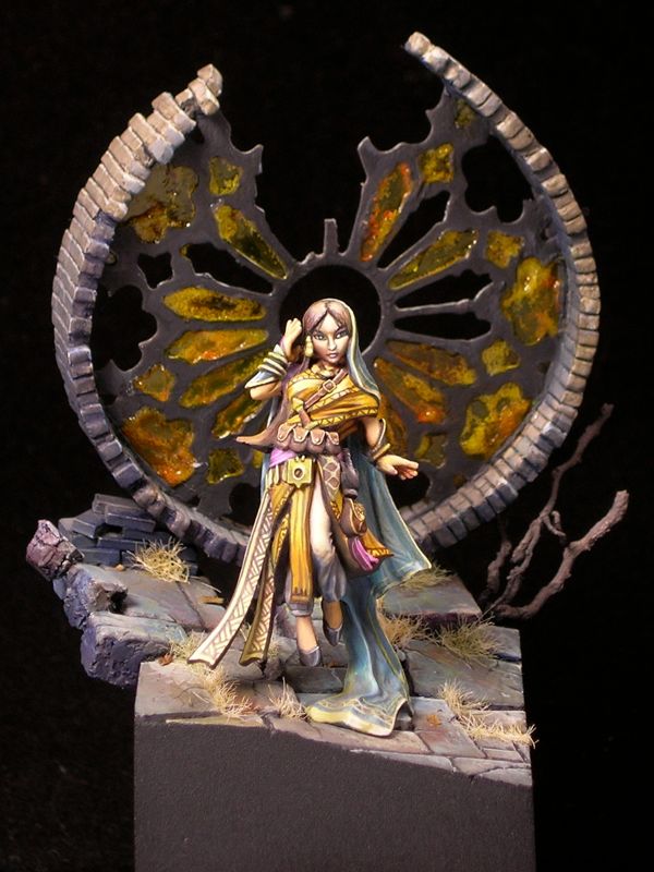
After I went for the first time last year, Reapercon immediately became my favorite convention to attend. It has a 100% miniatures focus, everyone is very friendly, and it is small enough that you can actually get to know a decent number of the attendees. Reaper is very welcoming of other manufacturers at their convention. Their painting contest is open to entries from any manufacturer and genre, and they have a number of awards for miniatures by other manufacturers, such as Dark Sword, Bombshell, and Scale 75. Nevertheless, I like to paint something by Reaper for the convention, partly to show my support, but mostly because they make some nice minis! Also, it makes you eligible to win Reaper Sophie trophies, which are pretty awesome. I chose to use Rivani, Iconic Psychic, sculpted by Bobby Jackson, for my entry this year.
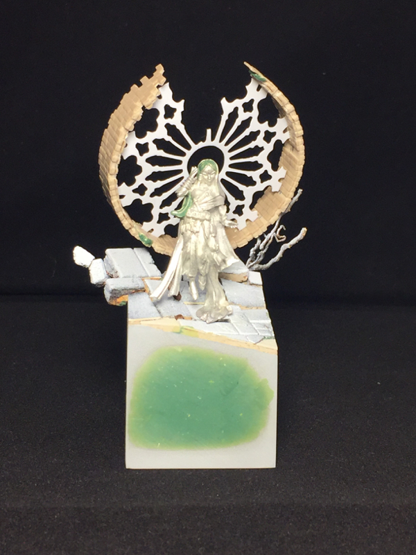
I like to start all of my miniatures by building the base, before I do any painting and often before I even start planning the painting. This allows me to do a lot of test fitting without handling a painted miniature (always a bad idea for competition pieces), and allows me to plan the lighting in the scene with both the miniature and base in mind, which is important.
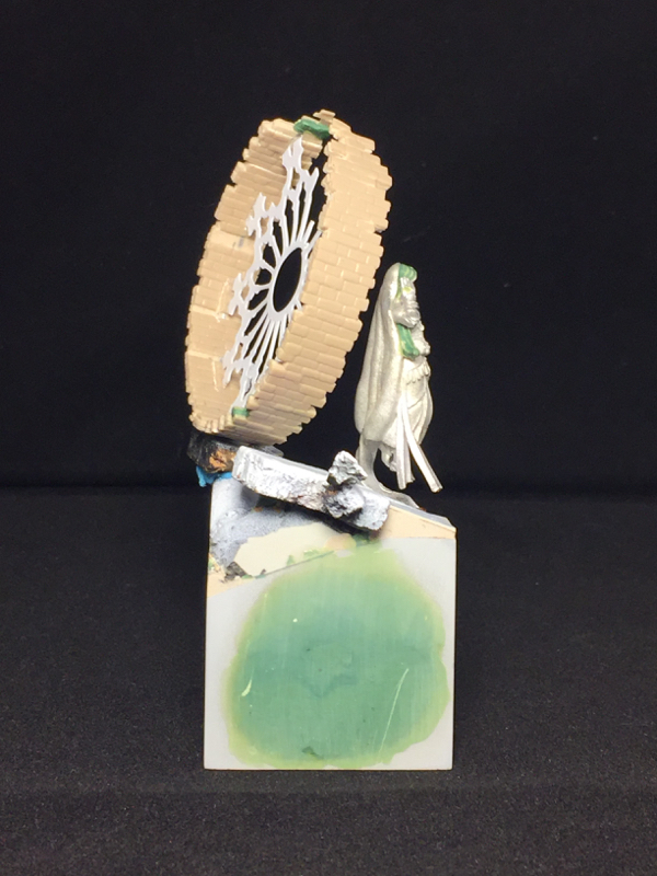
For me, bases are roughly equal parts composition and storytelling. I always start by thinking about what sort of story I want to tell. For Psychic, because the psychic herself is floating, I decided to emphasize that by building a base which feels like it is just hanging there, oblivious to the laws of physics. I built a ruined church, but consciously did it in a way that a real ruin could never happen. Large parts of the structure are missing, and yet the remaining parts somehow stick around exactly where they started even though they lack support.
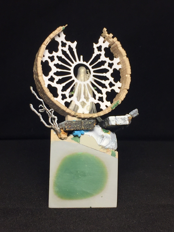
Once I have my concept in mind, I start thinking about how to best convey that concept in miniature. This usually involves building components I think will be useful for that concept, and then testing out compositions with those components until I have something where the composition works, and the scene is sufficiently detailed and confined.
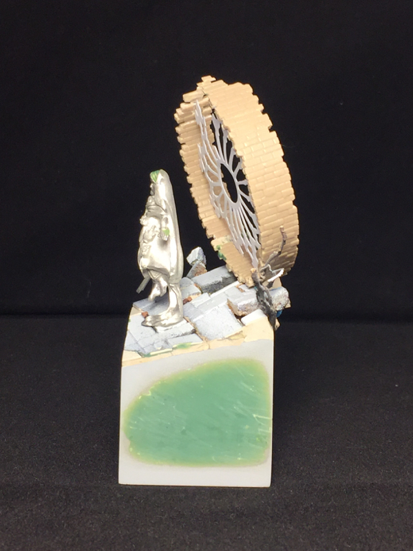
The base is basically scratch built, using juweela bricks, textured plastic card (stonework and bricks), cork tile, putty, roots, and a couple of paperclips to provide armatures for more fragile components, atop a Secret Weapon resin cube. I did use two off-the-shelf components: the stained glass support structure (the cames), and one of Scibor’s resin cast stone faces. The stained glass cames is a plasticard cutout from a prototype product line that a friend of mine, Seth Amsden, is working on, to be called “Sensei’s Scenics.” It will be available before the holidays, and you can find out more by following Seth on Instagram.
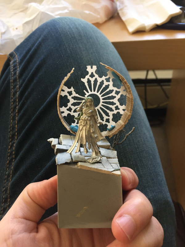
This picture, with my jeans in the background and lots of blue tac, shows the test fit where I finalized the basic composition of the piece.  I think I nailed the front view, with the figure nicely framed by the elements behind her, while leaving enough unusual angles and gaps to keep things interesting from other views.
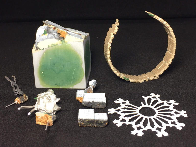
In order to get the sides perfectly smooth, I built the central part of the base and the protruding elements as separate pieces, with lots of test fitting. That way I could sand all of the walls of the central part until they were nice and flat. This sometimes involves a couple of rounds of sanding, priming, and sanding more, since priming will reveal flaws that you didn’t know were there.
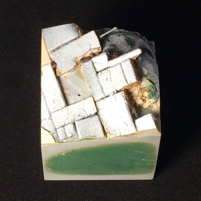
Once you have those nice flush sides, it’s best to get a nice thick coat of black primer and then a clear coat, with no brush-applied paint. This keeps things nice and smooth, and also primer & clear coat will stand up to handling better than brushed-on paint. The downside is you need to be careful not to mar the surface, as you will never be able to replicate that finish once the piece is completely assembled and painted.
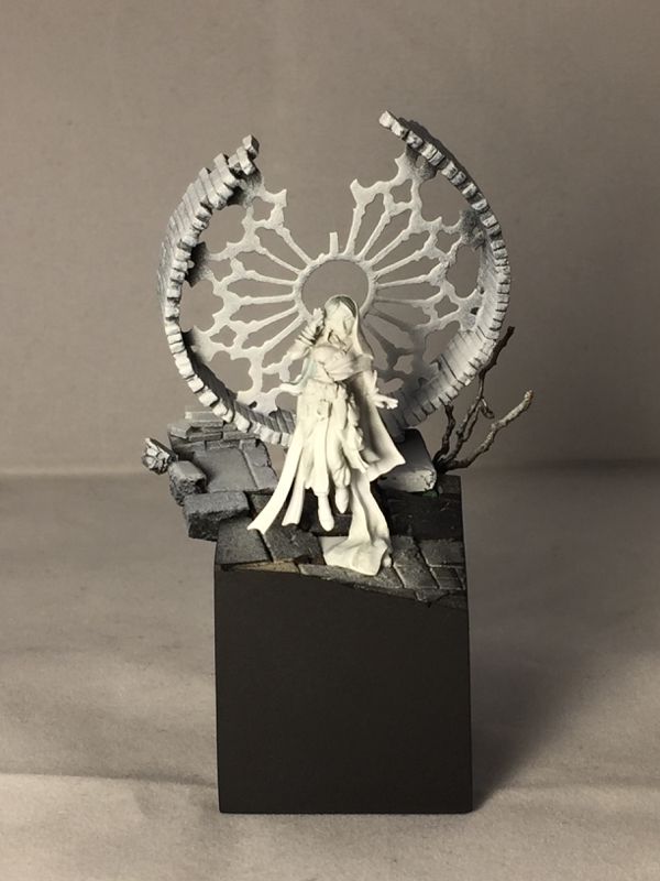
I chose to prime the psychic herself white, in order to get nice bright colors, while pre-shading the base with two-tone priming. This helps the psychic herself pop from a distance, and stand out from the base. I kept the psychic as a separate piece for painting, to allow easy access to all angles, and mounted her on one of the stone blocks from the base so I could easily mate the two parts when finished.
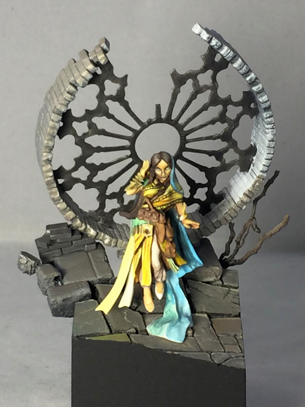
The painting itself was very quick, so unfortunately I only have three work-in-progress photos. Some painters like to keep the miniature very clean from start to finish, starting with very uniform base coats and building from there in a very controlled fashion. This is not my approach at all. I like to create contrast and overall impact quickly, which leaves lots of signs of my process, such as visible brushstrokes and “tide marks” from washes. Both types of process have their own pros and cons, but for me a more chaotic process is simply more fun, and that wins.
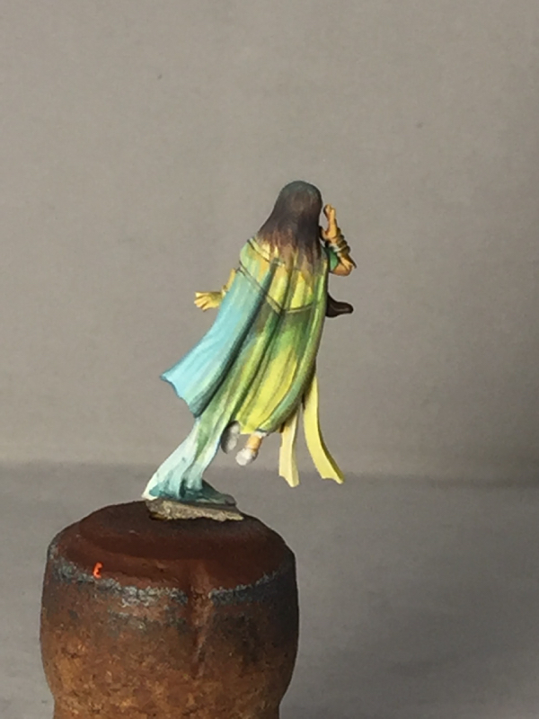
I initially planned a strong translucency effect for the psychic’s veil, so this early sketch from the back mainly depicts the psychic’s clothing under the veil, rather than the veil itself. As painting progressed, the veil ended up being much less translucent than my initial vision, although you can still definitely see through it in places.
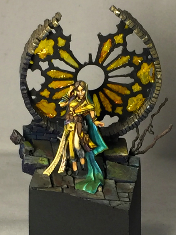
One of the great things about Bobby’s sculpt is the number of smooth, relatively flat areas he left for freehand. Miniatures that leave some flat surfaces give the painter more flexibility than miniatures which are extremely detailed everywhere. I tend to prefer more geometrical freehands, so that’s mostly what I did. I also freehanded-in some folds in the fabric where I thought the sculpt was a bit too smooth.
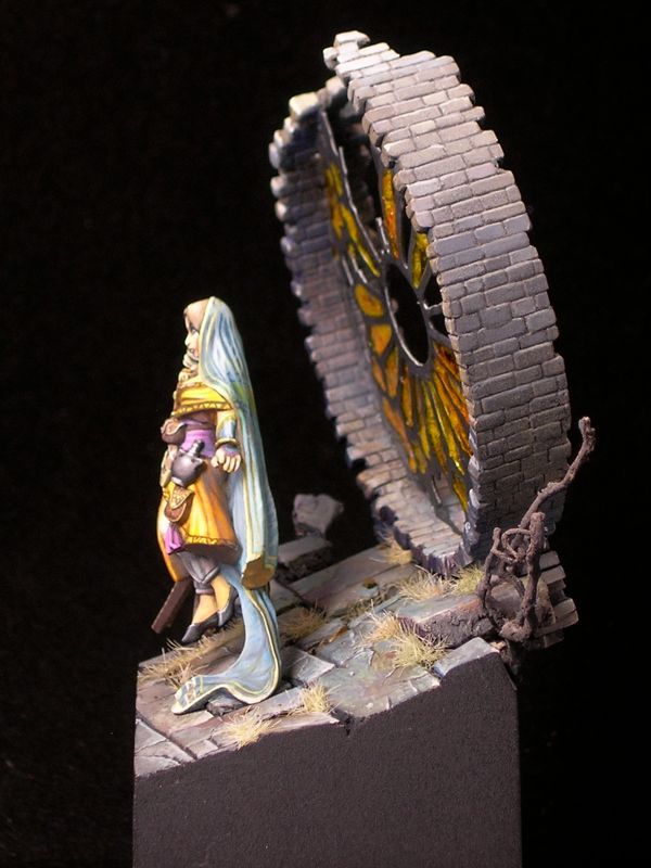
The stained glass itself is made out of Uhu, the german glue brand that some folks like to use for blood and goo effects. It is clear and sufficiently durable to hold its shape when covering windows like this. When used to create flat sheets, like I’ve done here, it picks up lots of bubbles and has extremely variable thickness. For some applications this would be a problem, but I think it works wonderfully for this sort of medieval glass window where the quality of the glassmaking would be somewhat primitive.
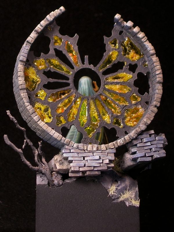
I colored the glass by waiting for the Uhu to dry, and then painting over it with a mixture of Tamiya clear yellow and Daler Rowney orange ink. By varying the mixture between orange ink and clear yellow, and the thickness of the paint over the Uhu, I was able to vary the color a bit, adding to the non-uniform appearance of the glass. Rather than worrying about painting inside the lines for this, I simply covered everything using a brush that was big and cheap (that tamiya stuff is bad for your brushes). I then went back with an off-black and carefully repainted the cames.
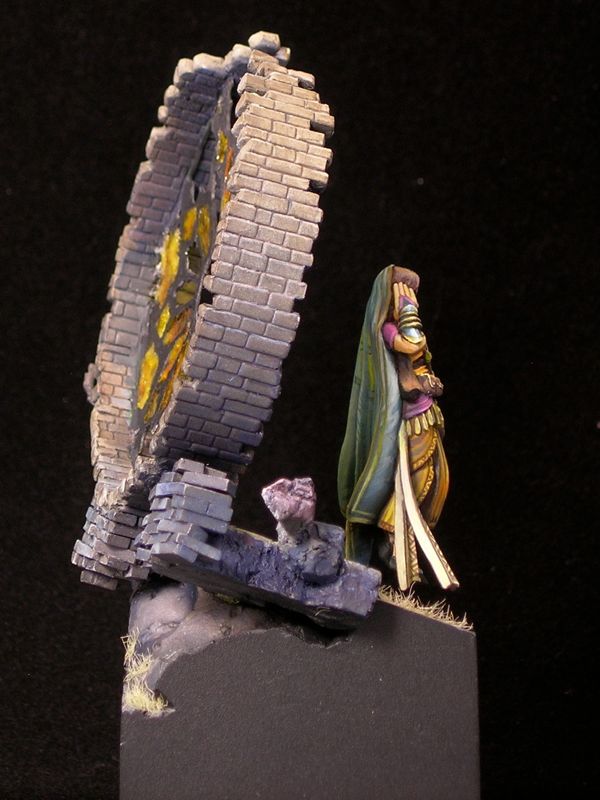
Psychic’s Dream won a gold medal in the open judging at Reapercon, and placed third overall in the Reaper painter’s competition.

Value Sketch: Steamthing

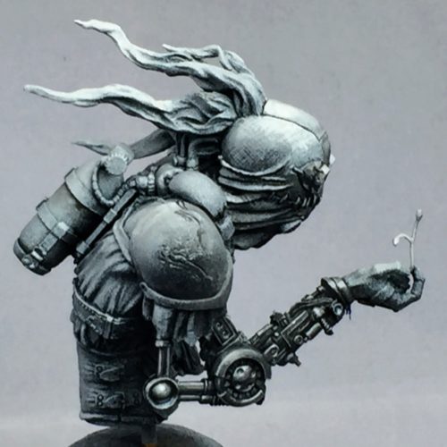
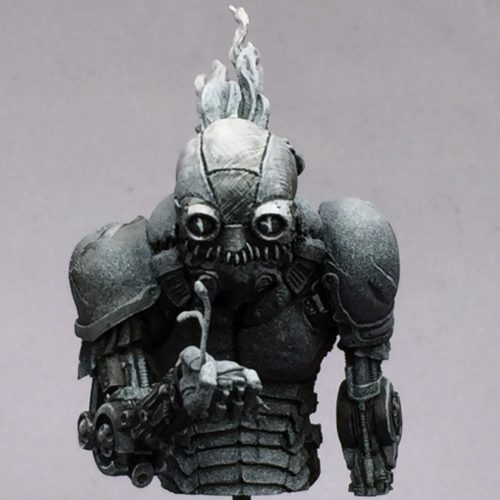
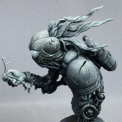
A couple of months ago I took a class with Matt DiPietro of Contrast Miniatures (formerly of Privateer Press) on the use of value sketches in miniature painting, as a first step to establish contrasts before adding color. While the class mostly focused on tabletop-quality miniatures, and I painted a board game figure in the class as practice, I also started working on Patrick Masson’s “Steamthing” bust, as a bit of an experiment to see how this style would work for me in display quality.

Here is the finished value sketch. In the sketch, I focused mostly on the mechanical arms and the head, letting the “zenithal priming” create most of the sketch in the other areas. I’m not sure how well the textures will translate with color over the top; I may need to re-create them at the step where I add color.

One of the things that made me first fall in love with this sculpt is how expressive the face is, despite being just a burlap bag with some stitching and goggles. Patrick, and his brother Thierry who did the concept, managed to instill a lot of emotion in this little robot-thing.

When I first saw it on CoolMiniOrNot (way back in 2009, when it was posted), I knew I wanted one, and was very disappointed when the sculptor said in the comments it would not be cast. It seems a lot of people were interested though, and convinced him to rework some things (like the bottle attachment in back) in order to enable casting. When I rediscovered Steamthing in Patrick’s Putty & Paint gallery and learned casts were available, I immediately asked for one. If you want your own, you should contact Patrick.

I’m excited to start adding color!

From the workbench: St. Mark on Dragon, part 3

I reached an important milestone since part 2. There’s no more primer showing! There’s still lots of work to be done, but all of the main elements are now in place, so you can see how it all looks together.

st_mark_dragon_3rd_wip_1

I can’t decide which side is the front of this mini. I’m not sure if that’s a good or a bad thing, but I think it’s good. There’s a lot of energy moving in several different directions, which I think is one of the things that drew me to the mini originally.

st_mark_dragon_3rd_wip_6

The most obvious change since the last post is the rider of course. Originally, I painted his cloak and pants pink rather than orange. The color worked okay in the color scheme, I think, but I couldn’t get over my societal hangups about pink.

st_mark_dragon_3rd_wip_5

Fortunately a thin glaze with yellow ink was enough to change the color completely without destroying all of the highlighting and shading, and my careful texturing work.

st_mark_dragon_3rd_wip_4

The other main change is the addition of pigments to the base. I don’t think it photographs as well now, but it looks way better in person and that’s the main thing. Pigments create a wonderful dusty effect which makes the base look much more realistic as dirt and stone.

st_mark_dragon_3rd_wip_3

The pigments I used are mostly from the Secret Weapon “wet earth” set, which is somewhat ironic since I created a dry dusty effect using the pigments. Just goes to show you never to take names too seriously, since at the end of the day they are just colors. I used terracotta as the main color for the lit areas and violet (which is an awesome color!) in the shadows, with a few spots of red brick to provide variety.

st_mark_dragon_3rd_wip_2

I screwed up when I added the pigments, since I added the pigments first, then sprayed the whole mini with dullcoat (which it needed to kill the shine from the inks I used). Unfortunately the dullcoat ruined the lovely dusty effect. I added another layer of pigment, but that pretty much obliterated the highlighting and shading I had done before. So I had to re-paint the highlights and shadows over the pigment, and then add pigments a final time. Oy.

At least thick paint is not much of an issue for the rocks and dirt. But next time it’s definitely dullcoat first, then pigments, rather than the other way around.

From the workbench: St. Mark on Dragon, part 2

st_mark_dragon_2nd_wip_1

There’s been a lot of progress since part 1. The dragon body is nearly finished, and I’ve built out the base a bit.

st_mark_dragon_2nd_wip_3

I haven’t really put any paint on the rider yet, but I converted his arm holding a pistol into binoculars, which involved a fair amount of resculpting.

st_mark_dragon_2nd_wip_4

The round resin plinth he’s sitting on is only temporary, for holding him while I paint. I’m planning on putting him on a larger wood plinth eventually.

st_mark_dragon_2nd_wip_5

I’m not sure about the highlighting I did on the back leg in this shot. It doesn’t really make sense from a physics standpoint, but it also provides a sense of energy and motion which I like (and which was inspired by something Alfonso “Banshee” Giraldes said in a class I took from him). I’m going to leave it for now, and see how I feel about it when the rest of the mini is closer to finished.

st_mark_dragon_2nd_wip_2

On to the rider! I’m off to Google some fabric reference for his clothing, since I still haven’t figured out what I’m going to do with it. I’m thinking about doing something inspired from West Asian or South Asian fabric patterns. I visited the Victoria and Albert Museum in London a couple of weeks ago while traveling for work, and there was a show on the Fabrics of India which got me thinking along those lines.

From the workbench: St. Mark on Dragon, part 1

I saw this Dark Age figure at Gen Con, and just had to have it.

st_mark_dragon_1

It’s a lovely resin figure, which makes me very happy. Unfortunately the pieces don’t fit together quite as nicely as some of the resin figures I’ve had the pleasure of working with, so I had to do a bit of green-stuff work to hide the joins.

st_mark_dragon_2

The blue metals on the one side are close to finished, but everything else is (obviously) still very WIP. I’m really happy with how the metals are coming out. I’ve been shading my blues with red a lot lately. It’s only barely visible in these photos, but in real life I think it adds a lot of energy to them. I usually start by adding black to the mix to desaturate the blues, which aids the transition, and then add red or glaze with pure red in the deepest shadows. The result is clearly blue shaded with red this way, rather than looking purple.

According to traditional color theory, blue and orange are complements, as are red and green, but according to more modern color theory, cyan and red are complements. Since my blue hue is close to cyan, and I’m countering it with a primary red, this color scheme is more in line with modern than traditional color theory. Maybe.

From the workbench: Negative Space

My final Gen Con project nears completion!

negative_space

I’m calling it “Negative Space” because, in addition to the obvious art reference,  it sounds like some kind of spatial anomaly – very appropriate for a sci-fi scene. The figures are 90% finished; the base still needs to be painted. The main base components are from a laptop optical drive and heat sink mounted on a secret weapon resin block (they make really nice handles for display bases), with your basic plasticard/wire/putty and a Micro Art Studio terminal.


Also, I wanted to apologize for being so quiet of late. I’ve been hard at work getting ready for Gen Con, but I’m holding off on posting my finished entries as I didn’t want to give up the element of surprise. Also, it’s always more fun to wow people in person. Sorry I’m such a tease. I promise to post lots of picture afterwards. You can probably guess what I’m entering: it’s basically everything from the workbench minus what I’ve already shown finished.

This will be my last post before Gen Con. I’m super excited, and I hope to see some of my blog readers either in the competition, in my classes, or just around the convention! I’ll also be doing some demos and volunteering a bit around the MHE area, so please come by and say “hi” if you’re there!

From the workbench: Tribe Chief Morrow, part 2

I’ve been having a ton of fun painting Tribe Chief Morrow. He paints up super quickly, so I only had time for a few sets of photos before he was finished. When I left off in part 1, I had just finished the skin and leathers. Next I tackled the metals.

Tribe Chief Morrow - tackling the metals

Tribe Chief Morrow - metals (left)

Tribe Chief Morrow - metals (right)

Tribe Chief Morrow - metals (back)

A lot of the takes on this miniature have extremely corroded metalwork, but for mine I wanted it nice and clean, to really show the beaten metalwork texture. I’m really happy with how it came out.

Tribe Chief Morrow - final WIP

At this point he’s pretty much finished. I want to clean up the hair around the breastplate a bit, and I need to obtain a base. Luckily on the second count I have a friend who makes marvelous wooden miniature bases, so I’m looking forward to what he comes up with. I’m still thinking about tweaking some things, so if you have any suggestions, please leave them in the comments!

« Older posts

© 2024 Light Miniatures

Theme by Anders NorenUp ↑