Never be afraid to paint outside the lines

Category: Meditations

Philosophy, musings, and other ephemera

Update 2020

Wow, it’s been almost a year since I updated the blog! I’m really sorry about that, but between moving and my social life for the last year, I haven’t had as much time to blog as I would like. At least it’s been for good reasons. But since I’m #socialdistancing and staying home this weekend, it seemed like a good time for an update.

I haven’t been completely unproductive. I have been working hard on a two-part article on a mermaid piece I finished last year, which won best in show at KublaCon 2019. The first part focuses on the water, which came out really well, and I hope readers will find it interesting and potentially useful. Expect to see that within the next week.

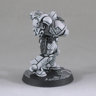
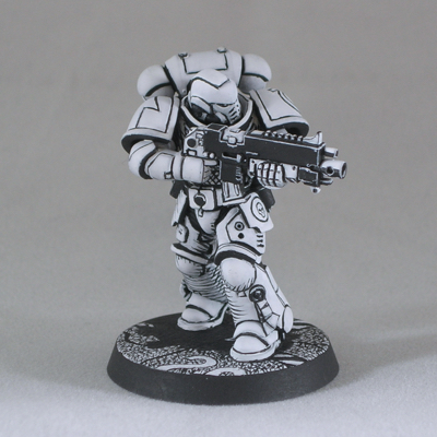
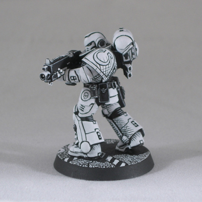
In the meantime, I thought I would share a quick little primaris marine I painted.

The inspiration was the “three-color rule” that some tournaments use to judge when an army is “fully painted”. Some people seem to regard this as a challenge, rules-lawyering a legally “fully painted” army with the minimum amount of effort.

I decided to tackle the reverse challenge: how can I get a good looking result with only two colors, so it’s still not legally “fully painted”. I used only two colors, black and white, with no blending, and I even tried to apply the paint as opaquely as possible so there’s not even the slight blending effect you get when translucent layers overlap.

I think it’s interesting what sorts of effects you can get with miniatures when you decide to depart from the usual style. The model looks really interesting in person, almost like a three-dimensional pen-and-ink sketch. I had planned to incorporate this marine into a joke diorama to enter into the US Golden Demon at Adepticon, but alas that is not to be. I’ll just have to satisfy myself with sharing him online instead.

Gadget repair for the miniature hobbyist

Today’s post is something different, a bit mini-painting-blog-meets-lifehacker. I’ve noticed that a lot of the knowledge I’ve accumulated through my hobby is useful outside the world of miniatures. Knowing how to attach small bits of metal or plastic to each other securely is quite a handy skill in today’s world of cheap electronic gadgets. If you’ve ever repaired a computer peripheral by finding the broken piece of plastic and pinning it back together, you know where I’m coming from. If not, hopefully next time one of your gadgets breaks, you will take a quick look to see whether you can fix it before adding to the world’s growing supply of e-waste.

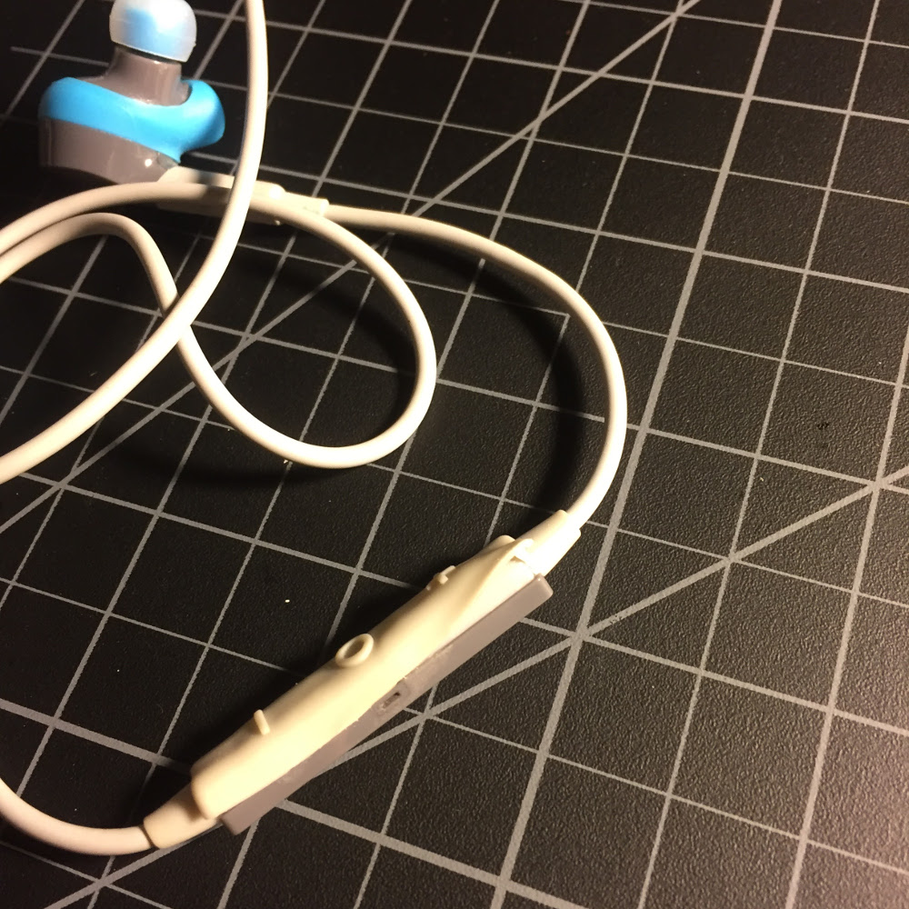
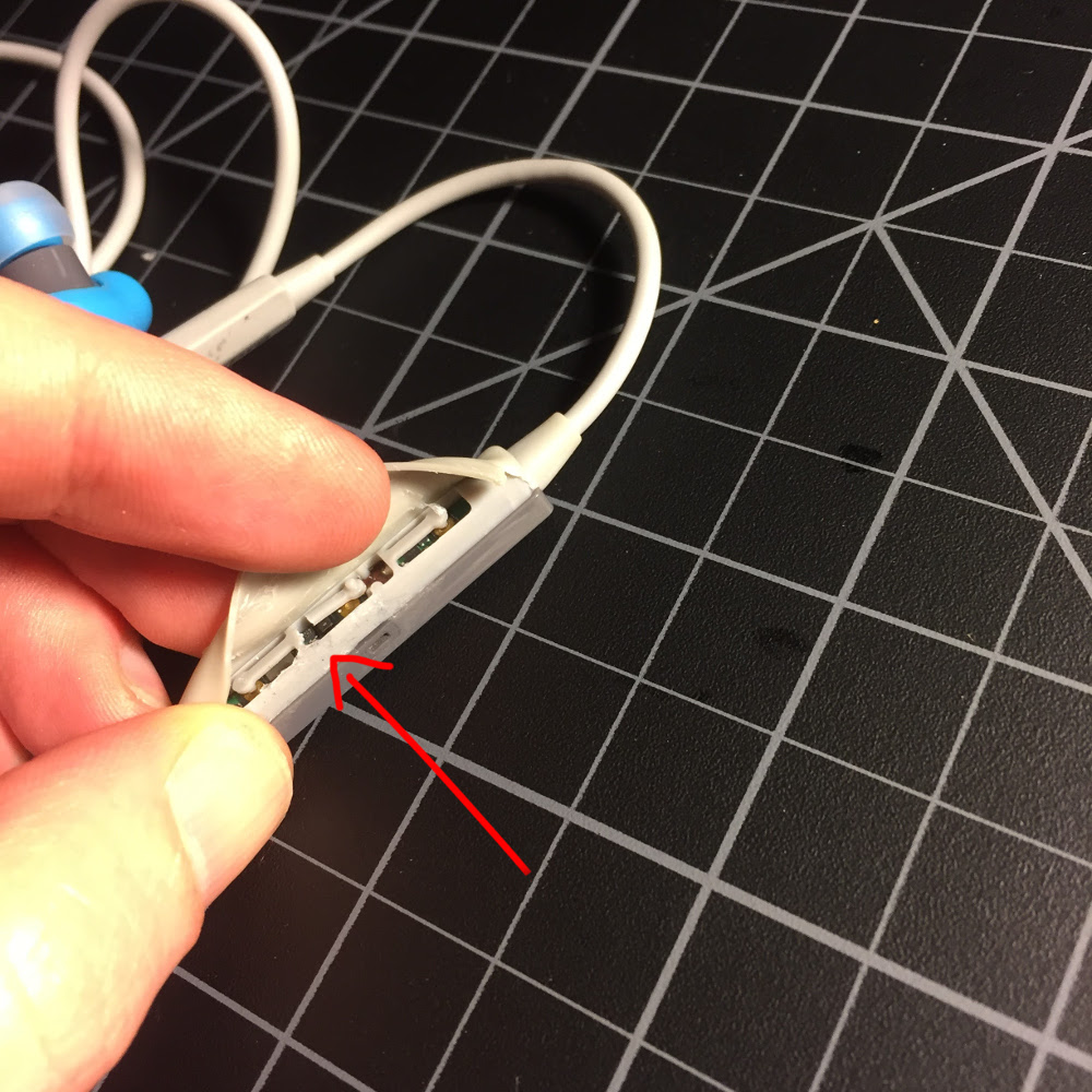
I’ve done this with a number of different devices, but the inspiration for this post was a pair of wireless headphones, which refused to turn on just past the end of their one-year warranty (funny how often that happens…) The last time I tried turning them on, I felt something a bit funny happen, which clued me in that the problem was likely mechanical, not electronic. That was lucky, as mechanical issues with electronics are much easier to figure out and fix than electronic problems. The first thing I did was open up the problematic part to see what was going on. Unfortunately, as these headphones were never meant to be open, that involved tearing some rubber, but I tried to do this in a controlled way that I would be able to repair later. Yes, this will void your warrantee. But if I had a valid warrantee, I never would have needed to get into this in the first place!

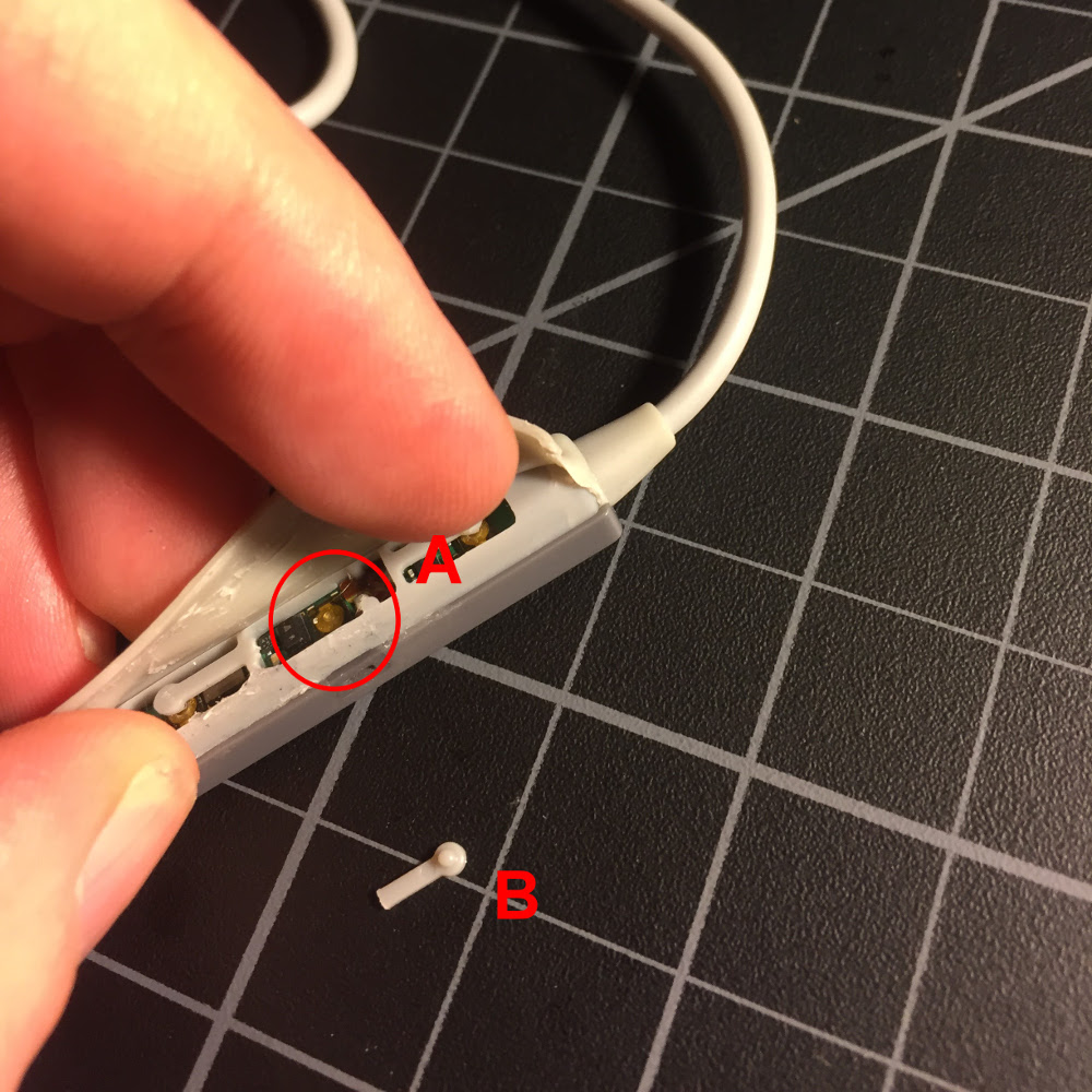
As I suspected, the problem was indeed a simple mechanical one. There are three plastic levers which contact the buttons for power and volume, and the plastic lever for the power button had broken off.

There is a small button (A) attached to the circuit board, which is meant to be pressed by the plastic lever (B) when the power button is pressed on the outside of the rubber sleeve. However, a year of pressing and holding the power button to turn the device on and off had fatigued the plastic to the point where it broke off.

When a broken piece of rigid plastic is the only thing keeping a gadget from functioning properly, repair is easy (for the miniature hobbyist). Joining small bits of plastic together securely is our specialty, and simply pinning the parts together is usually all it takes. For example, when I had a mouse with a broken scroll wheel, I was able to repair it this way by disassembling it, pinning the scroll wheel back together, and reassembling it.  I have done similar repairs to other computer mice and a home alarm system remote, as well as any number of more cosmetic repairs for chipped paint on christmas ornaments, eyeglasses, and the like.

Things get a bit more challenging if the broken part is particularly tiny, or needs to flex properly for the device to function. In this case, the part was tiny and needed to flex, so simply repairing the broken piece of plastic wasn’t going to work, and I would need to improvise a new mechanism. However, the job of the piece of plastic was very simple – it just needed to conduct force from a finger pressing on the button outside the sleeve to the electronic button inside. So devising and implementing an alternative mechanism was equally simple.

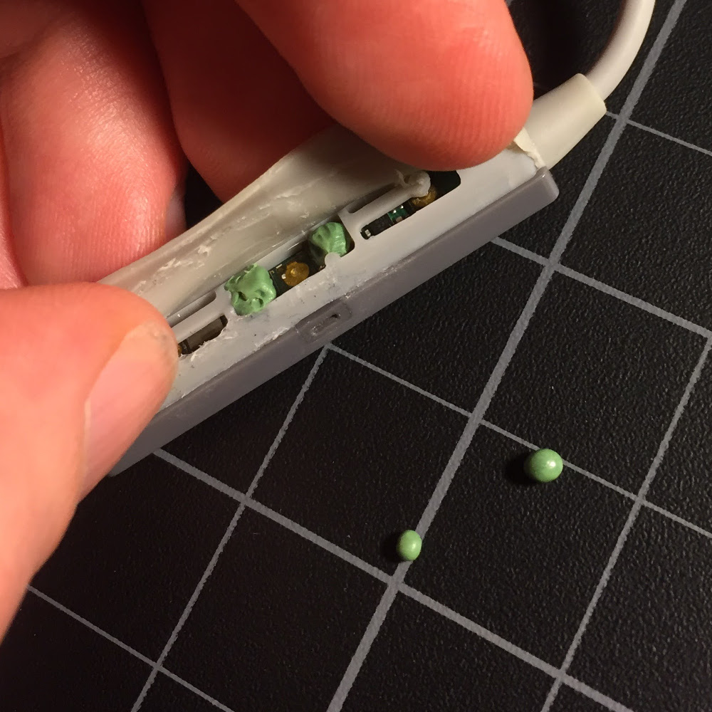
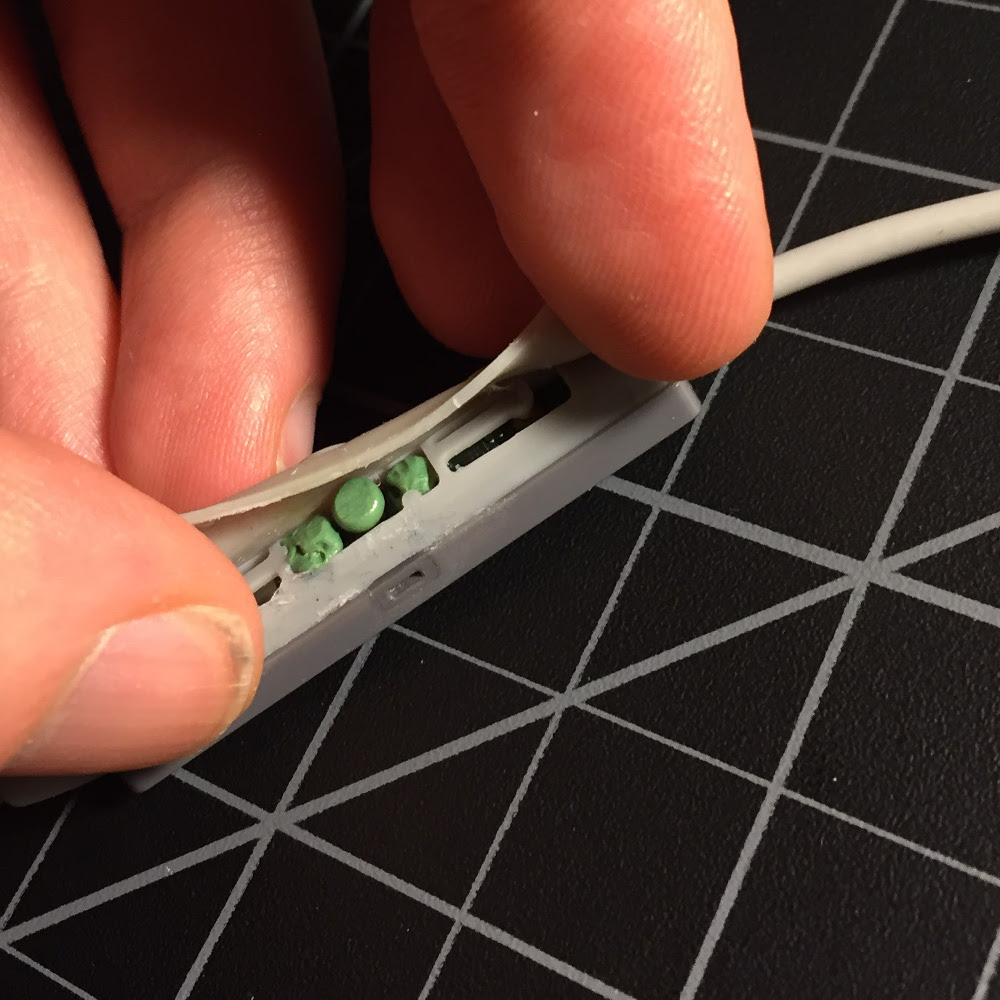
The solution I devised was a small puck (made out of two-part epoxy putty) that would be pressed into the electronic button when I pressed the power button. It could be free-floating inside the mechanism, held in place by the rubber housing. I also added some more two-part putty on either side to act as a guide, keeping the puck from drifting out of position. I wasn’t sure exactly what size and shape of puck would work best, so I made several, and gave them a full day to harden before trying them out.

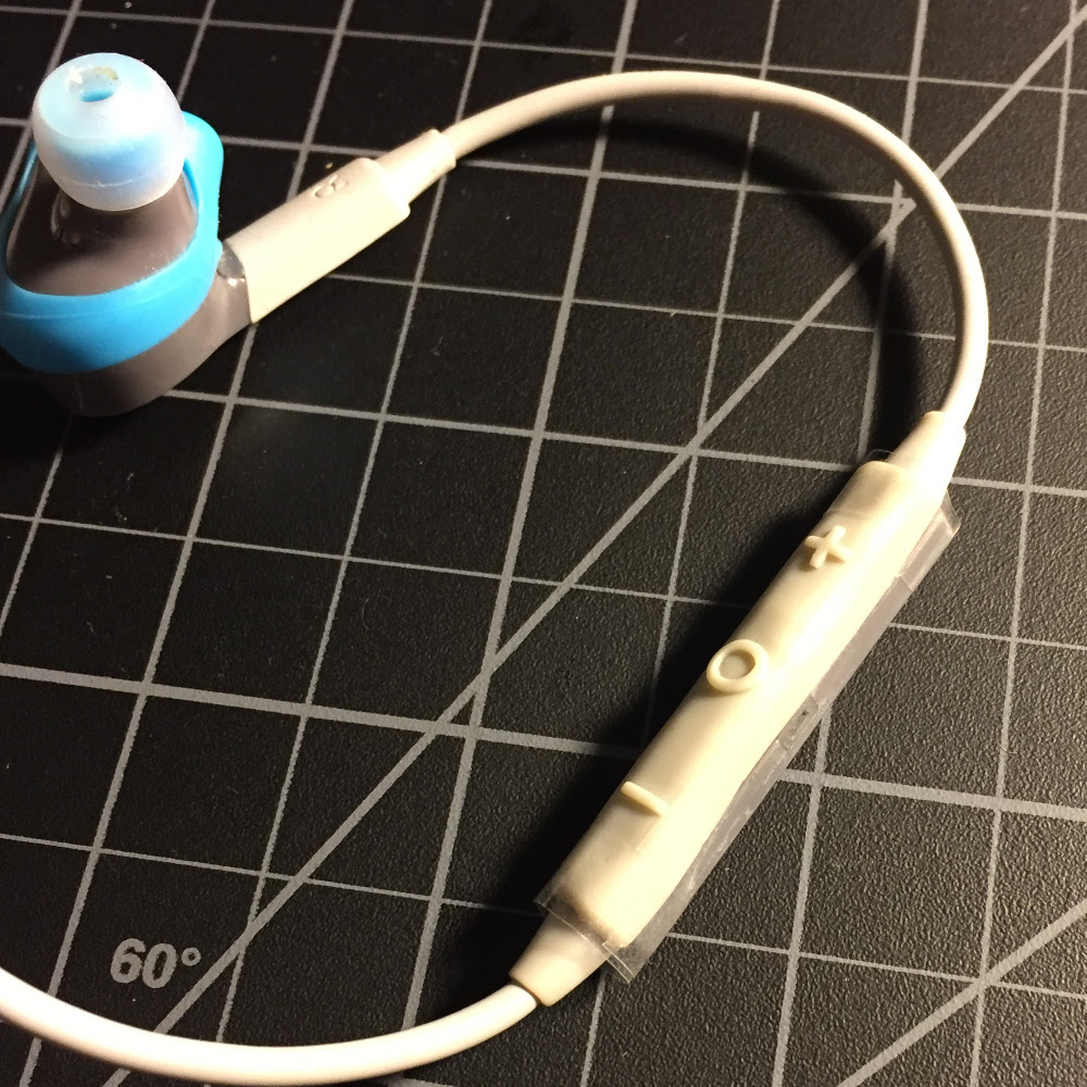
Once the pucks had hardened, I tried them all out, and found one which worked well in my test operations. I decided to tape the enclosure closed at first. That way I could keep easy access to adjust my repair if needed.

Luckily, no problems arose in several days of normal operation, so I glued the enclosure back together, and the repair is barely noticeable. So far it’s been about two months with the repaired device, and they work perfectly! Through a bit of ingenuity and use of the materials and skills garnered through years of miniature hobby work, I was able to repair a pair of $100 headphones rather than needing to replace them. Next time one of your electronic gadgets is broken, I encourage you to try the same before shelling out for a new one.

* * *

Sorry the blog has been so quiet lately, but I’ve been busy getting ready for Adepticon, which starts tomorrow. I’m really looking forward to seeing all the fantastic stuff in the case this year, as well as entering my own pieces. After I get back,

Color Wheels

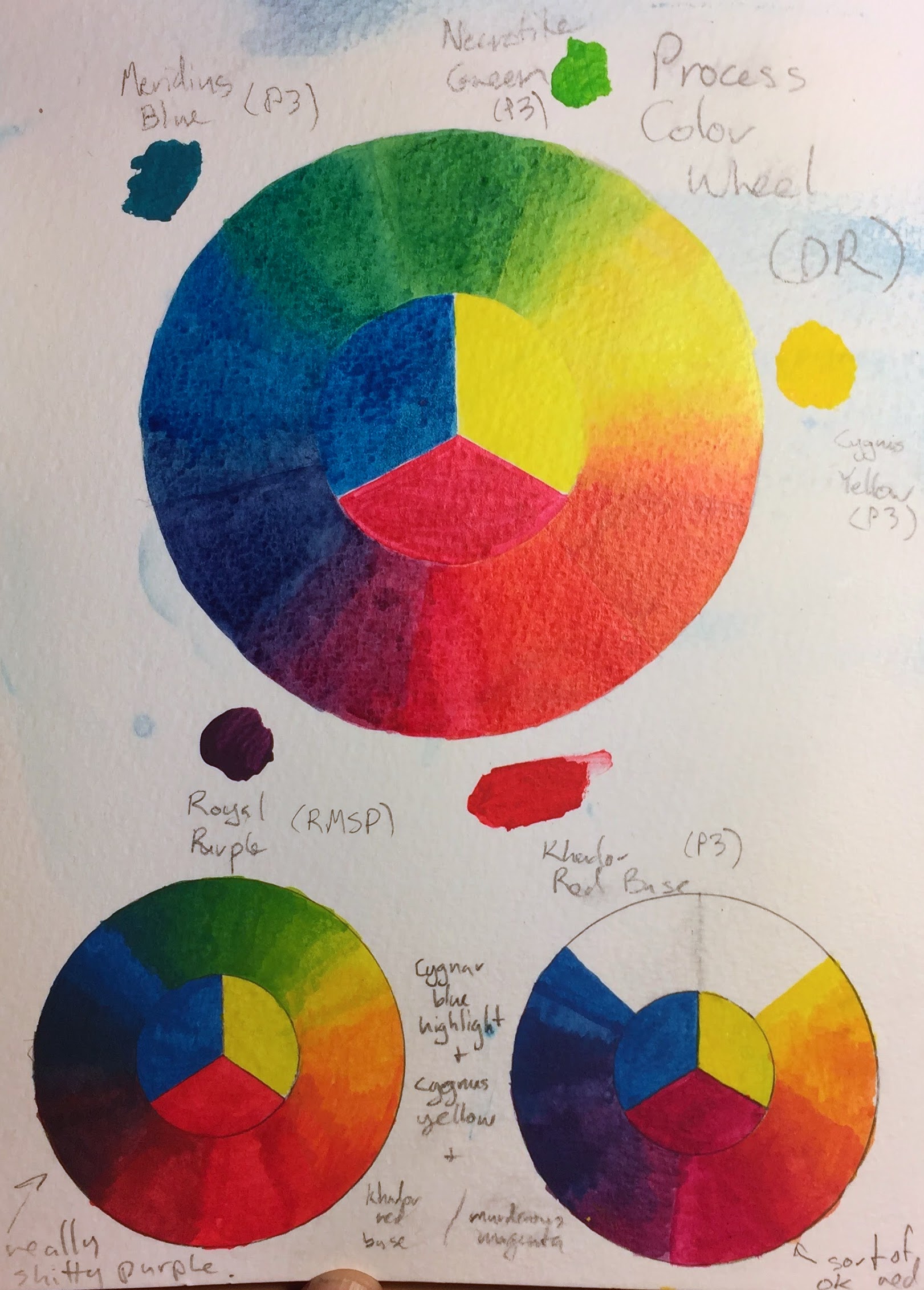
You can find lots of color wheels on the internet, but I find that the most useful color wheel is the one you make yourself, out of the actual paints you use for painting. Making a color wheel with your paints is a good way to understand their properties for color mixing. It can be a good way to figure out which paints make better primaries for mixing more vibrant colors.

The large color wheel in the center is using process inks by Daler Rowney: cyan, magenta, and yellow. That set of colors is well known to printers as being capable of mixing vibrant colors of every hue.

On the bottom are two color wheels I made using P3 paints, which is the set of paints I use most. Both color wheels use the same blue and yellow primaries, Cygnar Blue Highlight and Cygnus Yellow, which I find work very well as primaries. (Since the blue and yellow primaries are the same, I omitted one of the green sections, since it would be the same as the other one.) For the color wheel on the left, I used Khador Red Base as the red primary, and for the color wheel on the right, I used Murderous Magenta.

As you can see, with Khador Red Base, it’s impossible to mix any decent purples, so the purple part of the color wheel looks like it’s been mixed with black. On the other hand, using Murderous Magenta as the red primary gives a quite nice set of purples, and still works well for making reds (by adding just a hint of yellow) and oranges. This is a good illustration of how magenta, not red, is a primary color (for mixing paints).

On the other hand, the red you get by mixing Murderous Magenta and Cygnus Yellow is not quite as bright as Khador Red Base. It’s a fiction that every color can be mixed from three primaries. No matter what set of three paints you use, you will find there are colors that are impossible to mix from your primaries. I’ll be sure to share my entries with the blog!

Four tips to level up your painting

These are some things I’ve learned that I think most miniature painters would benefit from keeping in mind when they paint. Anyone, even people who just started the hobby, can follow these tips.

Pay attention to where the light is coming from when highlighting and shading

Figures that are lit in a realistic fashion are much more believable than ones which are not. Everyone who can see develops an intuitive sense of how things are supposed to look, and when the lighting is off we will notice it and be bothered by it, even if we can’t put our finger on what the problem is.

When highlighting and shading, don’t just highlight the raised areas and shade the recesses, as this is not the way light actually works. Instead, decide where the light is coming from early in the painting process, and try to consistently and realistically light your miniature with that in mind. The three dimensional nature of miniatures is a huge boon here, as you can often just hold your figure at the right angle with respect to a lamp and use that as your guide.

abalam lighting

A photograph to use as a guide can be useful, especially for more complicated lighting situations with multiple light sources. For just one light source, you can usually get away with just holding your mini at the right angle without taking a photo. Can you see where I deliberately highlighted some of recesses of the folds in his shirt, where they catch the light? Can you spot where I missed some?

Don’t just add white to highlight and black to shade, and don’t just use pre-mixed highlight and shadow colors

The light around you is constantly changing. Things look one way in the morning, another way at noon, and everything is beautiful during the golden hour in the late afternoon. This should influence the colors that you paint! When you paint a miniature, think about the ambient light conditions and the mood you want to set. In a cold environment, you might add blue to both the highlights and the shadows in order to set the appropriate mood. If you’re painting an alien on Mars, you might keep the highlights neutral in color, but add red to all of the shadows because of the color of the ambient light. Always keep the environment, lighting situation, and mood you want to create in mind when choosing colors.

Too often I see miniature painters who always paint elf skin with elf skin, elf skin highlight, and elf skin shadow, or who always highlight by adding white. I won’t tell you never to do this. In art, all rules are meant to be broken. But it should always be a choice made consciously, not unconsciously because that’s what the paint is called.

ruby_giant

When painting Ruby, I set the scene during golden hour. Both the direction and the color of the light are appropriate for a sun which is low in the sky. For the parts of the model lit by the sun, I added yellow to all of the highlights. For the parts of the model facing away from the sun, I highlighted by adding gray.

Smooth blends are for smooth surfaces only

A lot of miniature painters obsess over making their blends as smooth as possible, and a lot of this is energy which could be better spent elsewhere. Smooth blends are for smooth surfaces, and most of the objects in our lives have other textures than that. If you are painting a silk kimono, a polished ceremonial suit of armor,  or the skin of a pampered noble, then by all means try to make your blends smooth. But if you are painting a rough work garment, armor which has seen combat, or the skin of a warrior, your blends should not be perfectly smooth. Try to show the grain of the leather, the weave of the fabric, the varying structure of the stone, the lines and scratches from wear, where the paint has started to chip, where corrosion has beset the metal. These are more interesting to look at, and more fun to paint, than smooth blends on every surface.

khador_destroyer_1Do you see any smooth blends? Of course not! This ‘jack has been through years of war; there are no smooth surfaces left. As I was creating the lights and shadows in the white armor,  I did a lot of sketchy blending and left a lot of “bathtub ring” effects where an edge of paint dried. If you do this once or twice, it looks like a mistake, but if you build up a texture out of it, it just looks like weathering. For the turquoise ‘jack, I created an entirely different texture by highlighting with a lot of short lines of color.

Freehand is not hard

Some freehand is hard. If you’re trying to paint something which needs to be very detailed, very regular, or perfectly symmetric, you need to have good brush control. On the other hand, there are a lot of good uses for freehand that are not challenging to pull off. For example, try a cherry blossom pattern, rough graffiti, or something totally abstract. Even a simple border can add interest without being difficult to paint. As you get experience with easier bits of freehand, you can move on to more technically challenging subjects.

axer2

The zebra-skin loincloth on this axer was super simple to do. It’s just a series of lines, and they aren’t supposed to be straight or the same width.
Abalám, revisited

When I posted Abalám on Putty & Paint, one of the comments I received was from Roman Lappat (of Massive Voodoo fame) who wrote,

Great piece. Love the light situation, even I think there are minor parts missing here and there, but this does not make the bust bad. If you want me to point out my thoughts about the light shot me an Emal 🙂

Let me just say I love this reaction. “I like this mini, but see some ways it could be better. I must tell the painter!” Constructive criticism is fantastic, and I’m thankful for all of it I can get, especially when it comes from as knowledgeable a source as Roman. As I wrote in Thoughts on painting competitions, constructive criticism is extremely valuable in improving your work.

When I emailed Roman, he sent me a very helpful diagram showing the areas he felt the light was missing or not strong enough.

Roman's critique

Armed with this sketch, my brush, and some red paint, I went back to my figure, and intensified.

abalam-before-after

Of course, the lighting is also rather different between the two photos. I’m terrible at miniature photography, sorry! I think the new pictures are somewhat closer to life, but this guy is really tricky to photograph.

abalam-revisit-5

I followed all but one of Roman’s suggestions, which was the back of the helmet. It’s just so recessed that I didn’t feel it would receive very much light, so the very strong light that Roman suggested would look out of place. Also, you have to be very careful painting lighting effects in heavily recessed areas of a miniature, because you are fighting against the shadows of the miniature itself. In the end, I did retouch the back of the helmet, but with a dull, dark red, instead of the strong effect that Roman suggested.

I did add light on the rivets, but it’s subtle, and hard to make out in these photos.

abalam-revisit-3

In addition to following Roman’s advice, I also intensified in some areas he didn’t highlight. I made the light on the neck much more dramatic, since it looked flat and poorly painted in the original. I added light on the lower-most armor plate, as that was one of the areas that lit up in my original study but where I had not added a glow effect. And I intensified the light on all of the ropes and the sash, and not only the parts Roman indicated.

Many people, when confronted with criticism, are resistant towards it, and try to find reasons to ignore it. I think this is a very good example of how one can benefit from not only being open to criticism, but trying to look further, and explore how you can use the insight in the criticism to improve upon things that the critique did not specifically identify.

abalam-revisit-4

Now that I’ve posted the back view, Roman’s probably going to point out all of the areas I’m missing here! I’m joking of course, but in truth, I think I can guess which areas he would point out.

I intentionally took a lot of shortcuts on the back, because a bust like this will normally be seen mostly from the front. Also, I have a policy never to retouch figures after they win awards!

abalam-revisit-2

I entered the bust into the KublaCon painting contest last weekend, and was fortunate enough to win Best in Show and one of the People’s Choice awards. This is my second KublaCon win in a row, as Tribe Chief Morrow won Best in Show last year. KublaCon is a Crystal Brush qualifier, which means that my award comes with round-trip airfare to Chicago for Crystal Brush. This will be my second time going, since I lived in Chicago for the first year of the competition, but moved away and missed the other years.

Word from the judges is that the decision between my entry and the second-place winner was very close. This just goes to show the importance of getting feedback on your work. Without Roman’s advice, I probably wouldn’t have won.

after

Thanks again, Roman!

Congratulations to the Crystal Brush winners!

Congratulations to the three overall winners of the 2015 Crystal Brush Awards, Kirill Kanaev, Ben Komets, and Jessica Rich. There were many fantastic entries this year, and it was a pleasure looking through the galleries. I would like to highlight some of my favorites, in addition to the overall winners.

The Archivist - Katie Martin

The Archivist by Katie Martin

I wasn’t familiar with Katie Martin’s work before this, but I’ll be paying attention now. She took home trophies in several categories, but my favorite was this archivist. I adore the archivist’s green cloak, with it’s pointillism texture and freehand patterns.

CatManDu - James Wappel

CatManDu by James Wappel

Jade Knight - Damon Dreschler

Jade Knight by Damon Dreschler

This titan may be my favorite piece in the competition. Everything is executed flawlessly, and all of the elements are perfectly in line with the theme.

Serina - Mary Profitt

Serina by Mary Profitt

The Fruits of Sacrifice - Matt DiPietro

The Fruits of Sacrifice by Matt DiPietro

I hope to have the chance to see this piece in person at some point, because I have the feeling the pictures are not doing it justice. I love the dark take on the fairy tale, Grimm, not Disney.

Sad Panda Restaurant - Justin McCoy

Sad Panda Restaurant by Justin McCoy

This is a very cool, atmospheric piece. I can almost smell the stir-fry cooking. It’s amazing how Mr. Justin scratch-built all of the cookware and even the vegetables for this floating restaurant. Check out his blog for some WIP photos of the construction process.

I haven’t made it to Chicago for Crystal Brush since the first year it was held, but after seeing this year’s crop of entries, I really want to go back.

Thoughts on painting competitions

It’s almost spring, which means another convention season is approaching. I love conventions, and I especially love painting competitions, both because they provide an opportunity to glimpse fabulous miniature art works in person, and because they provide an opportunity to share your best work. Personally, I find it thrilling just to have my art in a big glass display case at a convention, even when I don’t win anything. As the 2015 season approaches, I thought I would share some of my personal thoughts on how to approach painting competitions, and a bit of what my own experience has been.

Continue reading

Where are all the updates?

I know I know, it’s been over a month since I’ve posted. I wanted to post at least once a week when I started the blog, but this is a busy time of year for me (as it is for many of us), so I’ve been falling down on the job. I guess I better make my new year’s resolution be to post more next year!

Right now I’m visiting family and away from my miniatures, so any real content will have to wait for January. In the meantime, here are some of my favorite recent (and not-so-recent) posts on the blogs I follow:

Happy holidays, and have a merry new year!

The Happy Painter’s Manifesto

Six rules to live by.

  1. There is no right and wrong. Each of us must find our own happy painting spirit, and our own path of miniature painting. Others can offer helpful advice and guidance, telling us what has worked for them, but what worked for them may not work for us, and vice versa.
  2. There are no mistakes. There are only accidents. When painting with the happy painting spirit, it is up to us to make our accidents into happy accidents, which while not intended can bring interesting life to our miniatures.
  3. There is no fear. Nothing is more paralyzing to an artist than fretting that the mini won’t be good enough, or that the technique is too difficult, or that we won’t have time to finish. Just forge ahead, and we will always make progress.
  4. There are no deadlines. All of us have our own stresses, and miniature painting can contribute to that, if we have miniatures for clients, or miniatures which have to be finished for this gaming night or that convention. It is important sometimes to paint, just for ourselves, some pieces which are finished when we say they are, because we are happy with them, and not for any lesser reason.
  5. There are no critics. We should listen to others’ suggestions, but not feel bound to follow them or pay attention to criticism. It’s also good not to pay too much attention to our inner critics, especially in the early stages of a piece.
  6. There are no rules. Never be afraid to paint outside the lines!

Inspired by Roman Lappat of Massive Voodoo.

© 2025 Light Miniatures

Theme by Anders NorenUp ↑