Never be afraid to paint outside the lines

Author: David (Page 7 of 8)

From the workbench: Tribe Chief Morrow, part 2

I’ve been having a ton of fun painting Tribe Chief Morrow. He paints up super quickly, so I only had time for a few sets of photos before he was finished. When I left off in part 1, I had just finished the skin and leathers. Next I tackled the metals.

Tribe Chief Morrow - tackling the metals

Tribe Chief Morrow - metals (left)

Tribe Chief Morrow - metals (right)

Tribe Chief Morrow - metals (back)

A lot of the takes on this miniature have extremely corroded metalwork, but for mine I wanted it nice and clean, to really show the beaten metalwork texture. I’m really happy with how it came out.

Tribe Chief Morrow - final WIP

At this point he’s pretty much finished. I want to clean up the hair around the breastplate a bit, and I need to obtain a base. Luckily on the second count I have a friend who makes marvelous wooden miniature bases, so I’m looking forward to what he comes up with. I’m still thinking about tweaking some things, so if you have any suggestions, please leave them in the comments!

Congratulations to the Crystal Brush winners!

Congratulations to the three overall winners of the 2015 Crystal Brush Awards, Kirill Kanaev, Ben Komets, and Jessica Rich. There were many fantastic entries this year, and it was a pleasure looking through the galleries. I would like to highlight some of my favorites, in addition to the overall winners.

The Archivist - Katie Martin

The Archivist by Katie Martin

I wasn’t familiar with Katie Martin’s work before this, but I’ll be paying attention now. She took home trophies in several categories, but my favorite was this archivist. I adore the archivist’s green cloak, with it’s pointillism texture and freehand patterns.

CatManDu - James Wappel

CatManDu by James Wappel

Jade Knight - Damon Dreschler

Jade Knight by Damon Dreschler

This titan may be my favorite piece in the competition. Everything is executed flawlessly, and all of the elements are perfectly in line with the theme.

Serina - Mary Profitt

Serina by Mary Profitt

The Fruits of Sacrifice - Matt DiPietro

The Fruits of Sacrifice by Matt DiPietro

I hope to have the chance to see this piece in person at some point, because I have the feeling the pictures are not doing it justice. I love the dark take on the fairy tale, Grimm, not Disney.

Sad Panda Restaurant - Justin McCoy

Sad Panda Restaurant by Justin McCoy

This is a very cool, atmospheric piece. I can almost smell the stir-fry cooking. It’s amazing how Mr. Justin scratch-built all of the cookware and even the vegetables for this floating restaurant. Check out his blog for some WIP photos of the construction process.

I haven’t made it to Chicago for Crystal Brush since the first year it was held, but after seeing this year’s crop of entries, I really want to go back.

From the workbench: Tribe Chief Morrow, part 1

Last weekend I received a nifty little package from Germany. Inside was Forged Monkey’s Tribe Chief Morrow bust, a sweet little gorilla bust sculpted by Raffaele Picca, who is a great sculptor in addition to being one of my favorite painters. The cast was amazingly clean, with only one small bubble and almost no mold lines. Cleanup took only ~15 minutes, and I have very high standards for cleaning a cast before I start painting. I was so excited I started painting at once.

Tribe Chief Morrow - starting with the face

This is the first mini I’ve primed black in a long time, but given the black gorilla skin and many metal areas, it seemed convenient. I started with the face, as that’s the most important thing to get right on any figure, but especially a bust. I always like to find relevant reference material before I start painting, and for this bust, I was inspired by this adorable baby gorilla.

Tribe Chief Morrow, step 2 (right)

I originally went with red for the leathers, but wasn’t happy with how it looked and switched to yellow. It still looks a bit odd, but I think that once the metals are painted it will fit much better, and provide a nice warmth contrasted with the black. Of course, this was when I started kicking myself for priming black, but a few coats of menoth white highlight provided a good base for the yellow.

Tribe Chief Morrow, step 2 (front)

Zebra-skin provides striking patterns, and seemed appropriate for a gorilla chieftain. The larger stripes are how most of the body looks, and the finer stripes underneath are from the zebra’s head. No Zebras were harmed in the production of this blog post.

Tribe Chief Morrow, step 2 (left)

This guy is incredibly fun and quick to paint. I highly recommend picking up a copy for yourself!

Thoughts on painting competitions

It’s almost spring, which means another convention season is approaching. I love conventions, and I especially love painting competitions, both because they provide an opportunity to glimpse fabulous miniature art works in person, and because they provide an opportunity to share your best work. Personally, I find it thrilling just to have my art in a big glass display case at a convention, even when I don’t win anything. As the 2015 season approaches, I thought I would share some of my personal thoughts on how to approach painting competitions, and a bit of what my own experience has been.

Continue reading

From the workbench: “2084”, part 2

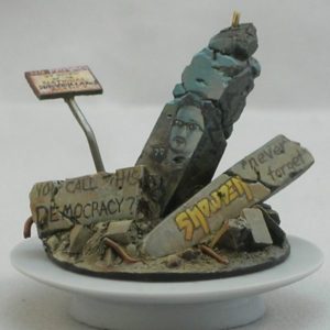
Yes, that’s a 10mm tall portrait of Edward Snowden.

2084-base-1

I imagine Lisbeth inhabiting a dystopian future with constant worldwide surveillance. I decided to cover the concrete blocks she’s flying over with graffiti protesting that situation.  The front says “Snowden ‘never forget'”, “You call this democracy?” and “The NSA is watching.”

2084-base-2

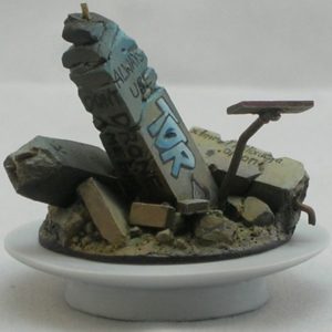
On the back you can read “Always use Tor” (with the Tor logo), “Don’t drone me bro,” and “xfmro77i3lixucja.onion,” which is an onion address for the Imperial Library of Trantor. In addition to being a reference to Asimov’s Foundation series, the Library of Trantor is an online collection of DRM-free digital books. (I really wanted to use an address for Wikileaks instead, but sadly they don’t seem to have a functional onion address right now.)

This graffiti was partially inspired by the 8.8.8.8 graffiti Turkish citizens used to evade the DNS block Turkey placed on Twitter last spring. I imagine citizens in a future Orwellian society using Tor to keep websites up and available despite state attempts to take them down, and using graffiti to tell each other how to access them.

2084-base-4

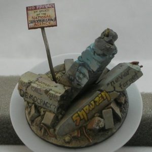
The sign says, “No privacy by order of the National Surveillance Agency”. Originally I painted the sign as “No entry by order of the National Security Agency”, and then painted over “entry” and “Security” as if someone had graffitied over an official sign.

2084-base-3

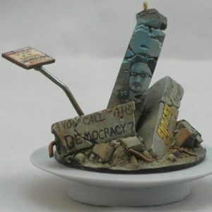
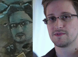
The portrait of Snowden was the most time-consuming part of the graffiti. I copied Laura Poitras’ well-known portrait of the whistleblower. (Used under CC-BY license.)

snowden

I think I made a pretty good likeness, although when I put them side-by-side like this, I see a few details I need to fix.

snowden_portrait_comparison

Parachute pants!

I’m super excited about my current project, which will be titled “2084” for reasons which shall soon become apparent. The figure is Lisbeth, by Studio McVey. This is the second time I’ve painted this figure. She’s a total kick to paint—I love the gigantic parachute pants, and there are lots of surfaces which just scream for freehand. Plus, I gave my first copy away, so I wanted a second to keep.

cypherpunk1


Starting with the prep work. My cast had a bit of an offset running between the folds in her pants, which was a bit of a pain to clean up.

cypherpunk4


I also decided to do some minor conversion work. Lisbeth comes with a backless tube-top-like-thing which I don’t much like, so I turned it into a full (if short) shirt. I also reshaped her hover-board into something a bit more snowboard and less surfboard.

cypherpunk2


I added a sign to the base, and started penciling in the graffiti I plan to paint. I smudged some of it with my thumb, but the face you see if going to be a portrait of a guy with a goatee and glasses.


cypherpunk3

cypherpunk5

cypherpunk6


The red is a lot more vibrant than it looks in these photos. I’ll try to come up with some better ones, later.

cypherpunk7


Old concrete usually has different colored stains, which I’ve tried to simulate here. It won’t be terribly visible once the graffiti is added, but will help the whole thing be a bit more realistic.


cypherpunk8


At this point you can probably guess who the portrait is, and why the title is “2084”.

New photo setup

I finally have a more-or-less permanent photo setup in my apartment, which should make it a bit easier to post photos for the blog. I broke it in by taking some new photos of miniatures I painted a while ago, but never had any decent photos of. Hope you like them!

Akarui – Studio McVey

akarui-1

akarui-2

akarui-3


Ar-Fienel – Studio McVey

ar-fienel-1

ar-fienel-2

ar-fienel-3


Kifaro – Studio McVey

kifaro-3

kifaro-4

kifaro-1

kifaro-2


Queek – Games Workshop

queek-1

queek-2

queek-3


Ur-Fildyr – Studio McVey

ur-fildyr-1

ur-fildyr-2

ur-fildyr-3


Comments and critiques are always welcome.

Step-by-step: clockwork base

clockwork_base_closeup

When I painted Commander-Adept Nemo, I was inspired by Natalya “Alexi-Z” Melnik’s amazing version of Nemo from the previous Gen Con. I really liked the non-metallic metal armor and the elaborate base she used, so I decided to do something similar for my version. It’s a fair bit different from hers, but I really liked her idea of putting Nemo on a raised platform with technological elements. For my version, I wanted to create a clockwork mechanism you could see into, like a skeleton watch.

Continue reading

Where are all the updates?

I know I know, it’s been over a month since I’ve posted. I wanted to post at least once a week when I started the blog, but this is a busy time of year for me (as it is for many of us), so I’ve been falling down on the job. I guess I better make my new year’s resolution be to post more next year!

Right now I’m visiting family and away from my miniatures, so any real content will have to wait for January. In the meantime, here are some of my favorite recent (and not-so-recent) posts on the blogs I follow:

Happy holidays, and have a merry new year!

Tutorial: Object-Source Lighting

This tutorial is quite old. Please check out my new one instead!

Really! The new one is much better!


One of the most eye-catching effects in miniature painting is source lighting, where a glowing object casts light on the rest of the miniature. Especially in the fantasy and science-fiction genres, it’s a great way to show that a sword is imbued with magical energy, or a plasma cannon is charged and ready to fire. Let’s face it: glowing weapons are just cool. This technique is often called “object-source lighting” (OSL) by figure painters, as the source of the light is represented on the miniature (an “object-source”).

Pulling off believable glow effects is tricky, however, and there are many examples of poorly done lighting effects on the internet. In this article, I will show a step-by-step sequence of how I paint source lighting effects, using a Cryxian Slayer by Privateer Press as the demo mini. I’ll also provide plenty of tips and additional examples to help you give your models that eye-catching glow.

Continue reading

« Older posts Newer posts »

© 2025 Light Miniatures

Theme by Anders NorenUp ↑