Never be afraid to paint outside the lines

Author: David (Page 3 of 8)

IPIK-7 (Steamthing)

IPIK had never been so far from his home. Food was getting harder and harder to find, even though only a handful of survivors of The Fall were still around scavenging. In the century since civilization collapsed, every home, grocer, or other potential stockpile of sustenance had been picked clean. The elders claimed that once upon a time, food grew by itself, but IPIK had never witnessed this. It sounded like a myth. But now there was a small green strand poking through the sand. What could it be?

Wow, it’s been a long time since I’ve posted on the blog. Sorry about that! I went a little convention crazy this year with Crystal Brush, Kublacon, World Expo, Gen Con, and Reapercon. I’ve been so busy working on my entries for the various competitions (and, y’know, life) that I haven’t had much time to write about minis.

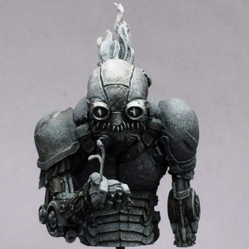
Now that I’ve finished all but one of my competitions of the year, I wanted to take some time to update the blog. First up is my main entry from Gen Con this year, Patrick Masson’s “Barney the Steamthing” bust.

I have been wanting to paint this bust ever since I first saw it on CoolMiniOrNot way back in 2009. However, the sculptor, Patrick Masson, said at the time that it couldn’t be cast. “Don’t think there is a chance to make a cast. Unfortunately there are a lot of uncastable areas. I should change too much things. The next one will be.” So I was very happy when I came across it recently in Patrick’s Putty & Paint gallery, here, and saw that casts are available. You just have to contact him through his website, Artik Toys.

I posted some early WIP photos in April; at the time he was all black in white as I started painting the bust in Matt DiPietro’s “sketch” class using the value sketch technique he teaches in the class. This mini continues to show the influence of the classes I’ve been taking, especially Alfonso Giraldes and Kirill Kanaev, along with Matt. It definitely borrows from Alfonso’s “fuck smoothness” approach and Kirill’s teachings on textures. As Alfonso correctly points out, most of the objects we encounter in our lives do not appear as smooth color transitions, but rather as textures of one kind or another.

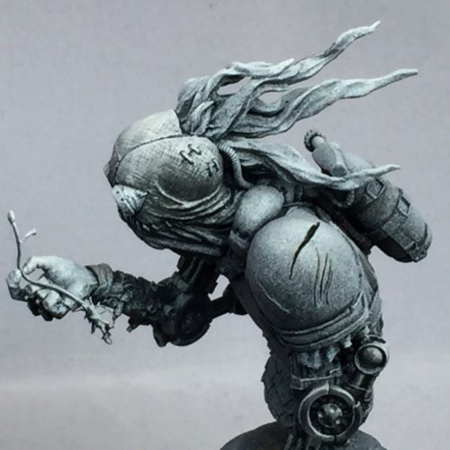
In total, I painted fifteen different textures on different areas of IPIK. There’s the woven burlap of his head, the shiny metal of his eyes, the corroded metal of his arms, the dirt-covered but still shiny coke can, the chipped paint of his shoulders, the cracked leather straps supporting his backpacks, and so on. Try to spot all fifteen!

In addition to the textures, I also had a lot of fun with the various freehands all around, especially the repurposed materials. As a post-apocalyptic scrounger, IPIK is all about recycling. His head covering is made from burlap potato sacks. If you look closely, you can make out the texts: “NAME BRAND POTATOES” and “100 LBS PRODUCT OF USA.” The oxygen bottle on his back even has the correct NFPA 704 warning symbol for oxygen. My absolute favorite bit of IPIK is the coke can. Painting a scavenger who repurposes everyday objects opens up a lot of opportunities, and few everyday objects are more iconic than the coke can.

Figures tend to be about character, and this is especially true for busts. This can make painting figures with helmets, masks, or other head coverings a bit tricky. Patrick (and his brother Thierry who did the concept) did a really good job on Steamthing’s face, putting a lot of life and expression into what is really just some stitched-together fabric, but it still poses a bit of a challenge for the painter. One of the ways I addressed this was putting the reflection of the plant in IPIK’s eyes. It’s a bit of a cheat—from most angles, the reflection of the plant would not be visible. But as soon as I saw the effect in the first sketch I did, I knew it was the right thing to do.

2017 Classes

This year I am again teaching classes at KublaCon and Gen Con, and I’m also adding a new convention: Reapercon! I went to Reapercon for the first time last year and had a blast, so this year I’m excited to be teaching classes there.

I will be teaching Two-Brush Blending for the fourth year running, and this will be my second year teaching a class on painting the “tricky colors”: white, black, and red. I’ve had a lot of good feedback on both of those classes, so I’m looking forward to teaching them again. Those classes will be held at all three cons. Also, I’m happy to offer a class on lighting effects at Reapercon. I’ve learned a lot since I first wrote my OSL tutorial, and I’m looking forward to sharing what I’ve learned. I also plan to write an updated tutorial when I have a chance.
Continue reading

The White Orc

This is the third and final installment of my series on my entries into Crystal Brush. Make sure to check out part 1 and part 2.

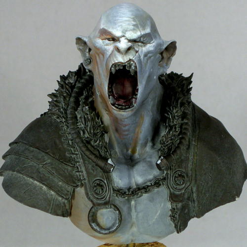
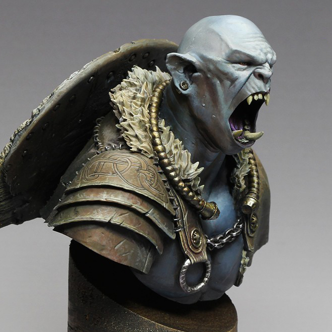
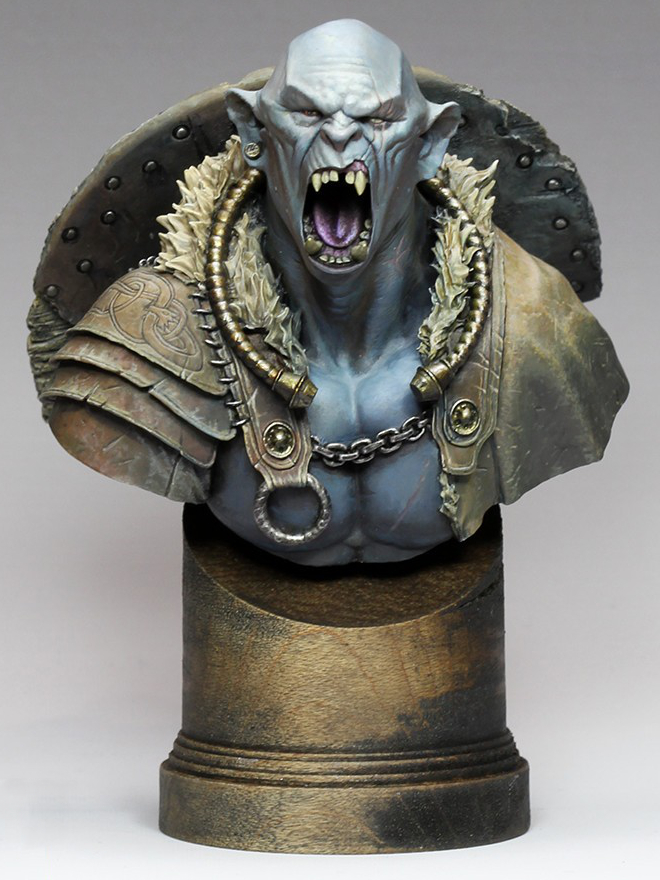
“The White Orc” was my main entry into the Crystal Brush competition this year, the one I spent by far the most time on.

Sometimes a miniature just goes right from the start, and this was one of those miniatures. I started the bust not long after taking a class with Alfonso Giraldes, and had a chance to watch him execute his style of sketching, and gradually turning the sketch into a finished painting. It was quite inspiring to watch, and I knew I wanted to have a go at it; this bust was the result.

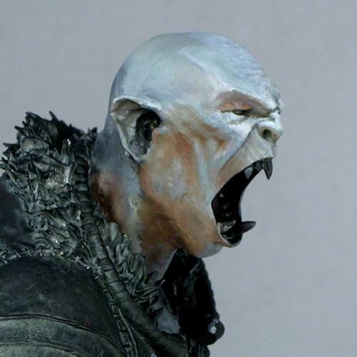
I decided to paint the orc’s skin a light, neutral color that would be strongly influenced by his environment, and do a warm/cold ambiance. I really like complicated lighting situations, and study the way light is used in film in order to later recreate interesting situations with paint. Light neutral tones are perfect when you are playing with complicated lighting situations, since they will be most influenced by the light. I placed a strong white light almost directly overhead, with a warm ambiance from one side, and a cold ambiance on the other. The warm/cold contrast is extremely strong in the initial sketch. I eventually decided the contrast was too strong, and added more warmth to the cool side with some purple. The contrast is still quite apparent if you’re looking for it, but is now subtle enough that you might not notice it.

The shield was a lot of fun to paint, with all the battered wood texture. The freehand was one of the parts I struggled with a bit. I started out painting a bloody handprint, and it was just awful. I wasn’t the least bit happy with it, so started Googling alternative ideas for inspiration. Once I hit upon the idea of doing Celtic knot-work for the shield it all fell into place.

I like to get a lot of critiques on my miniatures, as other people often spot things I miss or have ideas I didn’t think of. One of the comments that kept coming up again and again in critiques was, the shield is too clean! So I kept dinging it up more and more. In the end, it ended up really with a really interesting weathered appearance.

It’s interesting to compare the initial face sketch with the finished product. I actually left a lot of the sketchiness in, especially in the cheeks. I tend to focus a lot more effort on areas that are meant to be focal points—the forehead, eyes, and mouth in this case—and leave things sketchier in areas which are less important. That may have been a mistake in retrospect, since I think it was one of the things the judges dinged me for, and may be part of why he finished just out of the medals. (My understanding is he finished 4th in his category.) I do plan to fix a few things that were bugging me in the photos (mostly where the neck meets the chest) and then enter him in another competition, so hopefully he’ll win some awards before too long. But in the end, I paint for me, not for the judges.

On a more positive note, he’s currently my top ranked model on CoolMiniOrNot, and even made the top 10 of the year as the score fluctuated between 9.5 and 9.6. That made me pretty happy.

The bust is by Hera Models, which has a fantastic little line of sci-fi and fantasy busts. They also make Abalam, which I painted last year. The miniature is now sold out; apparently it sold out in the last couple of weeks, after I presented my own version at Crystal Brush. I like to think I sold at least a few copies, wink.

Even though this bust is sold out, Hera’s “academic orc” bust is still available, and is a modified version of the same bust, without the armor. I can definitely recommend it, as the face is extremely well sculpted and a joy to paint.

Voting links, for those so inclined:

Value Sketch: Steamthing

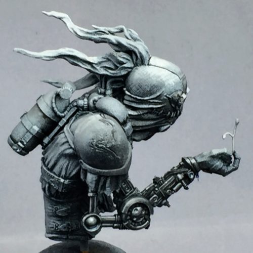
A couple of months ago I took a class with Matt DiPietro of Contrast Miniatures (formerly of Privateer Press) on the use of value sketches in miniature painting, as a first step to establish contrasts before adding color. While the class mostly focused on tabletop-quality miniatures, and I painted a board game figure in the class as practice, I also started working on Patrick Masson’s “Steamthing” bust, as a bit of an experiment to see how this style would work for me in display quality.

Here is the finished value sketch. In the sketch, I focused mostly on the mechanical arms and the head, letting the “zenithal priming” create most of the sketch in the other areas. I’m not sure how well the textures will translate with color over the top; I may need to re-create them at the step where I add color.

One of the things that made me first fall in love with this sculpt is how expressive the face is, despite being just a burlap bag with some stitching and goggles. Patrick, and his brother Thierry who did the concept, managed to instill a lot of emotion in this little robot-thing.

When I first saw it on CoolMiniOrNot (way back in 2009, when it was posted), I knew I wanted one, and was very disappointed when the sculptor said in the comments it would not be cast. It seems a lot of people were interested though, and convinced him to rework some things (like the bottle attachment in back) in order to enable casting. When I rediscovered Steamthing in Patrick’s Putty & Paint gallery and learned casts were available, I immediately asked for one. If you want your own, you should contact Patrick.

I’m excited to start adding color!

Crystal Brush Entries, part 2

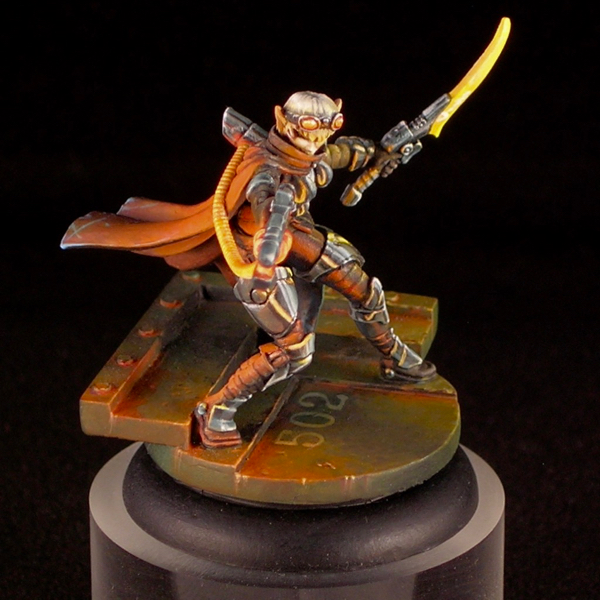
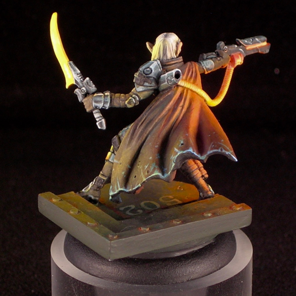
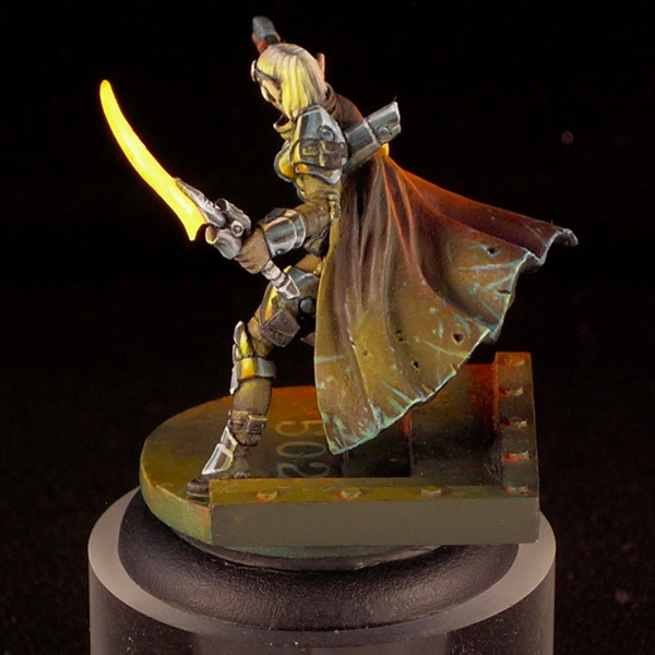
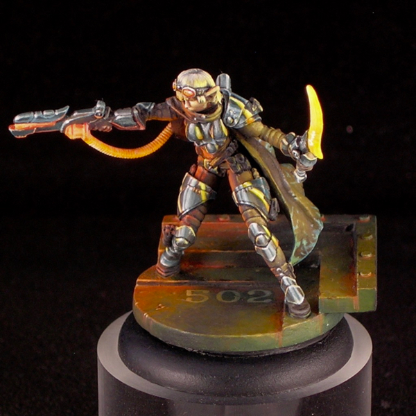
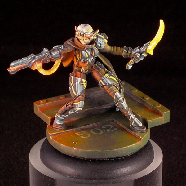
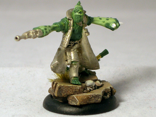
Today I’m continuing my three-part series on my Crystal Brush entries with my single figure entry. If you missed part 1, please check it out here. This figure is titled “Space Pirate Kaelyssa.”

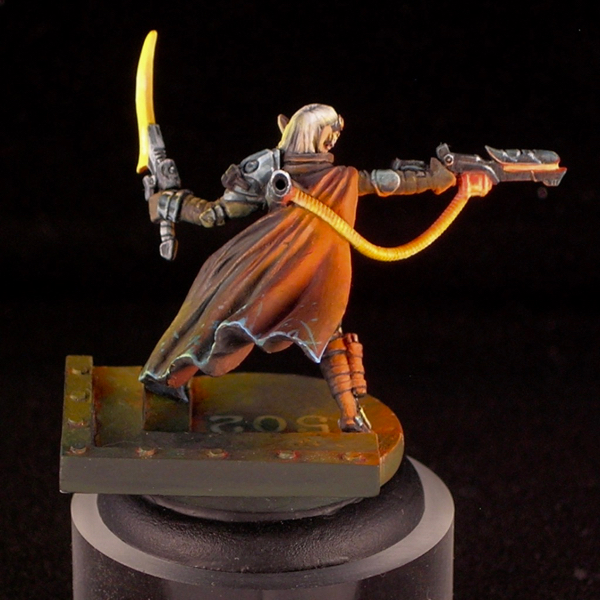
The figure is Kaelyssa, from Privateer Press’ steampunk game Warmachine. I got a big kick out of doing her up in true sci-fi fashion, not at all steampunk. Since she belongs to the Retribution faction, which already have a rather sci-fi look, this was quite easy. All I did was a very simple conversion to add a hose connecting her gun and backpack. The only other thing it took was paint. I was amused how many people asked me if it was an Infinity figure.

Part of the inspiration came from James Wappel’s excellent Professor Karrick. I absolutely love dramatic lighting and glow effects, and James’ take on Professor Karrick’s two light sources is excellent. The base he did complements it really well, providing a nice backdrop to catch the light. For my version, I kept the base but used a different figure from the same sculptor (Patrick Keith), converting it slightly to have a similar hose.

I tend to do simpler color-schemes on most of my figures, with two or three main colors dominating. In my experience, the easiest color-schemes to pull off are those that have at most two bright colors in them, and the rest of the colors are more muted. Here I was able to come up with a more complicated color scheme, with many very saturated colors in it, and I still think it works.

I was really surprised when Kaelyssa didn’t make first cut. I spoke with one of the judges, and he said that she was right on the bubble but the judges felt that the blending on the orange was not smooth enough and that kept her out. I’ve never been the smoothest blender, preferring to take my time creating textures and dramatic ambiance rather than glazing and glazing until I have really really ridiculously smooth blends. I think that hurt me here.

While I think there are some weaker elements, like her left arm and sword, I’m really happy with how the ambience and light effect came out. I think that overall Kaelyssa is good work, but given her poor result in Crystal Brush I plan to rework some of the weaker elements and enter her in another competition in the future (probably the Privateer Press competition at Gen Con).

Kaelyssa is sculpted with some fairly simple, round armor plates. Simple surfaces can be wonderful for an ambitious miniature painter, because they provide a good opportunity to make them much more complicated and interesting using paint. I took the opportunity to do a comic-book-style chrome effect, reflecting the glowing sword and ray-gun. I think the comic-book style art complements the sci-fi vibe really well.

There are a lot of debates between non-metallic metals vs. the use of metallics in miniature painting, with hard-line adherents on either side arguing their way is “better”. Personally I use both, but I think this miniature is a good example of some of the advantages of non-metallic metals. I could never have portrayed the interaction of shiny metals and a light source using metallic paints, the way I was able to do it here using nmm.

Crystal Brush Entries, part 1

I’m back from Crystal Brush, and wanted to share my entries!

I came with a bust, a unit, and a sci-fi single, putting the most time into the bust. Disappointingly, the bust was the only one which made first cut. I think that means that when you go to Crystal Brush, either you need to go all-out on your entry, or you might as well not bring it! That seems fitting for a contest as competitive as it is.

In sharing my entries with the blog, I’m going to start with the unit, which was definitely the weakest of the three entries. These are really gaming models, although I do have high standards for my gaming models. I didn’t even do any basing for them, just painting the 25mm bases they come with and calling that good enough!

I went with a classic red-and-military-green color scheme, which is really a very effective color scheme (yay color theory!) For the reds, I went with a high-contrast NMM look, which I think works really well for infinity models. The green cloth is subtly textured to better complement the shiny metals.

I still have another 4 models from this group to paint, since I got the Operation: Icestorm box set. Doing small tabletop gaming figures can be a nice break from larger projects, so I will probably finish the unit gradually in between other projects.

Next up is my sci-fi single entry, which I’ll be posting later this week!

Gadget repair for the miniature hobbyist

Today’s post is something different, a bit mini-painting-blog-meets-lifehacker. I’ve noticed that a lot of the knowledge I’ve accumulated through my hobby is useful outside the world of miniatures. Knowing how to attach small bits of metal or plastic to each other securely is quite a handy skill in today’s world of cheap electronic gadgets. If you’ve ever repaired a computer peripheral by finding the broken piece of plastic and pinning it back together, you know where I’m coming from. If not, hopefully next time one of your gadgets breaks, you will take a quick look to see whether you can fix it before adding to the world’s growing supply of e-waste.

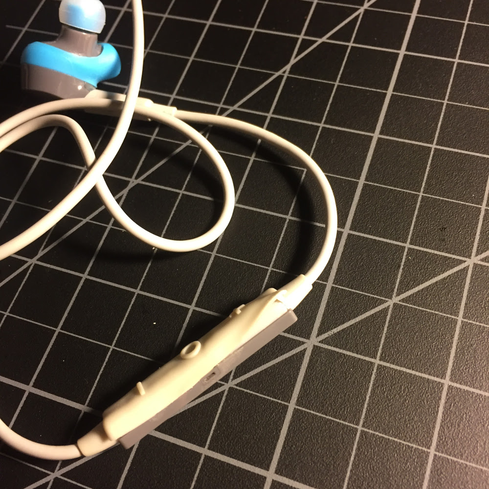
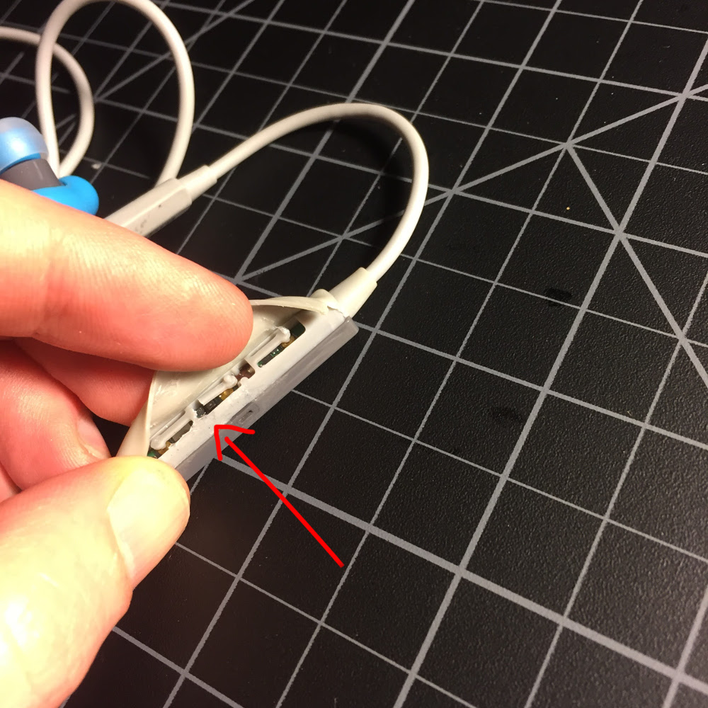
I’ve done this with a number of different devices, but the inspiration for this post was a pair of wireless headphones, which refused to turn on just past the end of their one-year warranty (funny how often that happens…) The last time I tried turning them on, I felt something a bit funny happen, which clued me in that the problem was likely mechanical, not electronic. That was lucky, as mechanical issues with electronics are much easier to figure out and fix than electronic problems. The first thing I did was open up the problematic part to see what was going on. Unfortunately, as these headphones were never meant to be open, that involved tearing some rubber, but I tried to do this in a controlled way that I would be able to repair later. Yes, this will void your warrantee. But if I had a valid warrantee, I never would have needed to get into this in the first place!

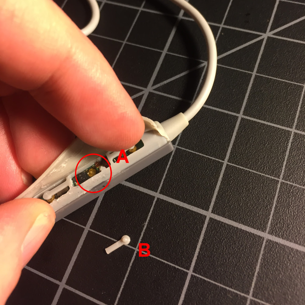
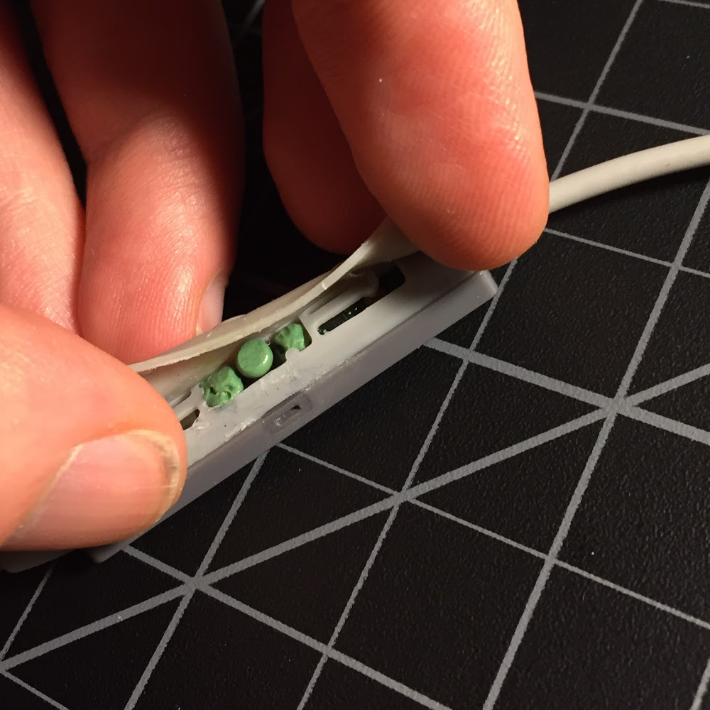
As I suspected, the problem was indeed a simple mechanical one. There are three plastic levers which contact the buttons for power and volume, and the plastic lever for the power button had broken off.

There is a small button (A) attached to the circuit board, which is meant to be pressed by the plastic lever (B) when the power button is pressed on the outside of the rubber sleeve. However, a year of pressing and holding the power button to turn the device on and off had fatigued the plastic to the point where it broke off.

When a broken piece of rigid plastic is the only thing keeping a gadget from functioning properly, repair is easy (for the miniature hobbyist). Joining small bits of plastic together securely is our specialty, and simply pinning the parts together is usually all it takes. For example, when I had a mouse with a broken scroll wheel, I was able to repair it this way by disassembling it, pinning the scroll wheel back together, and reassembling it.  I have done similar repairs to other computer mice and a home alarm system remote, as well as any number of more cosmetic repairs for chipped paint on christmas ornaments, eyeglasses, and the like.

Things get a bit more challenging if the broken part is particularly tiny, or needs to flex properly for the device to function. In this case, the part was tiny and needed to flex, so simply repairing the broken piece of plastic wasn’t going to work, and I would need to improvise a new mechanism. However, the job of the piece of plastic was very simple – it just needed to conduct force from a finger pressing on the button outside the sleeve to the electronic button inside. So devising and implementing an alternative mechanism was equally simple.

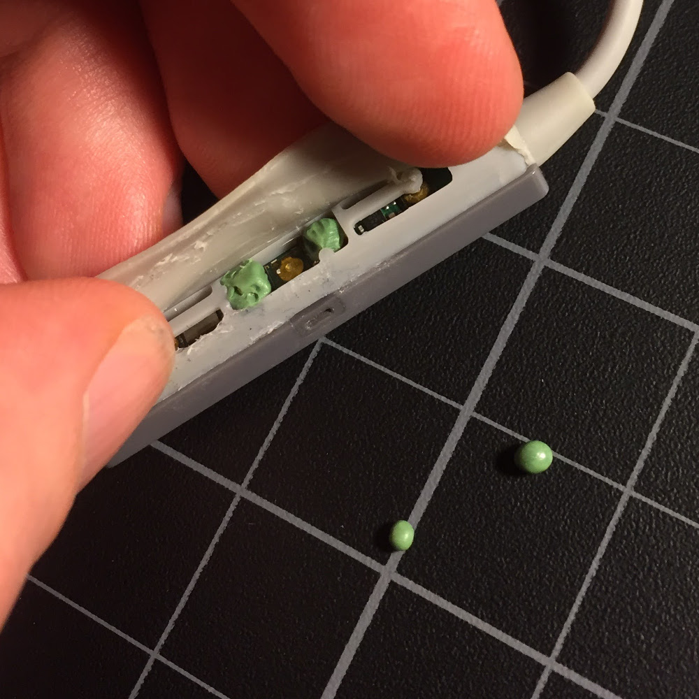
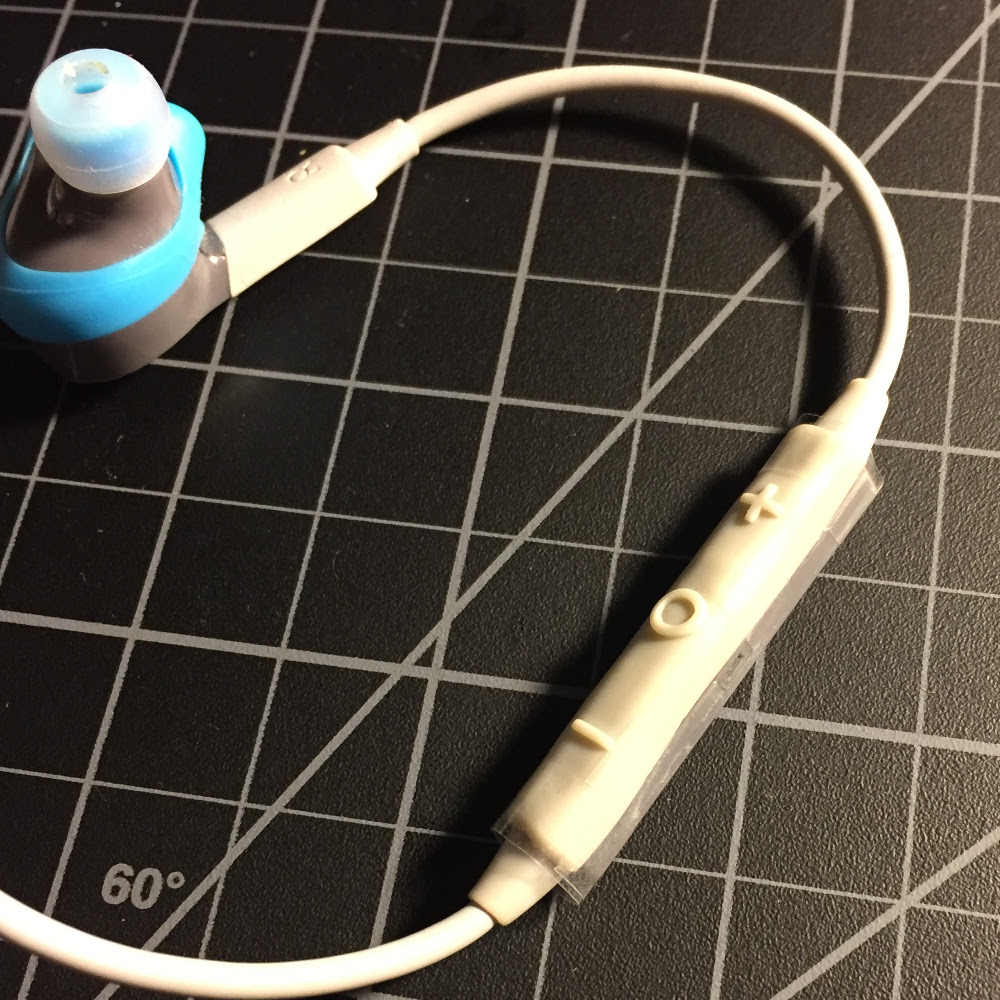
The solution I devised was a small puck (made out of two-part epoxy putty) that would be pressed into the electronic button when I pressed the power button. It could be free-floating inside the mechanism, held in place by the rubber housing. I also added some more two-part putty on either side to act as a guide, keeping the puck from drifting out of position. I wasn’t sure exactly what size and shape of puck would work best, so I made several, and gave them a full day to harden before trying them out.

Once the pucks had hardened, I tried them all out, and found one which worked well in my test operations. I decided to tape the enclosure closed at first. That way I could keep easy access to adjust my repair if needed.

Luckily, no problems arose in several days of normal operation, so I glued the enclosure back together, and the repair is barely noticeable. So far it’s been about two months with the repaired device, and they work perfectly! Through a bit of ingenuity and use of the materials and skills garnered through years of miniature hobby work, I was able to repair a pair of $100 headphones rather than needing to replace them. Next time one of your electronic gadgets is broken, I encourage you to try the same before shelling out for a new one.

* * *

Sorry the blog has been so quiet lately, but I’ve been busy getting ready for Adepticon, which starts tomorrow. I’m really looking forward to seeing all the fantastic stuff in the case this year, as well as entering my own pieces. After I get back,

Color Wheels

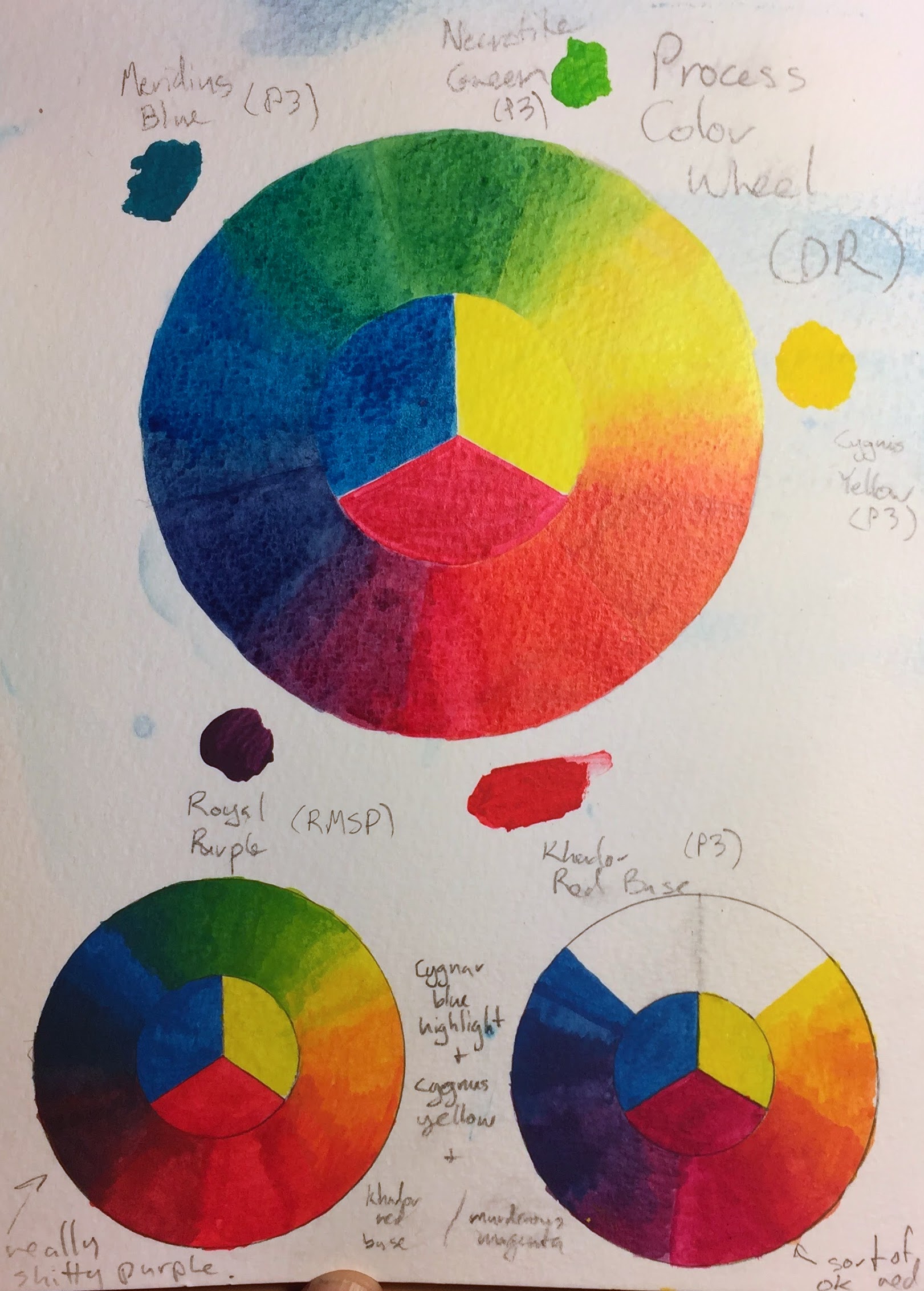
You can find lots of color wheels on the internet, but I find that the most useful color wheel is the one you make yourself, out of the actual paints you use for painting. Making a color wheel with your paints is a good way to understand their properties for color mixing. It can be a good way to figure out which paints make better primaries for mixing more vibrant colors.

The large color wheel in the center is using process inks by Daler Rowney: cyan, magenta, and yellow. That set of colors is well known to printers as being capable of mixing vibrant colors of every hue.

On the bottom are two color wheels I made using P3 paints, which is the set of paints I use most. Both color wheels use the same blue and yellow primaries, Cygnar Blue Highlight and Cygnus Yellow, which I find work very well as primaries. (Since the blue and yellow primaries are the same, I omitted one of the green sections, since it would be the same as the other one.) For the color wheel on the left, I used Khador Red Base as the red primary, and for the color wheel on the right, I used Murderous Magenta.

As you can see, with Khador Red Base, it’s impossible to mix any decent purples, so the purple part of the color wheel looks like it’s been mixed with black. On the other hand, using Murderous Magenta as the red primary gives a quite nice set of purples, and still works well for making reds (by adding just a hint of yellow) and oranges. This is a good illustration of how magenta, not red, is a primary color (for mixing paints).

On the other hand, the red you get by mixing Murderous Magenta and Cygnus Yellow is not quite as bright as Khador Red Base. It’s a fiction that every color can be mixed from three primaries. No matter what set of three paints you use, you will find there are colors that are impossible to mix from your primaries. I’ll be sure to share my entries with the blog!

Gurka Firewater

A lot of people get in to miniature painting through RPGs. When you play the same character weekly in a regular game, it’s a good motivation for painting a figure to represent the character, and doing a good job on it.

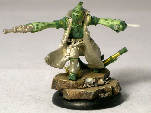
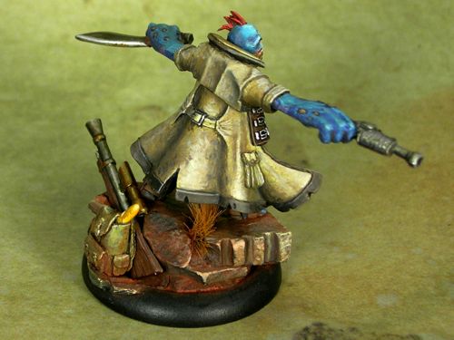
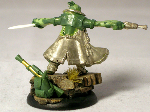
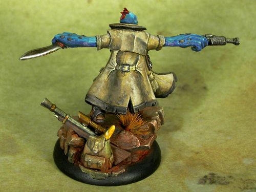
This is Gurka Firewater, my character in a weekly Unleashed game. I was disappointed with the available pygmy troll options in the Privateer Press miniatures line, so ended up converting my own, using Captain Allister Caine as the starting point. Since I started with a human figure, this involved extension conversion work.

The head, arms, and feet are full scratch. I sculpted one of the hands around one of Caine’s pistols, but the kukri and the rifle on the base are also fully scratchbuilt. I used a rotary tool to remove the head and grind down the breastplate so I could sculpt a troll belly over it.

Yes, that’s a baguette sticking out of his backpack. In the lore, trolls eat a lot and tend to carry food with them everywhere they go. I guess they’re sort of the hobbits of the Iron Kingdoms? A baguette seemed like a fun and fitting way of giving him some extra character. Perhaps I should also have added a flask, given his name. 😉

I ended up doing a very gritty paint-job with lots of texture. Somehow that seemed appropriate for a bushwhacker character. No smooth blending for this guy.

I entered Gurka in the “open” category at ReaperCon. Usually when I enter competitions, I use stock or near-stock models that are judged only on the quality of the painting. In the “open” category, they give roughly equal weight to both sculpting and painting, making it a much more challenging category. This is especially true for me, as I’m a much better painter than I am a sculptor. Luckily I was able to compensate somewhat for my sculpting deficiencies through my paintwork, and managed to eke out a gold medal.

It’s always good to push yourself, as that’s the best way to improve. With this miniature, I pushed myself to do a much larger amount of sculpting than I had before on any model, and that was definitely a challenge. But it also gave me the confidence to tackle more challenging sculpting projects in the future, since now I know I can do a project that involves significant sculpting, and still end up with a decent result.

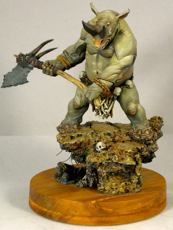
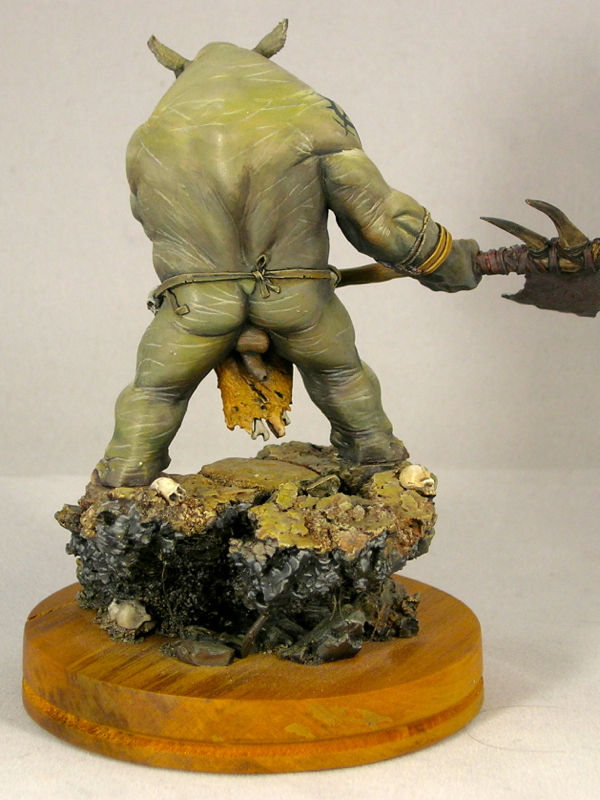
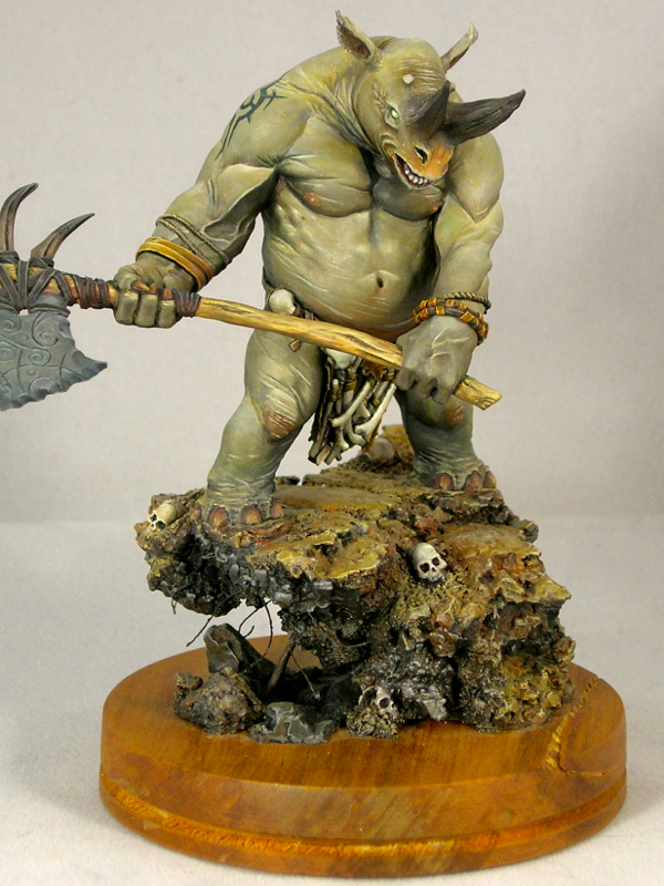
Kifaro

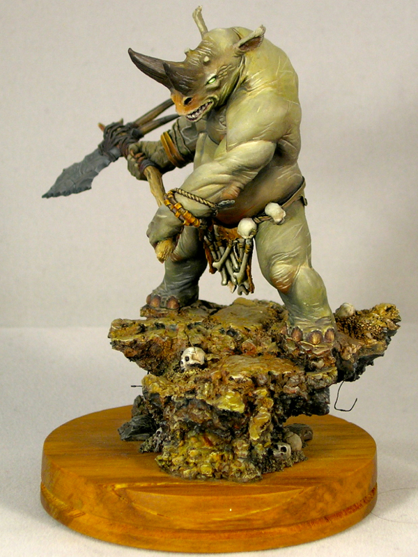
This is a miniature I painted a few years ago, in 2012 actually, but never managed to take decent photos of. My camera really doesn’t like him for some reason. These photos are a definite improvement over my last attempt, at least.

Kifaro comes from Studio McVey’s resin line (which I miss very much, since they stopped making them). He is sculpted by Allan Carrasco, who is probably the best monster sculptor in the world of miniatures and has a wonderful feel for anatomy, of both the real and fantastical variety.

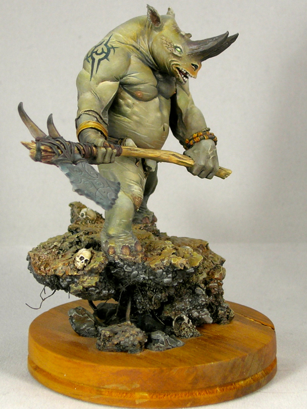
Because he is rhino-ish, I went with a realistic rhino coloring, which is a plain, slightly yellowish gray. This presented a bit of a challenge, to keep things interesting despite the plain gray coloring. One of the things I did to add interest is add a tattoo. I was inspired by “tribal tattoo” designs, but ended up with something abstract of my own invention.

The other thing I did was add color into the grays. I used a lot of very dilute ink glazes to vary the gray tones, and also added red-orange colors to places which often have a bit of extra fleshy color in other animals (though not rhinos, as it happens).

The base is built mostly of cork tile, with sand and putty added to vary the texture a bit, and hide the flat parts of the tile. I quite like building bases this way, because it’s very easy to rip parts off and glue them back in a slightly different position to alter the overall form. Because this sort of moving and reforming is similar to natural processes, you can also get great organically random textures as a nature side-effect of doing this.

Kifaro’s base was the first I built which just sort of rises up out of a wooden plinth, without filling it to the edges. It’s not something you see very often, but I quite like the effect. I have done it several times since, most recently with Desert Wanderer.

Of course, when the sculptor is a master of anatomy, it’s important that the sculpture is anatomically correct. Actually, Kifaro’s caster decided that right between the legs would be a marvelous place to place an injection point, leaving a big chunk of resin there, rather than accurately sculpted anatomy. Some very delicate reconstructive surgery was required to correct the deformity. Just one of the joys of being a perfectionist in this hobby. 😉

He’s posted here on Putty & Paint. Not

« Older posts Newer posts »

© 2024 Light Miniatures

Theme by Anders NorenUp ↑